Infa.ai
Wise Design SystemComponents
A date input lets people enter a date within a form.
Use date picker to let users pick a date from a calendar.
Dividers are used to create stronger hierarchy between contents, sub-section, and sections.
A dropdown (sometimes called a select) lets users choose a single item from a dropdown list.
Instructions are a list of bullet points marked as positive and negative.

A modal is an overlay that interrupts the user’s task to show an important message, disabling the rest of the screen.
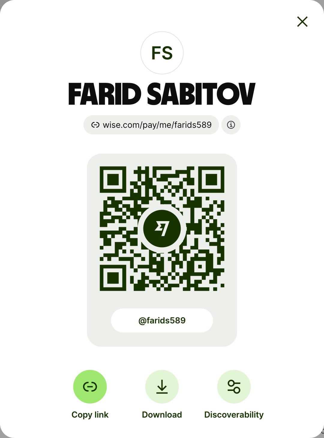
Money input lets users enter an amount in a currency of their choice or validate a prefilled currency.

A navigation option gives users a rich way to choose between options and navigate to another screen or step in a flow. Navigation options are presented in a list or as tiles (tiles are web only).



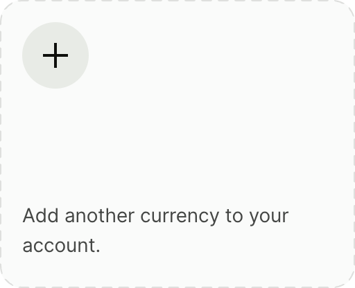
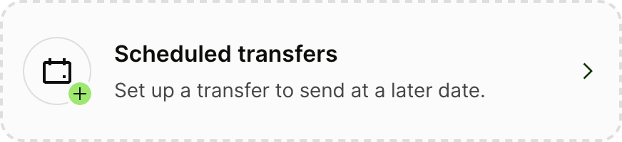


A nudge directs users to take an action on something that might be relevant at the time they see it.
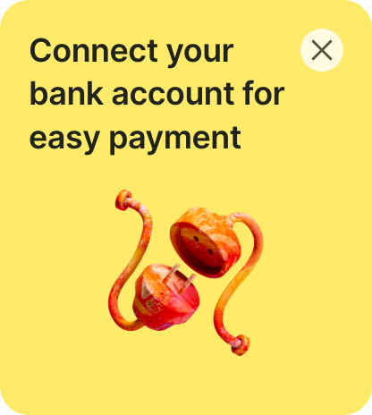
Lets users enter their password as part of a login or authentication process.

A popover is a short, floating message that gives the user some non-critical, extra context.
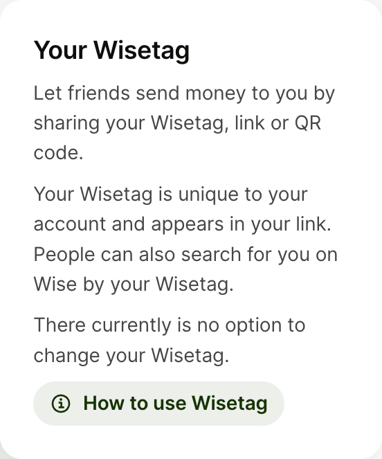
The Progress bar informs the user that the system needs time to load content. If you are on web please refer to screen loader guidance page.
Progress spinner provides reassurance to users that the app hasn’t crashed when they are executing lengthy and/or stressful tasks.
A promo card is used to promote products and features.

A radio lets users select a single item from a mutually exclusive list.
A screen loader is a temporary indicator to tell the user that a screen is loading. Once it’s finished, the loader is replaced by the screen. If on mobile please refer to the progress bar guidance page.
A search input allows users to look for information from a wide set of possible results.



A section header divides sections of a screen.




A segmented control allows users to update views of content and select between 2-3 alike options.
A select lets a user pick an option from a long list of options — typically 6 or more.

A snackbar is a brief, temporary notification that confirms the outcome of an action or process that’s just happened.
A summary summarises instructions, tasks, or benefits in a list.
A switch lets the user toggle an individual setting on or off.

Tables allow users to review large amounts of sequential information at a glance.
Tabs organise content into sections that users can alternate between.
A text area is a field that lets users enter several lines of text.
A text input lets users enter a single line of text.

Upload lets users upload a single file when uploading is the primary purpose of the screen.
An upload input lets users upload a single file, or multiple files, within a form.
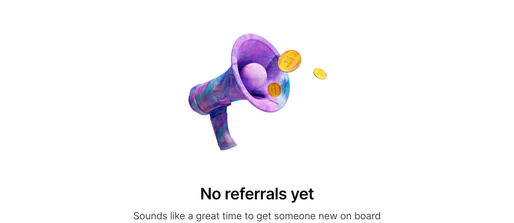
Empty state patterns are used inside of pages to denote when there is "nothing" to display.

The copy block is used to explain our features, benefits or service offering to our users.
An icon button lets the user perform an action with a tap or a click.

Chips allow users to filter content or make a choice from a set of options within a compact area.

A circular button lets the user perform an action with a tap or a click.
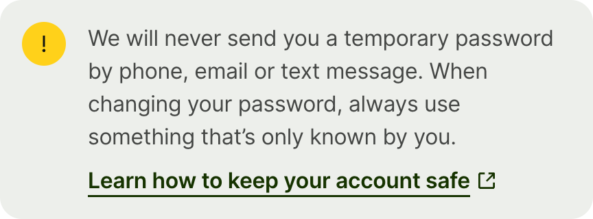
An alert gives users an important message about their current task within the context of a screen.


An avatar is a representation of a unique entity — like a person, a business, or an object. It can contain initials, images, icons, or flags.

A bottom sheet is a container you can use to display supporting content or a short, supplementary task on mobile experiences.
A button lets the user perform an action with a tap or a click.








Card is a container that groups related content.
Checkboxes let users select zero, one, or multiple items from a list.

A compact date input lets people enter a short date within a form.
A critical banner tells the user that they need to either unblock their account, or stop it from being blocked or closed.