Infa.ai
Vercel Design SystemComponents
# Show more A styling component used to toggle between expanded and collapsed content. ## Features - Default Behavior: Provides a simple toggle to show or hide additional content.


# Material Various surfaces with shadows, built on top of the <Stack> component. ## Features - Provides a variety of surfaces with shadow effects. - Built on top of the versatile <Stack> component for layout and structure.
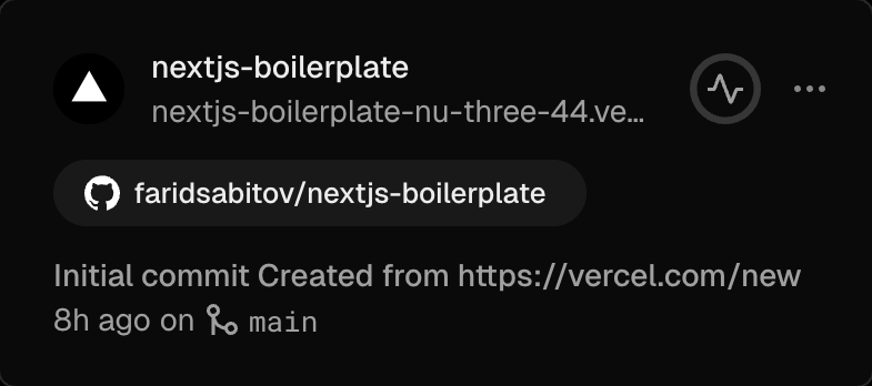


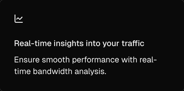
# Context Card Tooltip ## Features - Default View: Provides a tooltip with customizable positions. - Position Options: Supports top, bottom, left, and right placements.

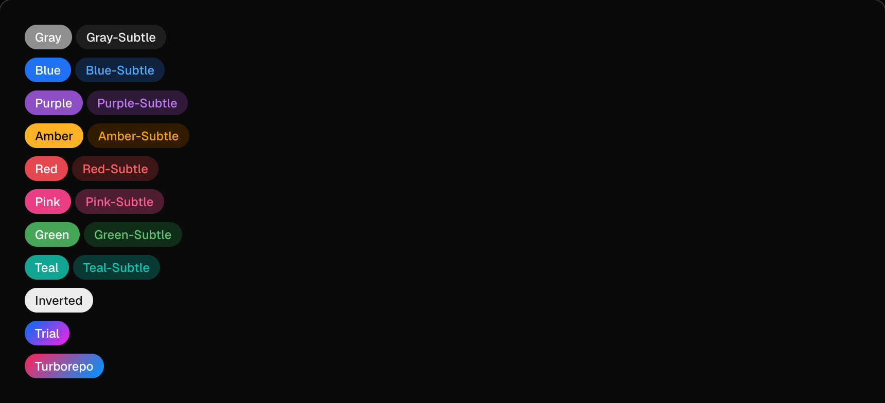
# Badge A label that emphasizes an element that requires attention, or helps categorize with other similar elements. ## Features - Variants: Available in multiple colors such as gray, blue, purple, amber, red, pink, green, teal, and inverted styles. - Sizes: Comes in small, medium, and large sizes. - With Icons: Badges can include icons for better visual representation. - Pill Style: A special link style based on <Badge /> styling, less prominent than a button.




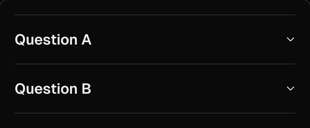
# Collapse A set of headings, vertically stacked, that each reveal a related section of content. Commonly referred to as an accordion. ## Features - Default View: Displays vertically stacked headings with collapsible content. - Expanded State: Allows sections to be expanded by default. - Multiple Sections: Supports multiple collapsible sections. - Small Size: Provides a compact version of the collapse component.


# Description Displays a brief heading and subheading to communicate any additional information or context a user needs to continue

# Drawer Display content in a separate view from the existing context. ## Features - Default View: Provides a drawer for displaying content on small viewports. - Custom Height: Allows customization of the drawer's height.
# Feedback Gather text feedback with an associated emotion. ## Features - Default View: Provides a feedback form designed for desktop use. - Inline Feedback: Allows users to provide feedback inline with the content.

# Checkbox A control that toggles between two options, checked or unchecked. ## Features - Default State: Provides a standard checkbox for binary options. - Disabled State: Includes disabled checkboxes, both checked and unchecked. - Indeterminate State: Supports an indeterminate state for partial selections.

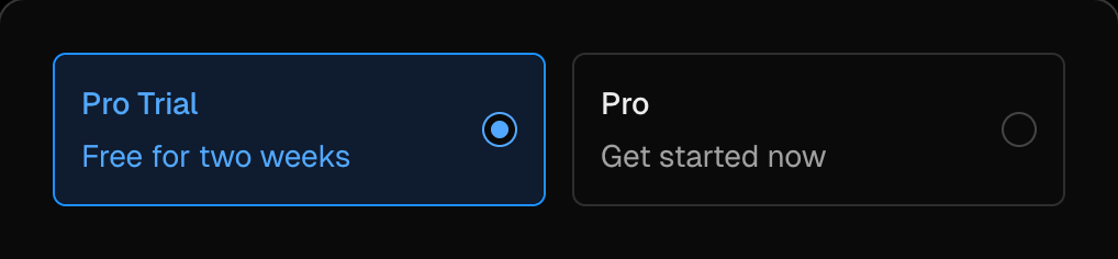
# Choicebox A larger form of Radio or Checkbox, where the user has a larger tap target and more details. ## Features - Single-select: Allows users to select one option from a group. - Multi-select: Enables selection of multiple options. - Disabled State: Supports disabled groups and individual inputs. - Custom Content: Displays additional content when an option is selected.
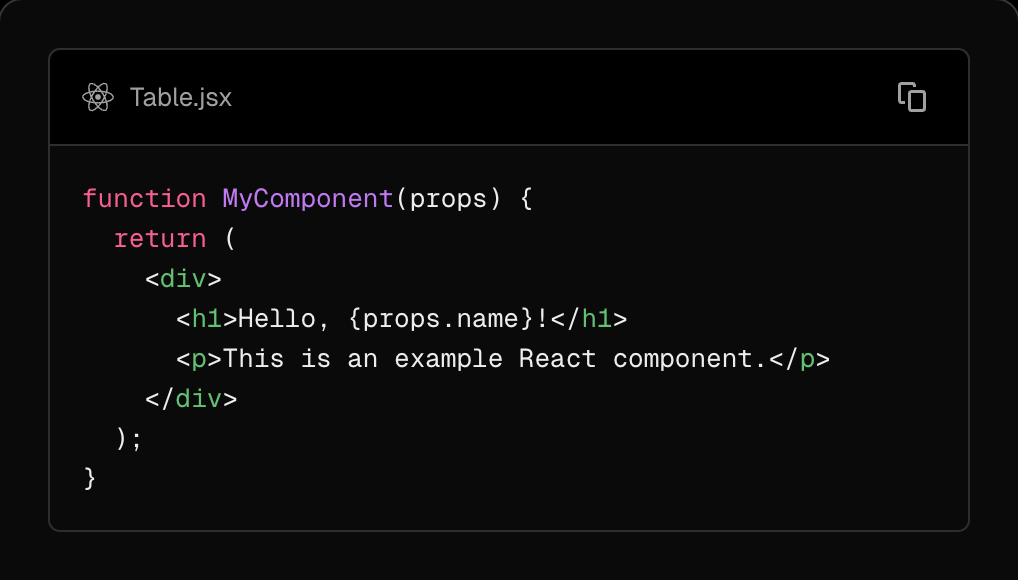
# Code Block Code Block component used across Vercel and Next.js. ## Features - Default View: Displays code with syntax highlighting and filename. - No Filename: Option to hide the filename for a cleaner look. - Highlighted Lines: Allows highlighting specific lines of code. - Language Switcher: Supports switching between programming languages like JavaScript, TypeScript, and Next.js. - Hidden Line Numbers: Option to hide line numbers for a minimalistic view.
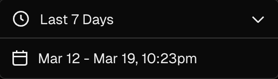
# Calendar Displays a calendar from which users can select a date or range of dates. ## Features - Default View: Provides a standard calendar interface for date selection. - Presets: Offers common date ranges for quick selection. - Compact Mode: Displays a smaller version of the calendar for space efficiency. - Stacked Layout: Arranges the calendar in a stacked format for better organization. - Presets with Default Value: Includes common date ranges with a pre-selected default value. - Min and Max Dates: Allows setting minimum and maximum selectable dates





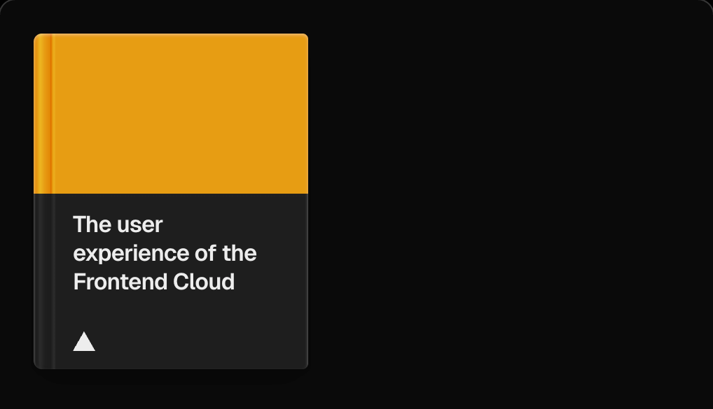
# Book A responsive book components
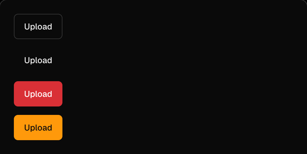
# Button Trigger an action or event, such as submitting a form or displaying a dialog ## Features - Sizes: Default size is medium, with options for customization. - Types: Includes various button types for different use cases. - Shapes: Supports icon-only buttons with svgOnly prop and aria-label for accessibility. - Prefix and Suffix: Allows adding icons or text before and after the button label. - Rounded Style: Combines shape="rounded" and shadow prop, ideal for marketing pages. - Loading State: Displays a loading indicator during asynchronous actions. - Disabled State: Prevents user interaction when necessary. - Link Buttons: Use ButtonLink for links with the same props as Button.


# Context Menu Displays a brief heading and subheading to communicate any additional information or context a user needs to continue. ## Features - Default View: Provides a context menu triggered by right-clicking. - Disabled Items: Supports disabling specific menu items. - Link Items: Allows menu items to function as links. - Prefix and Suffix: Includes options for adding prefixes and suffixes to menu items.
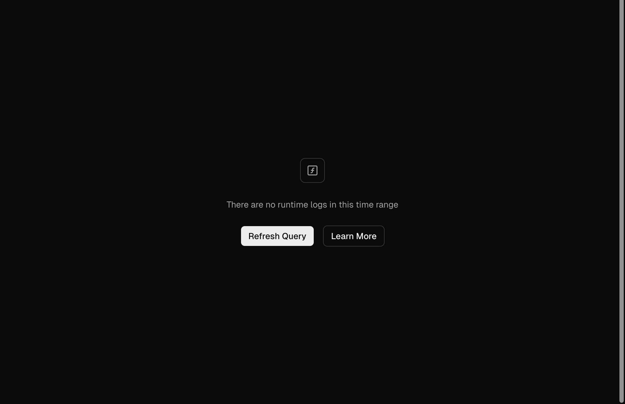
# Empty State Fill spaces when no content has been added yet, or is temporarily empty due to the nature of the feature and should be designed to prevent confusion. ## Features - Blank Slate: Basic empty state for first-run experience. - Informational: Includes in-line CTAs and supplemental documentation links to help users progress. - Educational: Launches a contextual onboarding flow to provide a deeper understanding of the app. - Guide: Provides starter content that allows users to interact with data and learn the system by tinkering or setting up their environment.






# Error Good error design is clear, useful, and friendly. Designing concise and accurate error messages unblocks users and builds trust by meeting people where they are. ## Features - Default View: Displays a standard error message. - Custom Label: Allows adding a custom label to the error message. - No Label: Provides an option to display error messages without a label. - Sizes: Supports different sizes for error messages. - Error Property: Includes an error property for additional context or actions.

# Gauge A circular visual for conveying a percentage. ## Features - Default View: Displays a circular gauge to represent a percentage. - Label: Includes labels to indicate specific values. - Default Color Scale: Uses a default color scale for visual representation. - Custom Color Range: Allows customization of the color range. - Custom Secondary Color: Supports setting a secondary color for the gauge. - Arc Priority: Provides an equal arc priority option for displaying ratios with equally sized arcs. - Indeterminate State: Displays an indeterminate state for ongoing processes.

# Keyboard Input Display keyboard input that triggers an action. ## Modifiers - ⌘ - ⇧ - ⌥ - ⌃


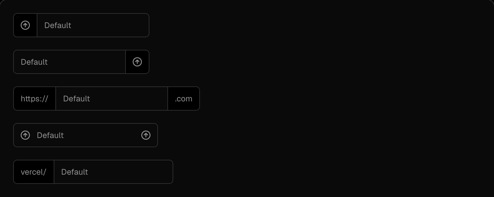
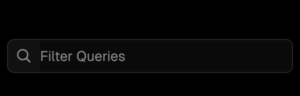
# Input Retrieve text input from a user. ## Features - Default View: Provides a basic text input field. - Prefix and Suffix: Supports adding prefixes and suffixes to the input field. - Disabled State: Allows disabling the input field for non-interactive use. - Search: Automatically clears the input when the escape key is pressed. - Command Shortcut: Displays the ⌘K shortcut for command palette support, transitioning to Esc when the field is dirty. - Error State: Shows error messages for invalid input. - Label: Includes a label for better accessibility and context.






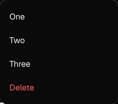
# Menu A dropdown menu component that is opened via a button. It supports typeahead and keyboard navigation for enhanced accessibility. ## Features - Default Behavior: Extends the Button component to provide dropdown functionality. - Actions: Includes actionable items within the menu. - Disabled Items: Supports disabling specific menu items. - Link Items: Allows menu items to act as links. - Custom Trigger: The trigger can be customized while still being wrapped by an unstyled button. - Prefix and Suffix: Supports adding prefix and suffix elements to menu items. - Adaptive Positioning: Automatically adjusts the menu position based on window bounds.
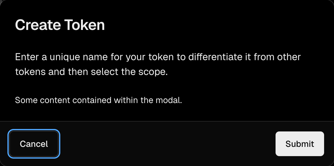
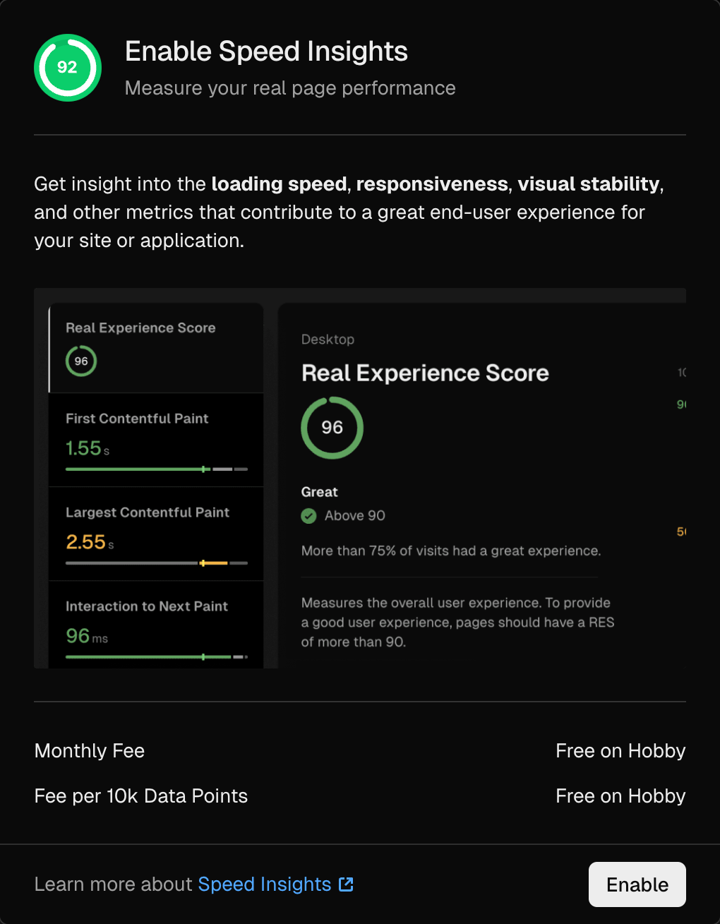
# Modal A popup component used to display content that requires user attention or provides additional information. ## Features - Default Modal: A standard modal popup for general use cases. - Sticky Modal: A modal that remains fixed in position. - Single Button Modal: A modal triggered by a single button. - Disabled Actions: Supports disabling specific actions within the modal. - Inset Modal: A modal with inset styling for a distinct appearance. - Initial Focus Control: Allows control over the initial focus when the modal is opened.
# Note A component used to display text that requires attention or provides additional information. ## Features - Default Note: Available in small, default, and large sizes. - Actionable Notes: Includes actions like "Upgrade" for interactive use cases. - Success Notes: Highlights success information with optional filled styling. - Error Notes: Displays error messages with filled or unfilled styles. - Warning Notes: Provides warning messages with filled or unfilled styles. - Secondary Notes: Used for secondary information. - Custom Labels: Supports custom labels for different note types like secondary, tertiary, warning, success, default, alert, error, lite, ghost, violet, cyan, and more. - Disabled Notes: Allows disabling specific notes.




# Progress A component used to display progress relative to a limit or task completion. ## Features - Default Progress: A standard progress bar to indicate completion. - Custom Max: Allows customization of the maximum value for progress tracking. - Dynamic Colors: Supports dynamic color changes based on progress values (e.g., increase or decrease). - Themed Progress: Can be styled to match specific themes

# Slider An input component used to select a value from a given range. ## Features - Default Slider: Provides a simple and intuitive way to select a value within a specified range.

# Project Banner A component used for temporary, project-wide notifications that require resolution. ## Features - Success Banner: Indicates positive, temporary mitigations put in place to protect a project (e.g., Attack Challenge Mode). - Warning Banner: Highlights exceptional states requiring non-immediate action to exit (e.g., during a rollback). - Error Banner: Alerts users to critical issues requiring immediate attention (e.g., payment failure).

# Radio A component that provides single user input from a selection of options. ## Features - Default Radio: Standard radio button group for selecting one option. - Disabled Radio: Supports disabling specific radio options. - Required Radio: Ensures a selection is required before submission. - Headless Radio: Allows using the RadioGroup component without RadioGroup.Item for custom implementations. - Standalone Radio: Unlabelled radio input for use in custom UI designs.

# Relative Time Card A popover component used to display a given date in local time. ## Features - Default Behavior: Provides a hoverable popover to show date and time information. - Localized Time: Automatically adjusts to the user's local timezone.
# Scroller A component used to display an overflowing list of items with various scrolling options. ## Features - Vertical Scrolling: Displays items in a vertically scrollable list. - Horizontal Scrolling: Displays items in a horizontally scrollable list. - Free Scrolling: Allows free scrolling in both directions. - Vertical with Buttons: Includes buttons to automatically scroll to a specific child element. - Horizontal with Buttons: Includes buttons to automatically scroll to a specific child element.

# Select A component used to display a dropdown list of items for user selection. ## Features - Sizes: Available in XSmall, Small, Default, and Large sizes to fit various design needs. - Prefix and Suffix: Supports adding prefix and suffix elements for enhanced context. - Disabled State: Allows disabling the dropdown with an optional placeholder. - Error State: Displays error messages for invalid or required selections. - Label Support: Includes labels for better accessibility and context.


# Skeleton A component used to display a skeleton placeholder while another component is loading. ## Features - Default Skeleton: Provides a skeleton with set width or box height. - Wrapping Children: Automatically calculates size if no fixed size is passed. - Fixed Size Skeleton: Retains size even when children are not null. - Pill Style: Offers a pill-shaped skeleton for specific use cases. - Rounded and Squared Styles: Supports rounded and squared skeleton shapes. - No Animation: Allows disabling animation for static placeholders.

# Snippet A component used to display a snippet of copyable code for the command line. ## Features - Default Snippet: Displays a single line of copyable code. - Inverted Style: Provides an inverted color scheme for better contrast. - Multi-line Snippet: Supports displaying multiple lines of code. - No Prompt: Removes the command prompt for a cleaner look. - Callback Functionality: Allows executing a callback when the snippet is copied. - Variants: Offers different styles and configurations for code snippets.

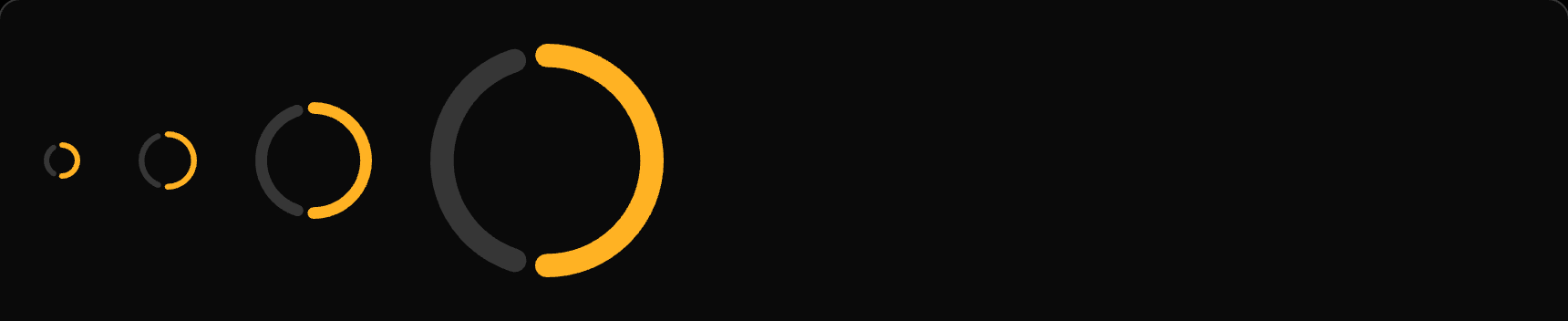
# Spinner A component used to indicate an action running in the background. Unlike loading dots, the spinner is typically used to provide loading feedback in response to user actions, such as button clicks or pagination. ## Features - Default Size: Provides a standard spinner size for general use. - Custom Size: Allows customization of the spinner size to fit specific design needs.

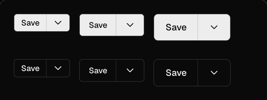
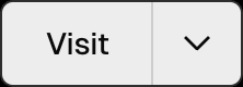
# Split Button A button that offers a primary interaction coupled with a dropdown menu offering additional actions. ## Features - Default Behavior: The button's primary action should be the first item in the dropdown menu. - Menu Alignment: Provides flexibility in aligning the dropdown menu.
# Stack The Stack component is used to display elements either vertically or horizontally on the page, providing a clean and organized layout. ## Features - Gap: Defines spacing between elements using a unit based on a 4px grid scale. - Padding: Adds internal spacing within the stack, also based on the 4px grid scale. - Responsive Design: Automatically adjusts the layout based on the window size.
# Status Dot The Status Dot component is used to display an indicator of deployment status, providing a visual cue for various states. ## Features - Default Behavior: Displays a simple dot to indicate status. - Labels: Supports various status labels such as Queued, Building, Error, Ready, and Canceled.


# Switch The Switch component allows users to choose between a set of options, providing a flexible and interactive UI element. ## Features - Default Behavior: Ensures the width of each item is wide enough to prevent jumping when active. - Disabled State: Supports a disabled mode for non-interactive switches. - Sizes: Offers multiple size options to fit various design needs. - Full Width: Can be configured to span the full width of its container. - Tooltip: Provides additional context or information when hovering over the switch. - Icon Support: Allows the inclusion of icons for enhanced visual representation.



# Pagination A component used to navigate between pages, typically in a multi-page interface. ## Features - Default Pagination: Provides navigation to the previous or next page. - Customizable: Can be styled and configured to fit various use cases.

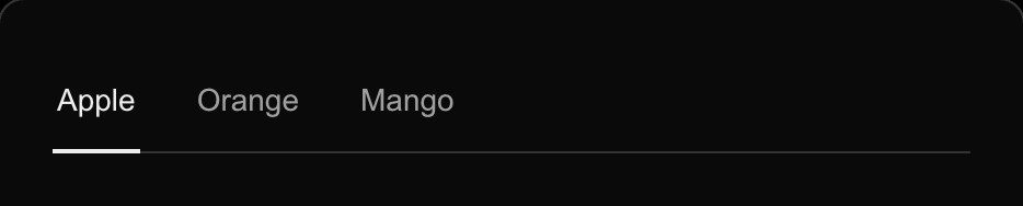
# Tabs The Tabs component is used to display tabbed content, allowing users to navigate between different sections or views within the same context. ## Features - Default Tabs: Simple tab navigation for switching between content. - Disabled Tabs: Supports disabling the entire tab navigation or specific tabs. - Tabs with Icons: Allows the inclusion of icons for better visual representation. - Secondary Tabs: Provides an alternative style for tab navigation.

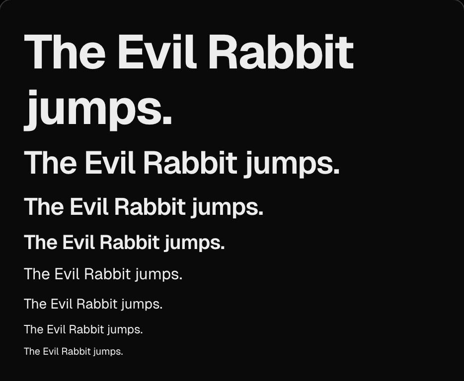
# Text The Text component is designed to display text using well-defined typographic styles, offering flexibility and customization for various use cases. ## Features - Sizes: Provides multiple size options for text elements. - Responsive: Adjusts typography dynamically based on screen size. - Variants: Includes predefined styles for headings, buttons, labels, and copy. - Color: Supports customizable text colors. - Modifiers: Allows bold, italic, and other text styles. - Polymorphic: Enables semantic HTML tags with visual styling. - Truncate: Handles long text by truncating it. - Clamp: Limits text to a specific number of lines. - Align: Offers text alignment options. - Monospace: Supports monospace font for code or technical content.
# Textarea The Textarea component is designed to retrieve multi-line user input, offering flexibility and customization for various use cases. ## Features - Default: A basic textarea for multi-line input. - Disabled: Supports a disabled state for non-editable textareas. - Error State: Displays error messages and visual cues for invalid input.
# Theme Switcher The Theme Switcher component allows users to toggle between light and dark themes, providing a customizable and user-friendly interface. ## Features - Default Behavior: Enables users to select a display theme (system, light, or dark). - User Preference: Remembers the user's theme choice for a personalized experience.

# Toast The Toast component is used to display succinct messages temporarily, providing feedback or updates to users in a non-intrusive manner. ## Features - Default Toast: Displays a simple message. - Multi-line Toast: Supports messages spanning multiple lines. - Toast with JSX: Allows embedding JSX elements within the toast. - Toast with Link: Includes actionable links within the toast. - Preserve Toast: Keeps the toast visible until explicitly dismissed. - Action Toast: Provides actionable buttons within the toast. - Undo Toast: Offers undo functionality for user actions. - Success, Warning, and Error Toasts: Displays messages with contextual styling for success, warnings, or errors.
# Toggle The Toggle component is used to display and control a boolean value, providing a simple and intuitive interface for on/off states. ## Features - Default Toggle: A basic toggle switch for boolean values. - Disabled State: Supports a non-interactive, disabled mode. - Sizes: Offers multiple size options to fit various design needs. - Custom Colors: Allows customization of toggle colors. - With Label: Includes labels for better context and usability.

# Tooltip The Tooltip component provides contextual information or guidance when users hover over or focus on an element. It enhances user experience by offering additional details without cluttering the interface. ## Features - Default Tooltip: Displays a tooltip in various positions (top, bottom, left, right). - No Delay: Shows the tooltip immediately without any delay. - Box Align: Aligns the tooltip content in different configurations (e.g., bottom/left, bottom/center). - Custom Content: Supports custom content within the tooltip. - Custom Type: Allows customization of tooltip styles. - Other Options: Includes features like no tip indicator and no center text.
# Avatar Avatars represent a user or a team. Stacked avatars represent a group of people. ## Features - Group Representation: Avatars can represent individual users or groups. - Stacked Avatars: Useful for showcasing multiple users in a compact format. ## Examples - Group: Displays a group of avatars with a count indicator. - Git: Represents avatars in a Git context. - Placeholder: Provides a default avatar when no image is available.



# Combobox Filters large lists to selectable options based on the matching query. ## Features - Uncontrolled Mode: Provides a basic combobox with default behavior. - Controlled Mode: Allows external control of the combobox state. - Disabled State: Supports disabling the combobox for non-interactive use. - Errored State: Displays an error state for invalid inputs. - Custom Width: Allows customization of input and list widths. - Custom Empty Message: Displays a custom message when no options are available. - Sizes: Offers multiple size options for different use cases. - Modal Integration: Works seamlessly inside a Modal, adapting to mobile as a Dialog.
# Command Menu Launch a set of actions as a full-screen overlay. ## Features - Default View: Provides a full-screen overlay for launching actions.

# Grid Display elements in a grid layout. ## Features - Non-Responsive Grid: Provides a basic grid layout with no responsive behavior. - Basic Grid: Includes a single grid with auto-flowing cells configuration. - Solid Cells: Uses the solid prop to occlude guides overlapped by cells. - Responsive Grid: Supports responsive rows and columns props at all breakpoints. - Responsive Guide Clipping: Enables guide clipping on specific cells in a responsive grid. - Hidden Row Guides: Allows hiding row guides for cleaner layouts. - Hidden Column Guides: Supports hiding column guides for better visual clarity. - Overlaying Cells: Provides grid layouts with cells overlaying others in various states. - Specific Guide Clipping: Enables guide clipping on specific cells for precise layouts.
# Loading Dots Indicate an action running in the background. ## Variants ### Default A simple loading dots animation to indicate background activity. ### With Text A loading dots animation accompanied by text, such as "Loading".

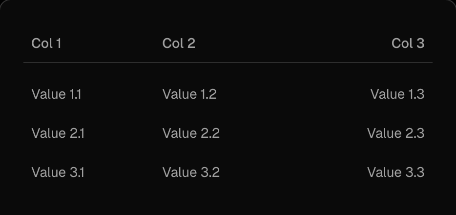
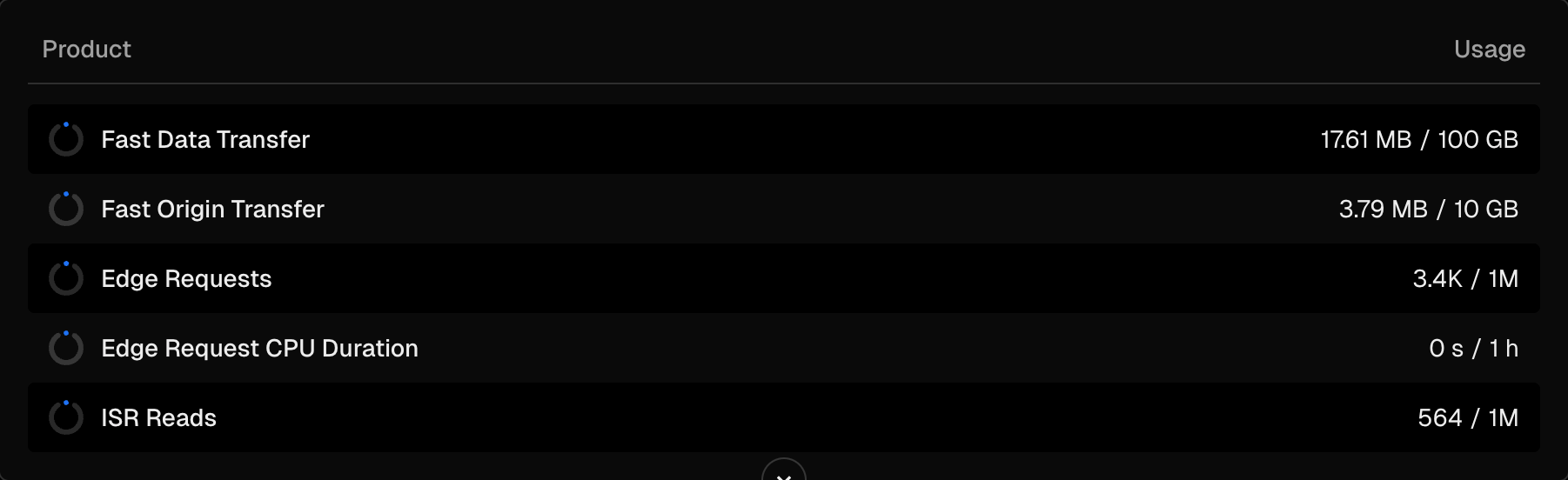
# Table The Table component is a semantic HTML table designed for displaying structured data in a clean and organized format. ## Features - Basic Table: A simple table layout for straightforward data representation. - Striped Table: Alternating row colors for better readability. - Interactive Table: Allows user interaction for enhanced functionality. - Full-Featured Table: Supports advanced features like product details, usage, pricing, and subtotal calculations. - Virtualized Table: Optimized for large datasets with efficient rendering.