Infa.ai
Polaris Design SystemComponents
Small overlays that open on demand and close when the merchant interacts with any other part of Shopify. Used to surface secondary information or actions.
Use pagination to let merchants move through an ordered collection of items that has been split into pages. On the web, pagination uses buttons to move back and forth between pages. On iOS and Android, pagination uses infinite scrolling.
Used to alternate among related views within the same context.
Used in components with too much content for the available vertical space. Embeds long-form content in components like modals and popovers.
Hides content and allows merchants to expand it. Used to hide optional settings, information, and actions.
Used to alternate among related views within the same context.
Used to indicate to merchants that a page is loading or an upload is processing.
Legacy version of the Stack component. Used for layout of a horizontal row of components or vertical centering.
Creates the structure of the Shopify admin. All of the main sections of the admin are nested in the frame.
Used to interrupt merchants with urgent information, details, or actions.
Not available within DS yet

Used primarily for actions like 'Add', 'Close', 'Cancel', or 'Save'. Plain buttons are used for less important actions.


Use to separate or group content.
Applies negative margin to a layout, extending it to the edge of the screen on small screens.
Used to group similar concepts and tasks together for easier scanning and reading.

Used for connecting or disconnecting a store to various accounts, like Facebook for the sales channel.
Allows merchants to take key actions at the bottom of specific pages in the interface.
Callout cards are used to encourage merchants to take an action related to a new feature or opportunity. They are most commonly displayed in the sales channels section of Shopify.

Use to display children vertically and horizontally with full width by default. Based on CSS Flexbox.
Box is the most primitive layout component. It’s a way to access Polaris design tokens.
Displays multiple related actions stacked or in a horizontal row for arrangement and spacing.


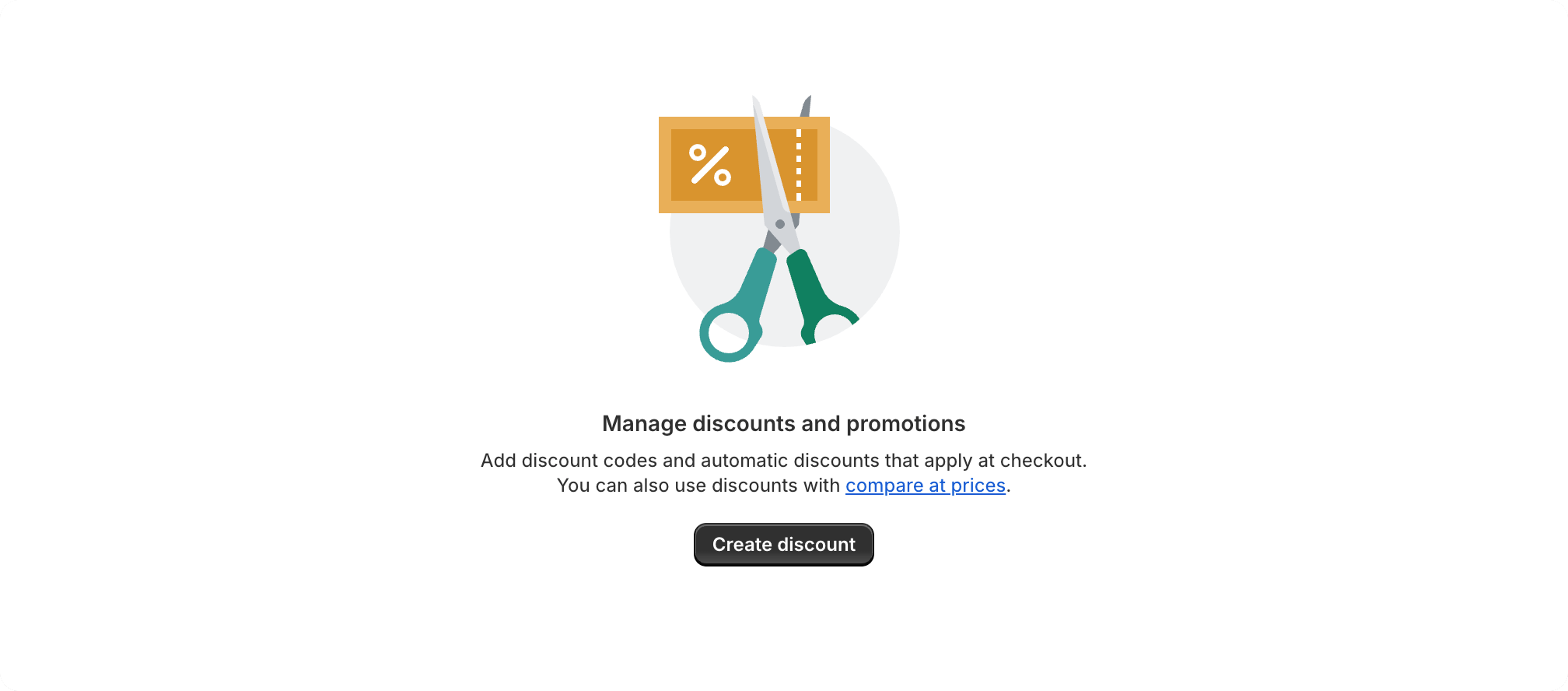
Empty states are used when a list, table, or chart has no items or data to show. This is an opportunity to provide explanation or guidance to help merchants progress. The empty state component is intended for use when a full page in the admin is empty, and not for individual elements or areas in the interface.
Use to lay out children horizontally with equal gap between columns. Based on CSS Grid.
Used to build the layout of a page in the Shopify admin. A flexible container for composing pages consistently.
A structural component used to group other components. Creates consistent spacing and helps layout stack and scale responsively.
The autocomplete component is an input field that provides selectable suggestions as a merchant types into it. It allows merchants to quickly search through and select from large collections of options. It's a convenience wrapper around the Combobox and Listbox components with minor UI differences.
Manages the layout of all forms and fields within it. Used for the layout of new forms and managing the layout of all forms.
Create complex layouts based on CSS Grid.
Provides a container for introductory or highlight information. Often used in a grid to present related content.
Use to display children horizontally in a row. Based on CSS Flexbox.
Checkboxes are most commonly used to give merchants a way to make a range of selections (zero, one, or multiple). They may also be used as a way to have merchants indicate they agree to specific terms and services.

Allows merchants to choose a color visually, or by entering a hex value.
Combobox is an accessible autocomplete input that enables merchants to filter a list of options and select one or more values.
Use index filters to allow merchants to filter, search, and sort their index table data and create unique saved views from the results.

A choice list lets you create a list of grouped radio buttons or checkboxes. Use this component if you need to group together a related list of interactive choices.
Inline errors are brief, in-context messages that tell merchants something went wrong with a single or group of inputs in a form. Use inline errors to help merchants understand why a form input may not be valid and how to fix it.
Date pickers let merchants choose dates from a visual calendar that’s consistently applied wherever dates need to be selected across Shopify.
The drop zone component lets users upload files by dragging and dropping the files into an area on a page, or activating a button.
A composite component that filters the items of a list or table.

Use radio buttons to present each item in a list of options where merchants must make a single selection.
A text field is an input field that merchants can type into. It has a range of options and supports several text formats including numbers.
A range slider is an input field that merchants can use to select a numeric value within a given range (minimum and maximum values).
A wrapper component that handles the submission of forms.
Select lets merchants choose one option from an options menu. Consider select when you have 4 or more options, to avoid cluttering the interface.
Used to educate merchants about keyboard shortcuts.
Used to show a thumbnail representation of an individual or business in the interface.

Used to inform merchants of the tone of an object or an action taken.

Tags represent a set of interactive, merchant-supplied keywords that help label, organize, and categorize objects. Tags can be added or removed from an object by merchants.
Used as a visual anchor and identifier for an object, along with text to provide context.

A clickable placeholder image that opens a video player within a modal or full screen when clicked.
Used to visually communicate core parts of the product and available actions, acting as wayfinding tools.
Helps merchants notice important, standout information that adds extra context to a task.
Provides a low fidelity representation of content before it appears, improving perceived load times.
Informs merchants about important changes or persistent conditions in a prominent way.

Used to visually represent the completion of a task or operation.
Provides a low fidelity representation of content before it appears, improving perceived load times.
Provides a low fidelity representation of content before it appears, improving perceived load times.
Used to notify merchants that their action is being processed. Used for content that can’t be represented with skeleton loading components.
Used with other skeleton loading components to provide a low fidelity representation of the UI before content appears.
Typography helps establish hierarchy and communicate important content by creating clear visual patterns.
Provides a low fidelity representation of an image before it appears, improving perceived load times.
An index table displays a collection of objects of the same type, like orders or products. The main job of an index table is to help merchants get an at-a-glance of the objects to perform actions or navigate to a full-page representation of it.
The option list component lets you create a list of grouped items that merchants can pick from. This can include single selection or multiple selection of options. Option list usually appears in a popover, and sometimes in a modal or a sidebar. Option lists are styled differently than choice lists and should not be used within a form, but as a standalone menu.
Action lists render a list of actions or selectable options. This component is usually placed inside a popover container to create a dropdown menu or to let merchants select from a list of options.
A Listbox is a vertical list of interactive options, with room for icons, descriptions, and other elements.
Used to organize and display all information from a data set. Aimed to be as simple as possible for merchants.
Resource items represent specific objects within a collection, such as products or orders. They provide contextual information on the resource type and link to the object’s detail page.
Footer help is used to refer merchants to more information related to the product or feature they’re using.

Used to present pairs of related information, like terms and definitions, or names and values, in a list format.
Lists display a set of related text-only content. Each list item begins with a bullet or a number.
A resource list displays a collection of objects of the same type, like products or customers. The main job of a resource list is to help merchants find an object and navigate to a full-page representation of it.
The Fullscreen bar is a header component that should be presented at the top of an app when it is in fullscreen mode. This is designed to ensure a uniform placement for a button to exit that mode. The Fullscreen bar can be customized by adding children.
Links take users to another place, and usually appear within or directly following a sentence.
Tooltips are floating labels that briefly explain the function of a user interface element. They can be triggered when merchants hover, focus, tap, or click.