Infa.ai
Nord Design SystemComponents
Avatar is used for showing a thumbnail representation of a single user or entity. Default avatar illustration is displayed when no src is specified.

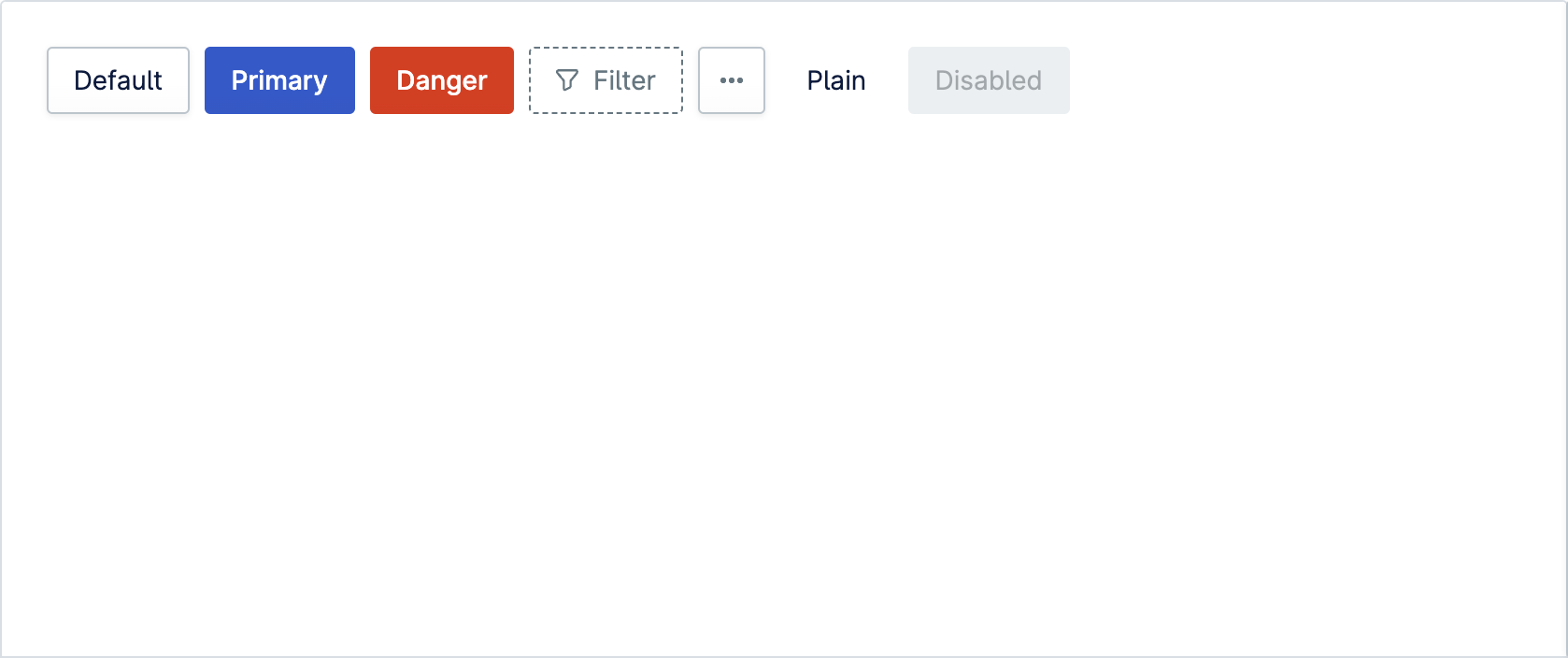
Buttons are used for interface actions. Primary style should be used only once per section for main call-to-action, while other styles can appear more frequently.
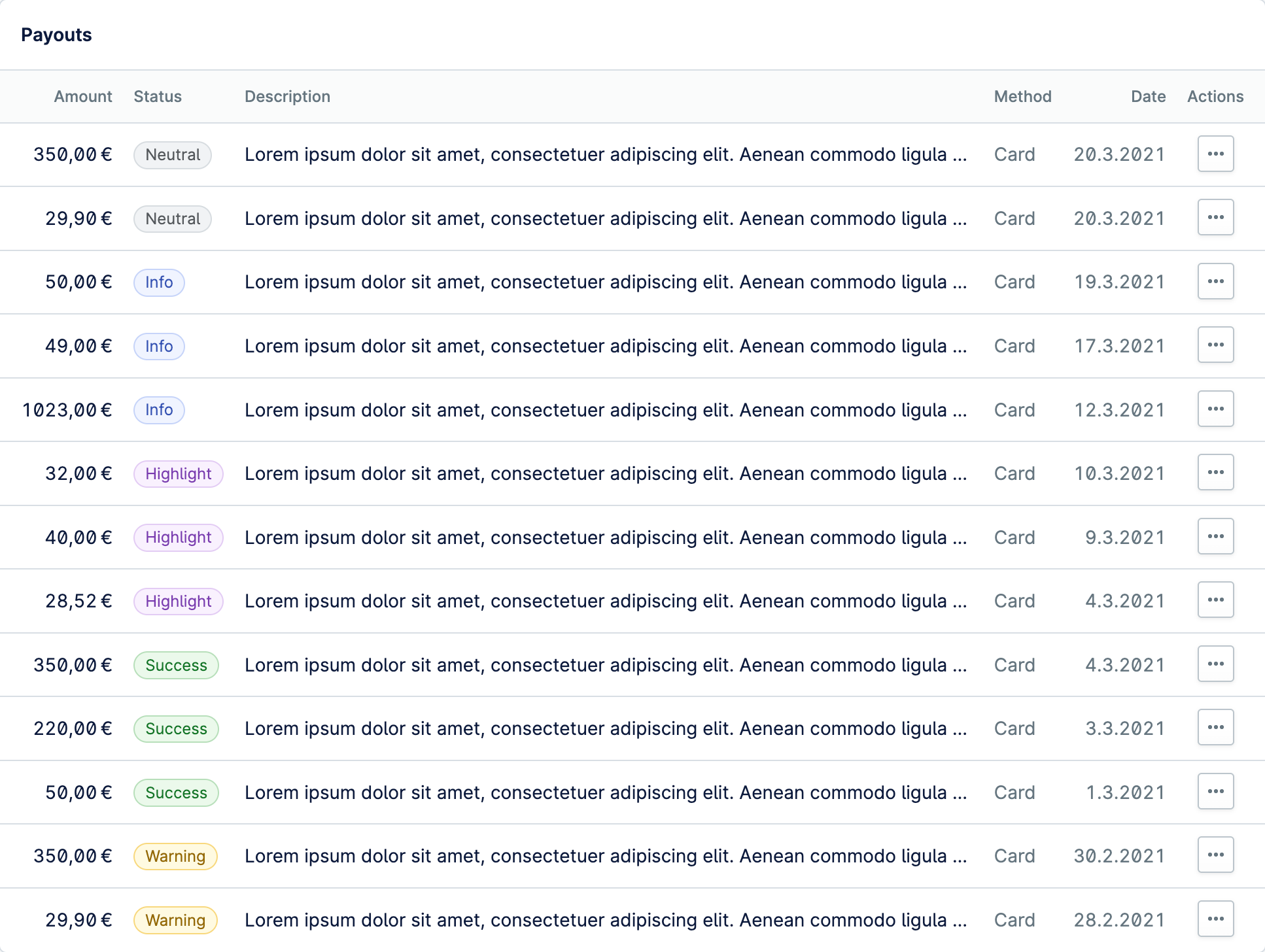
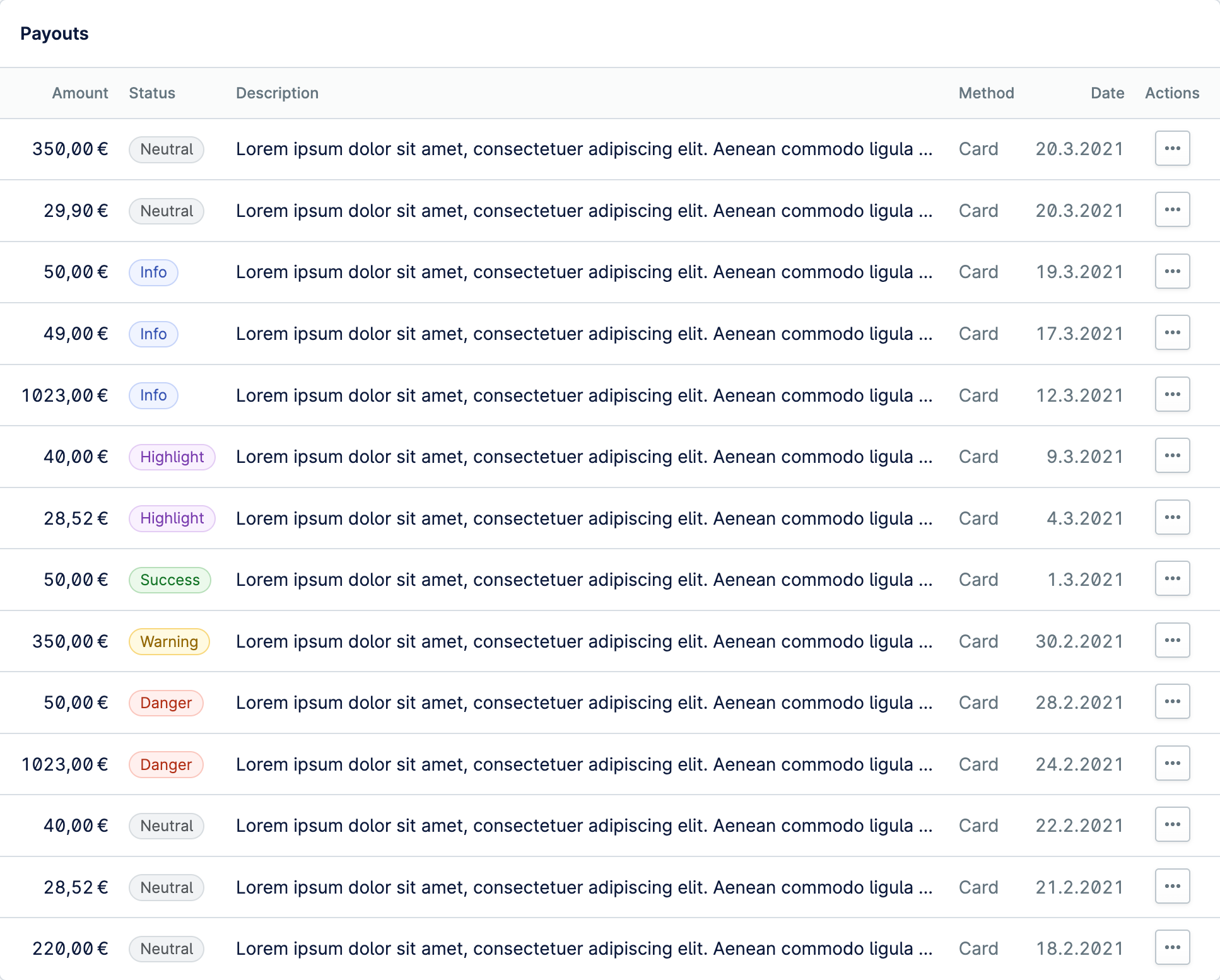
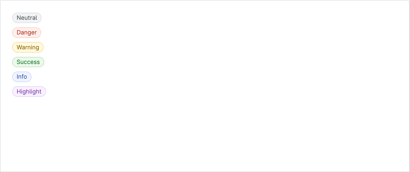
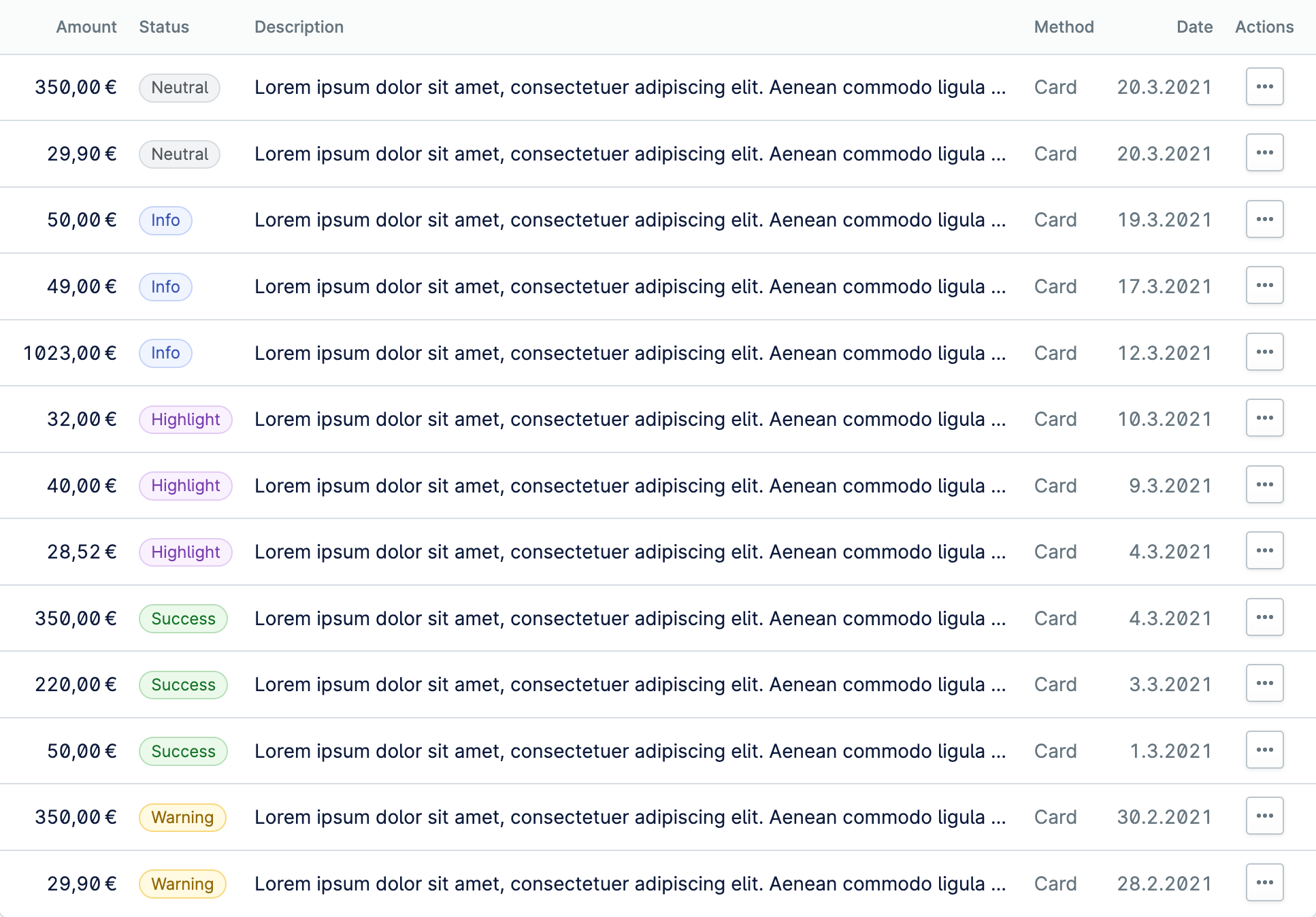
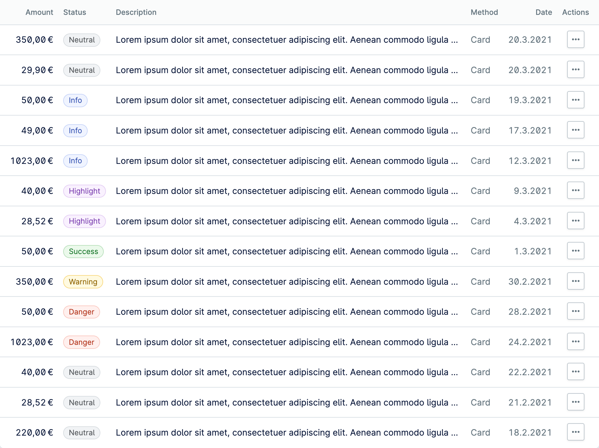
Badges are used to inform users of the status of an object or of an action that’s been taken. Commonly used in tabular data to indicate status.


Button groups are designed to bring together button controls that are of a similar nature. For example text formatting controls. Choose example Example: BasicExample: Active stateExample: DirectionExample: SingleExample: Small buttonsExample: SpacedExample: With dropdown Example: Basic Choose theme Theme: Light defaultTheme: Light high contrastTheme: Dark defaultTheme: Dark high contrast Theme: Light default Edit in CodePen Open in new window View RTL
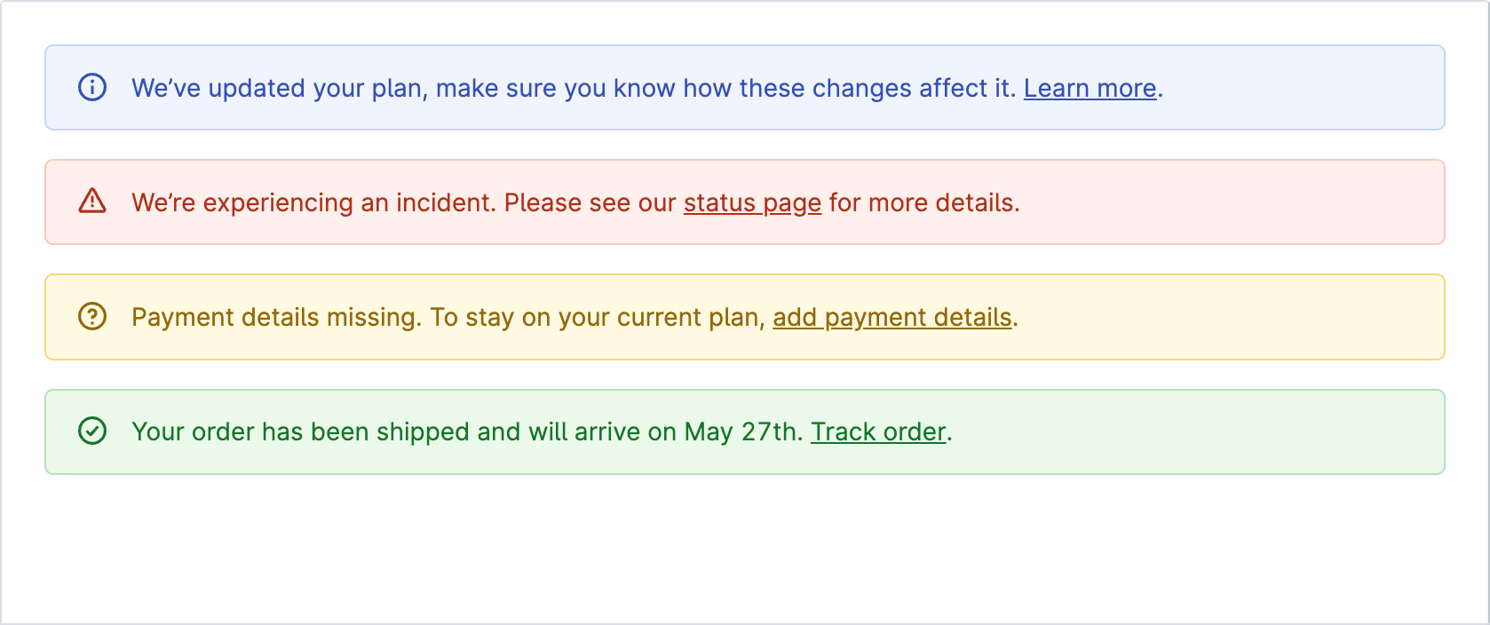
Banner informs users about important changes or conditions in the interface. Use this component if you need to communicate to users in a prominent way.
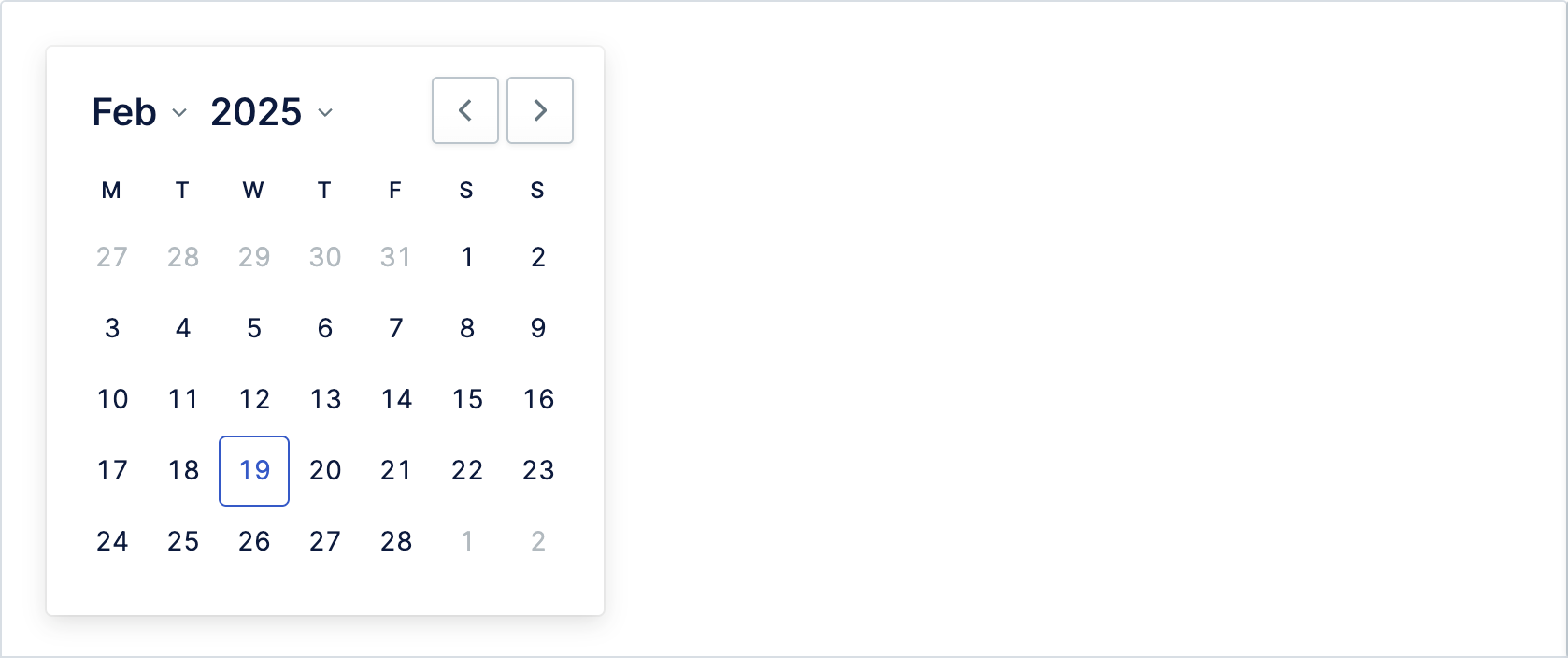
Calendar allows user to pick a date. It comes with built-in functionality that allows you to set a minimum and a maximum allowed date. Please note that the date must be passed in ISO-8601 format.
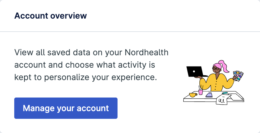
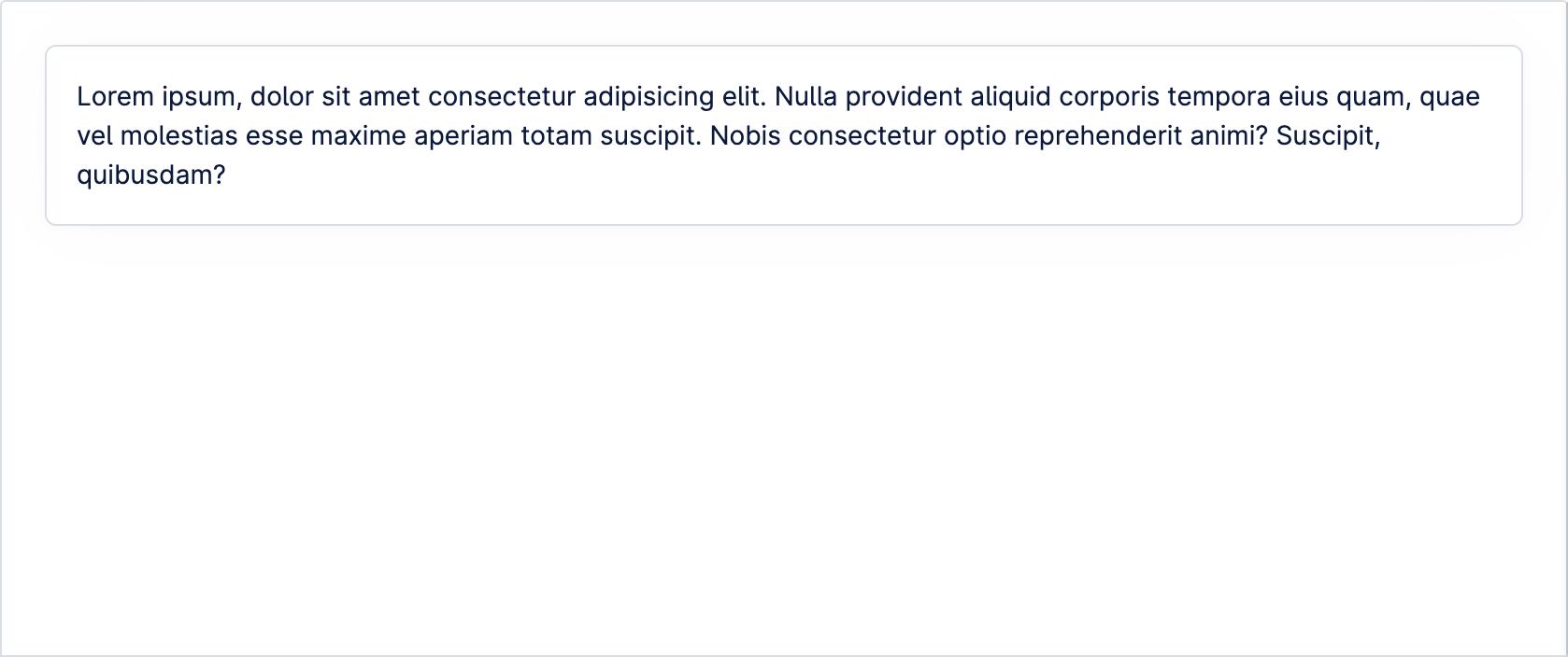
Cards are shadowed surfaces that display content and actions on a single topic. They should be easy to scan for relevant and actionable information


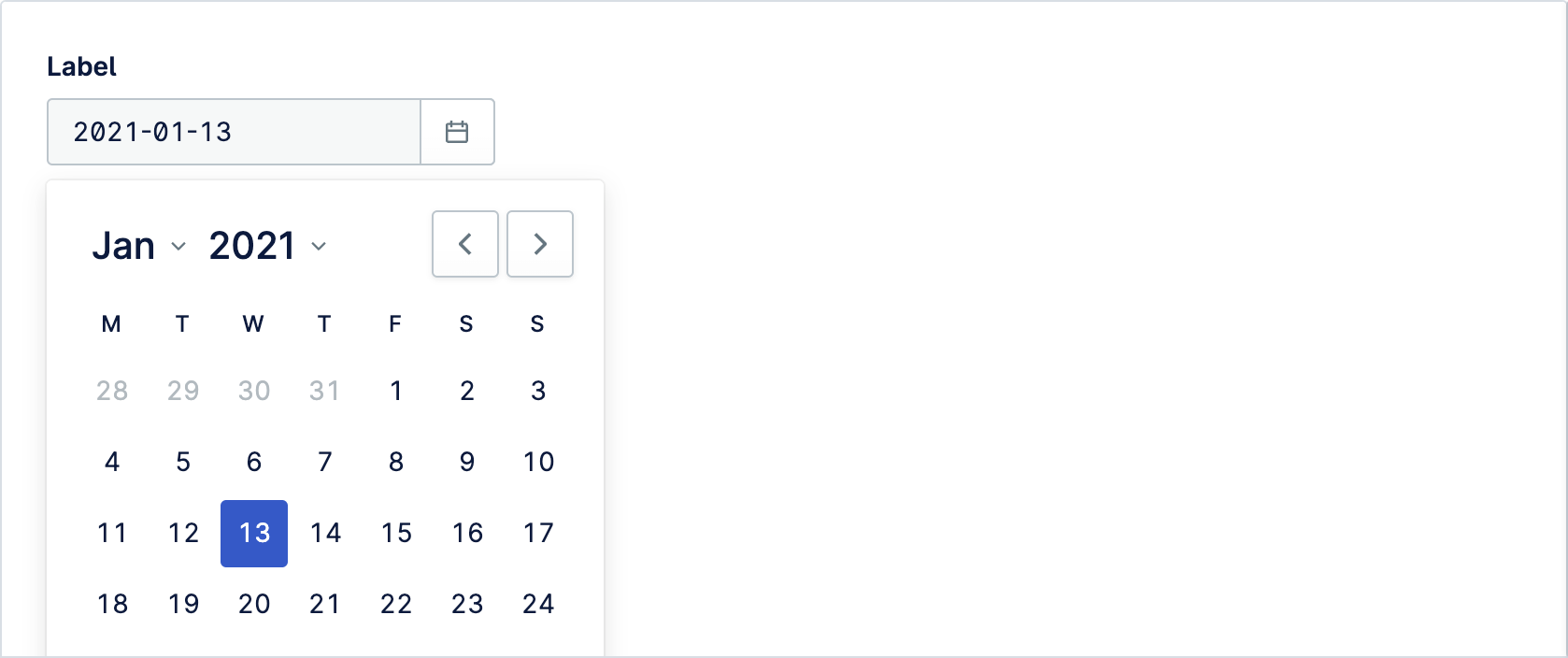
Date Picker allows user to enter a date either through text input, or by choosing a date from the calendar. Please note that the date must be passed in ISO-8601 format: YYYY-MM-DD.
Divider components are used to separate and distinguish sections of content or groups of menu items. Visually, they look like horizontal or vertical lines
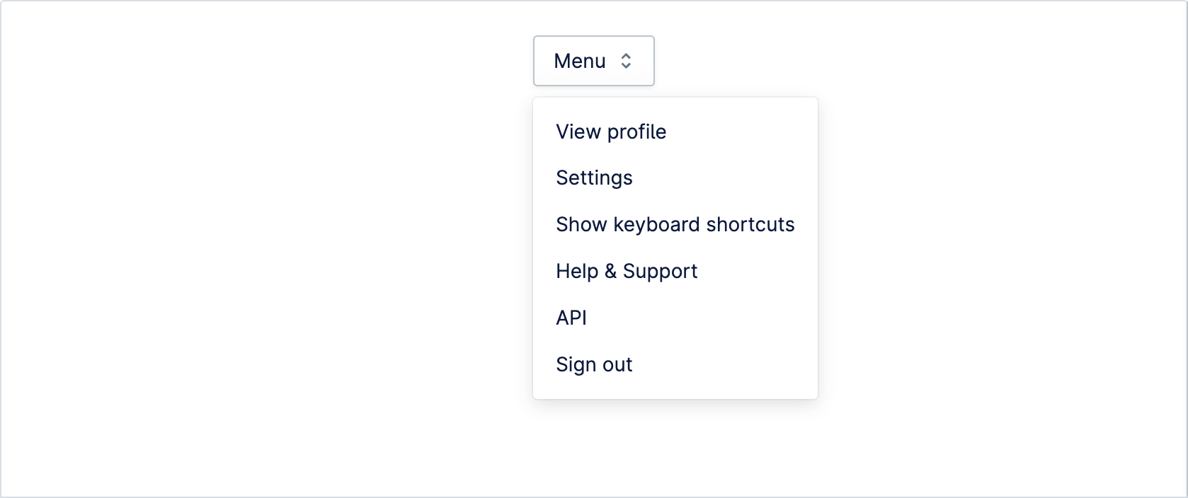
Dropdown menu displays a list of actions or selectable options for a user. Dropdown uses popout component internally to create the overlay functionality.
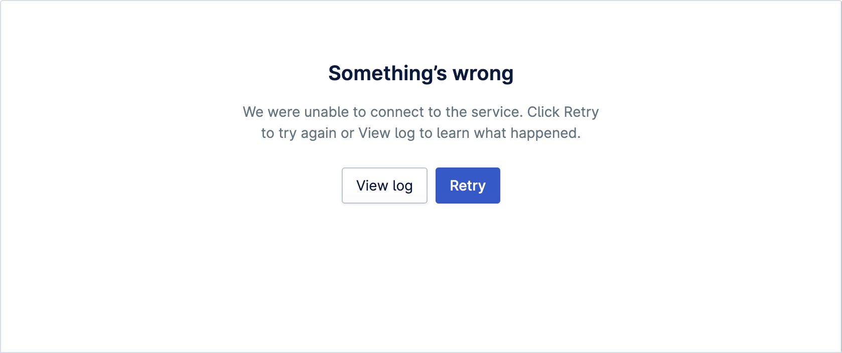
Empty state can be used when there is no data to display to describe what the user can do next. Empty state provides explanation and guidance to help user progress
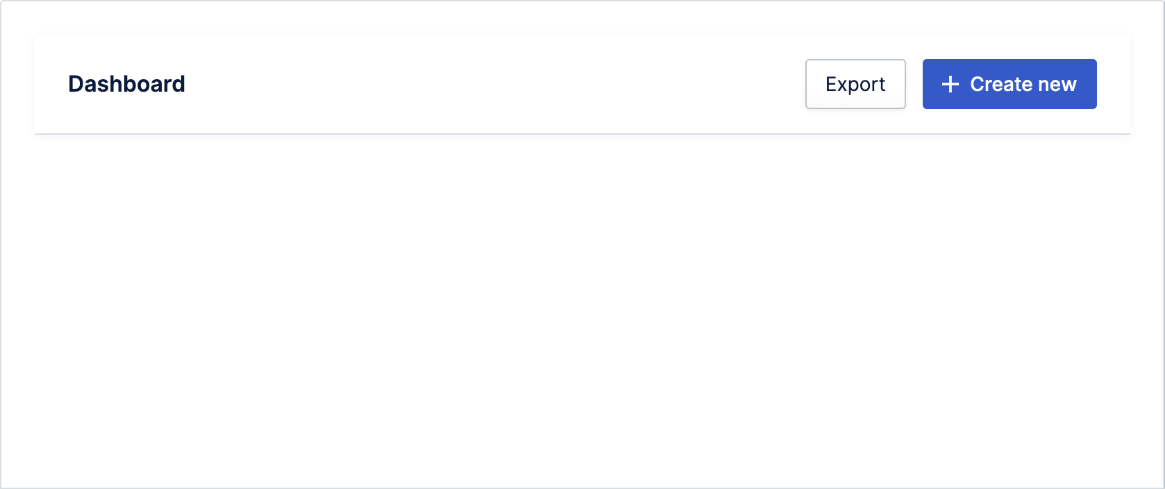
The header is a block of designated space for labelling the currently viewed context as well as providing primary actions
Layout component is used to create the main layout of an app. Layout currently comes with one main configuration: two-column
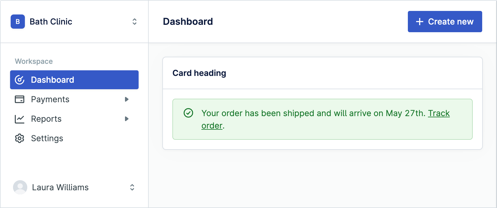
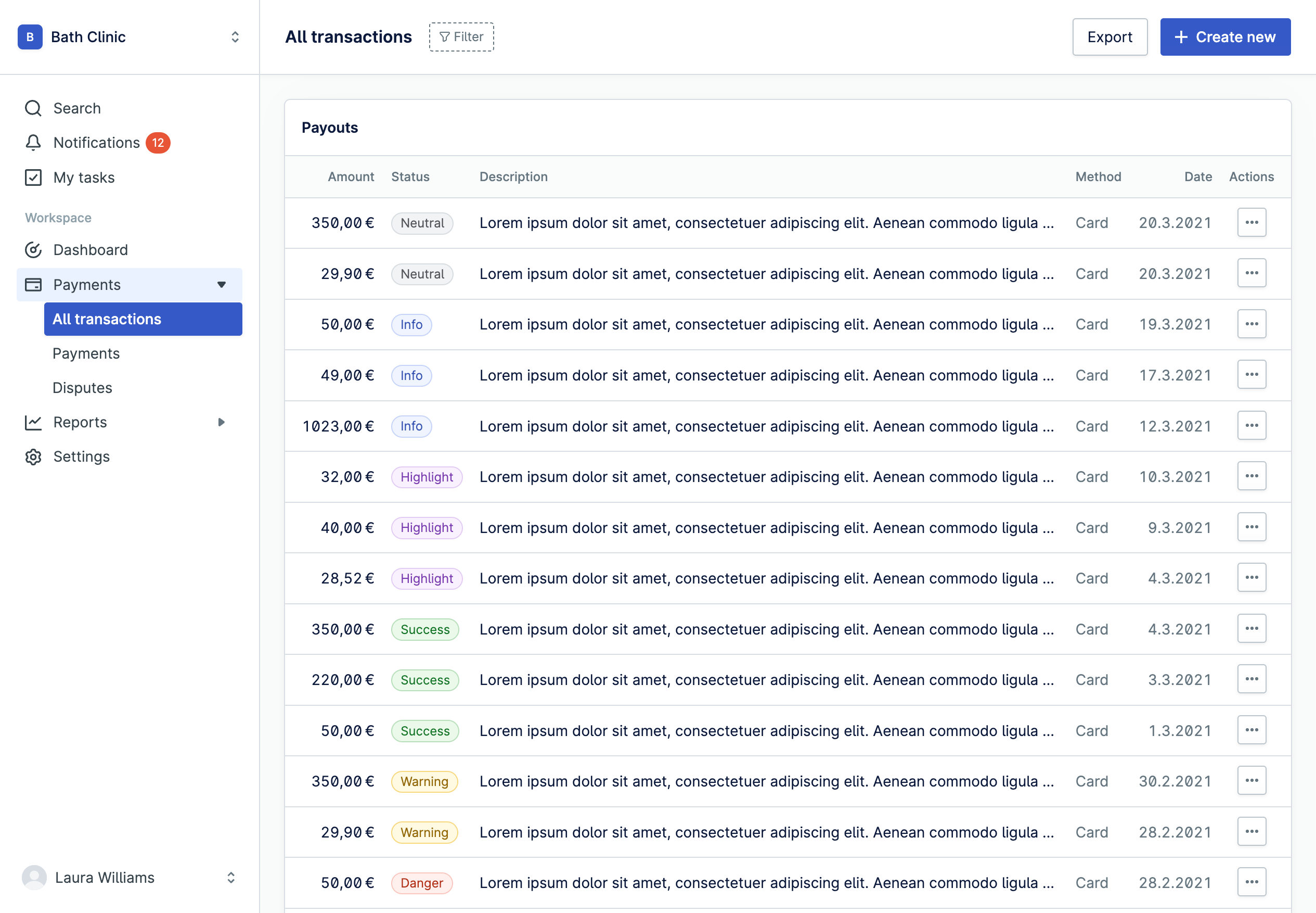
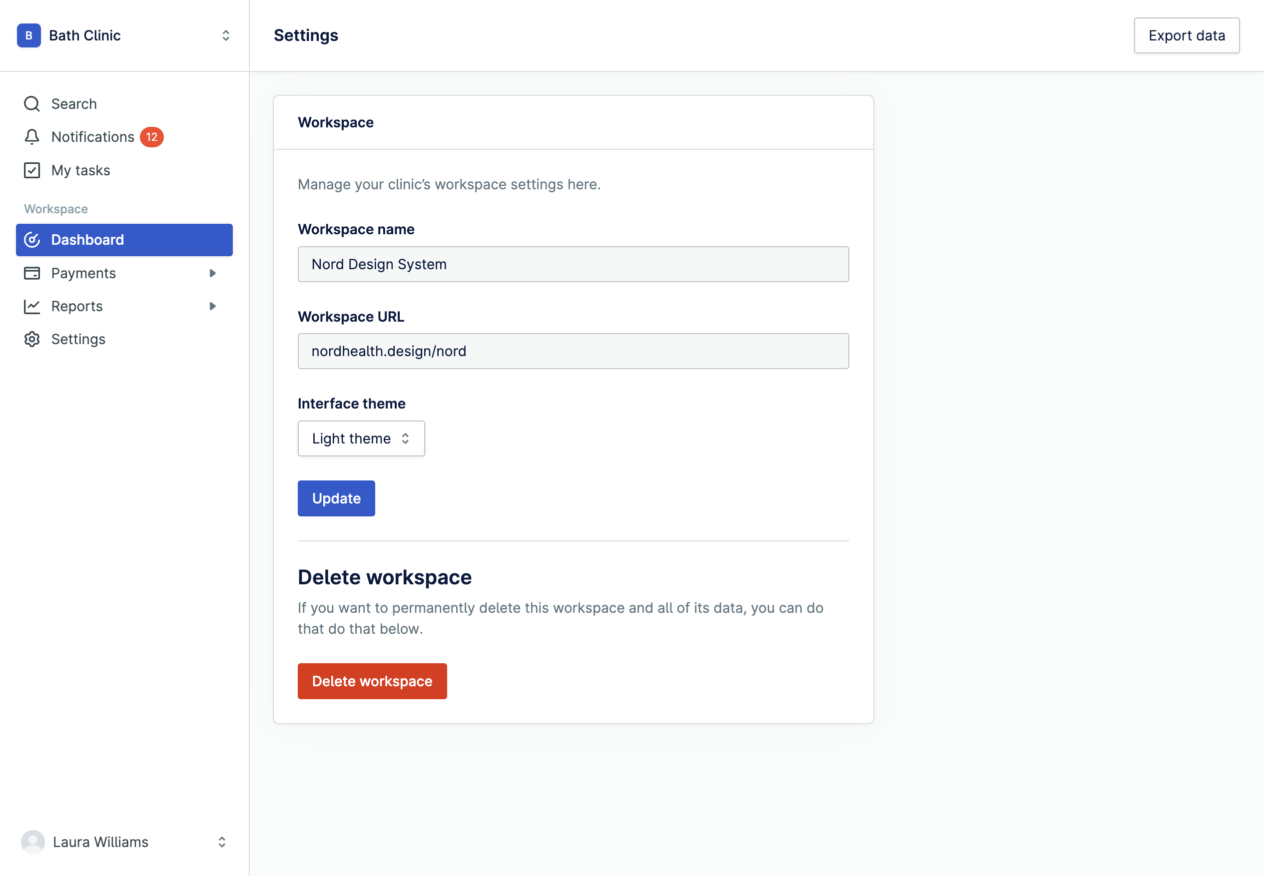
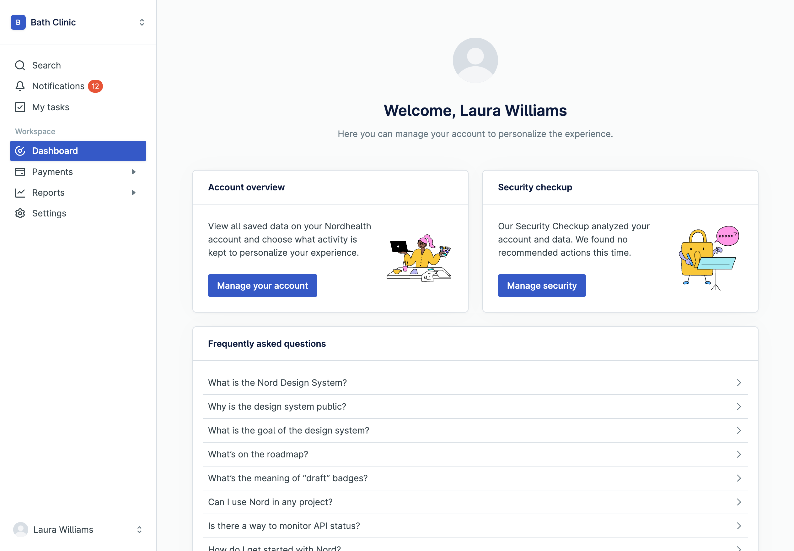
Navigation group includes all the actions or items in a single group and is used for grouping items into related categories
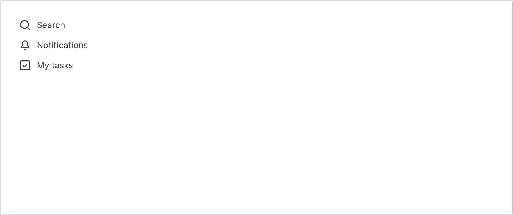
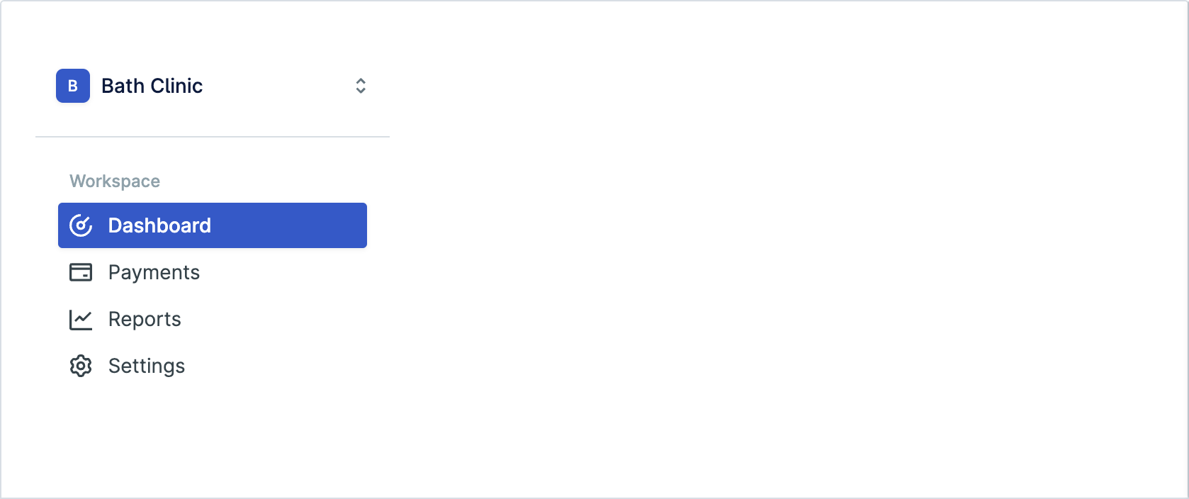
Navigation is used to display the primary navigation in the sidebar of an application. Navigation includes a list of links that users use to move between sections of the application
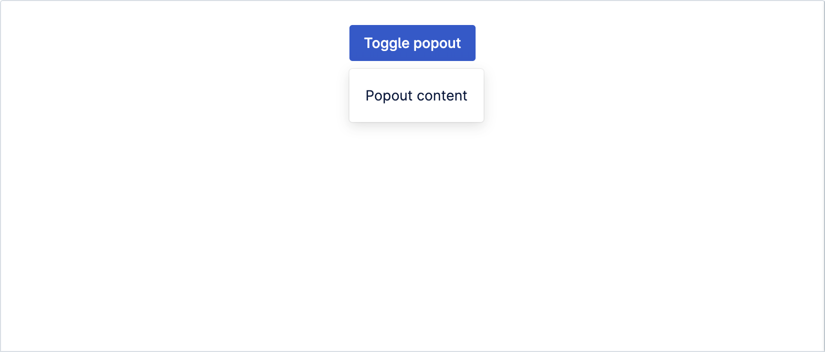
Popouts are small overlays that open on demand. They let users access additional content and actions without cluttering the page
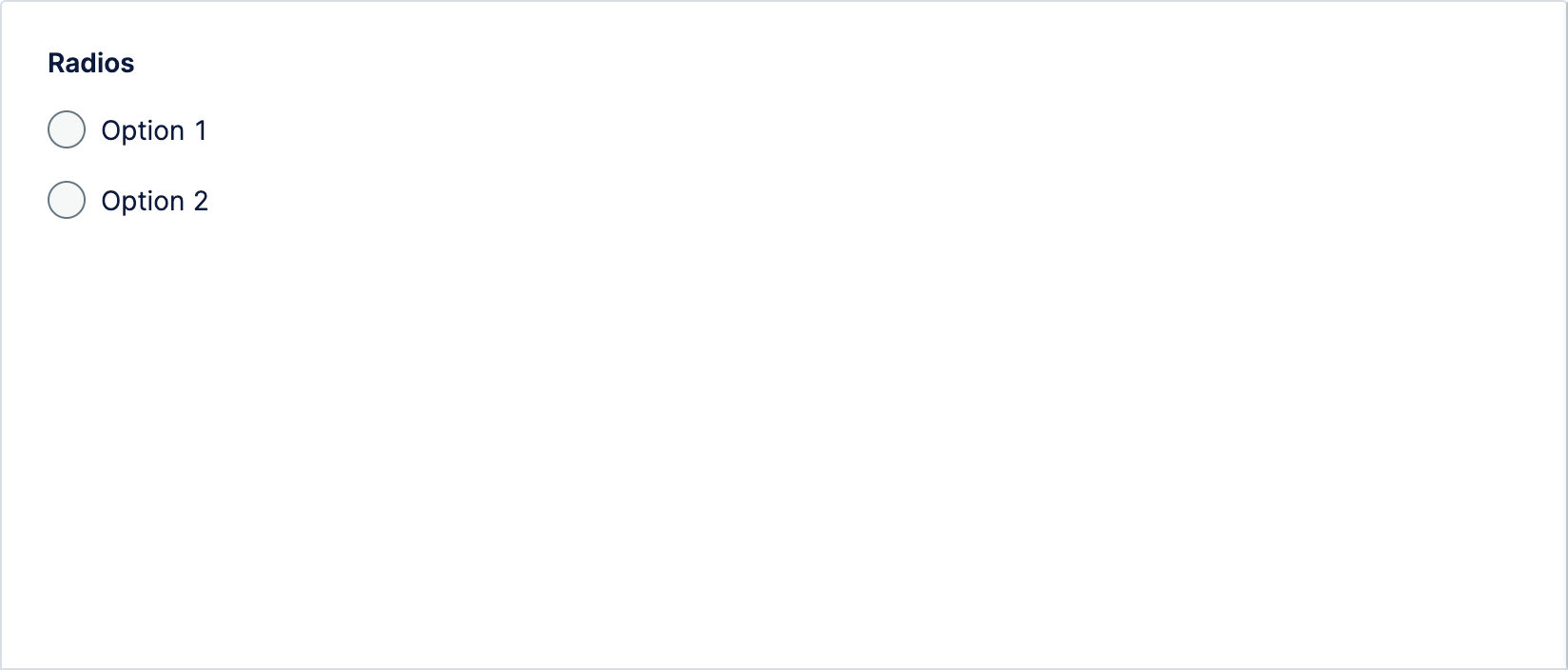
Radio buttons are graphical user interface elements that allow user to choose only one option from a predefined set of mutually exclusive options
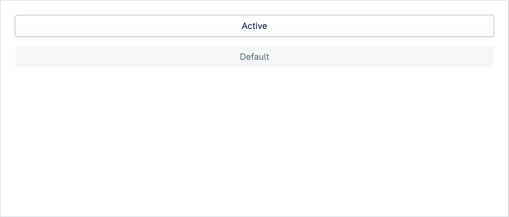
Segmented control items populate a segmented control with options. Every item should be placed inside a segmented control
Spinner component is used to indicate users that their action is being processed. You can customize the size and color of the spinner with the provided properties

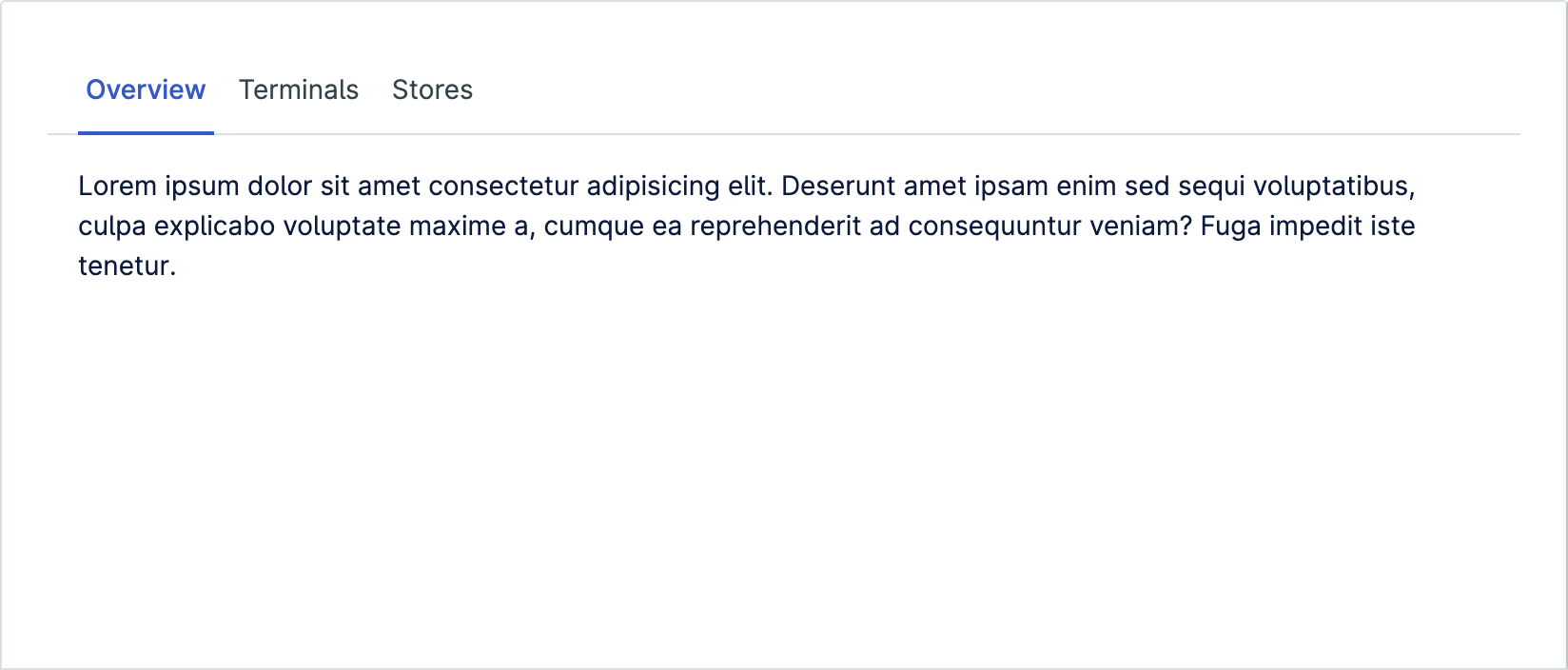
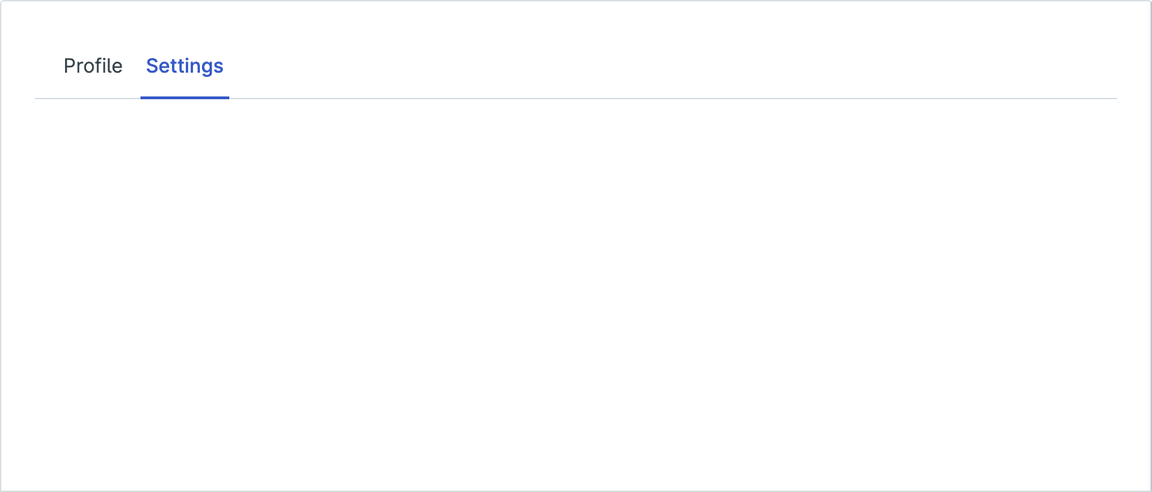
Tab Group allows multiple panels to be contained within a single window, using tabs as a navigational element
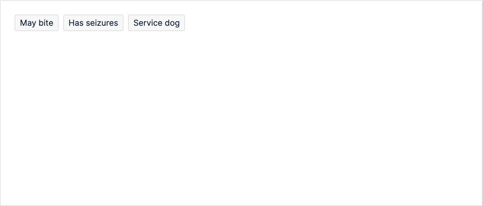
Tags represent a set of keywords that help label, categorize, and organize objects. Commonly used to signify the attributes of an object
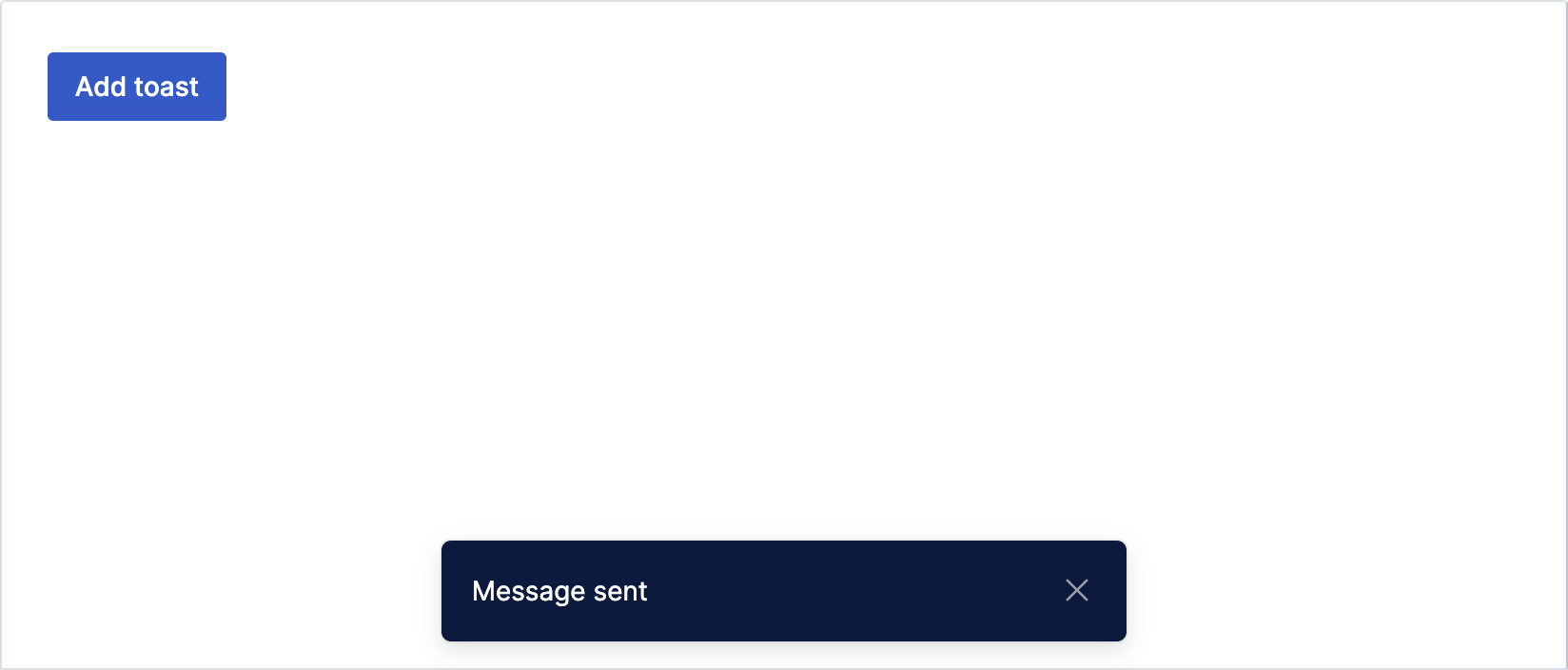
Toasts are non-disruptive messages that appear in the interface to provide quick, at-a-glance feedback on the outcome of an action
Tooltips are floating containers for displaying additional information for the currently focused element. A tooltip can be useful when you want to e.g. give a hint about an existing Command Menu shortcut

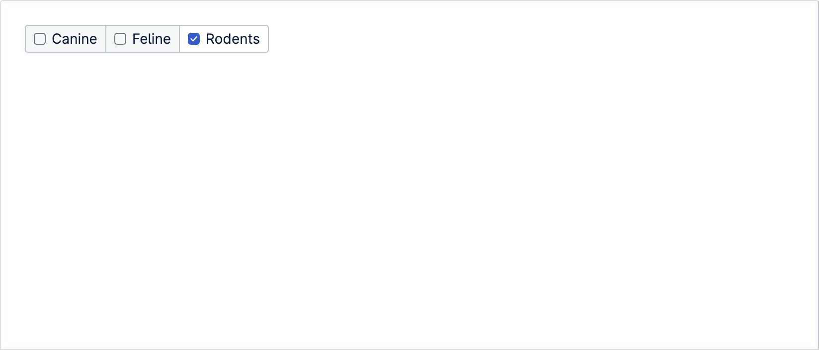
Checkboxes allow user to choose one or more options from a limited set of options. If you have more than 10 options, please use Select component instead.
Dropdown group includes all the actions or items in a single dropdown group and is used for grouping items into related categories
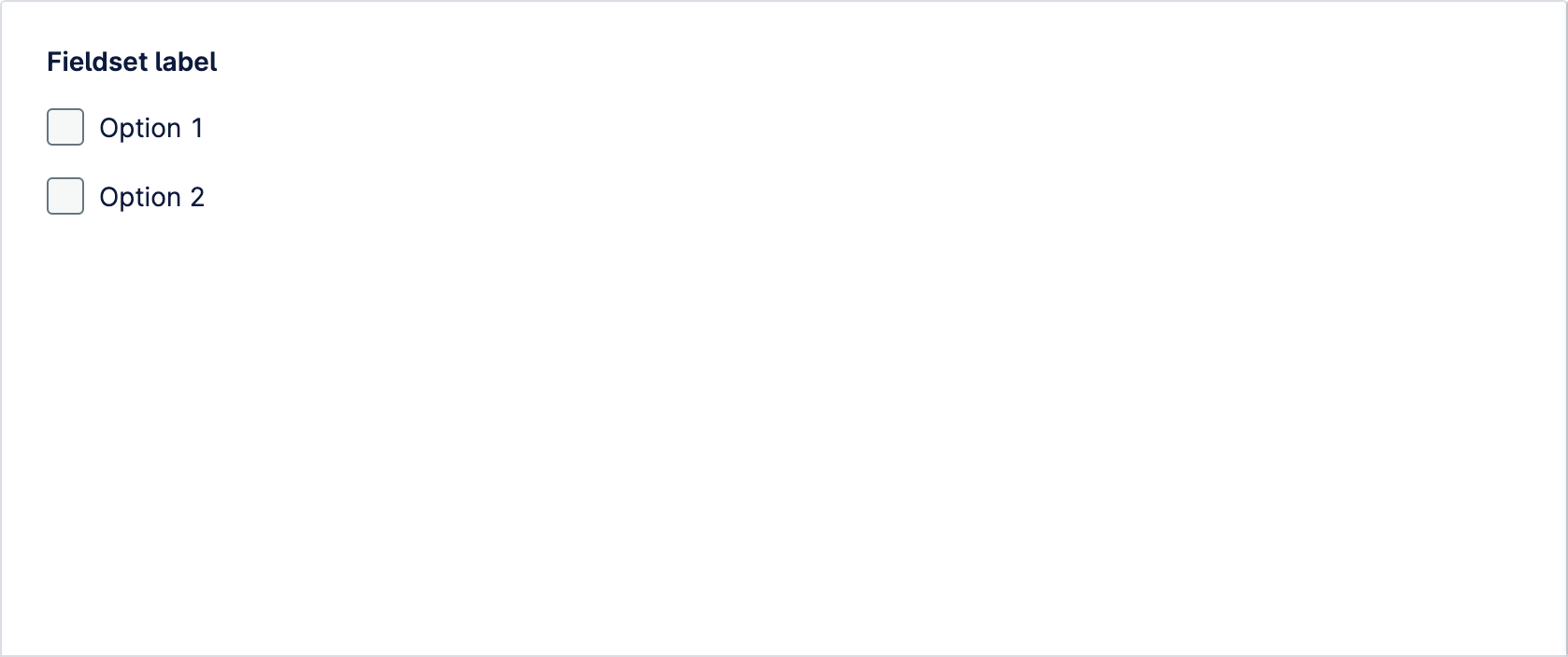
Fieldset is used for grouping sets of input components. It is necessary to use a fieldset with radio and checkbox components. It can also be useful for logically grouping other types of inputs
Icons are used to provide additional meaning or in places where text label doesn’t fit. Icon component allows you to display an icon from the Nordicons library

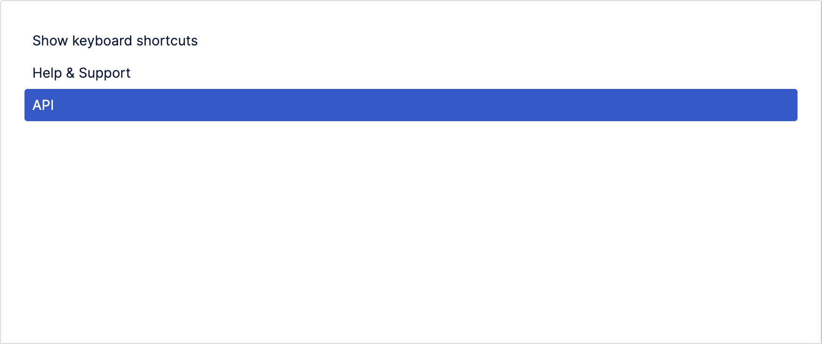
Message represents a specific item within a collection, such as notifications, tasks or conversations. Message can be placed directly inside a dropdown component
Nav toggle is meant for hiding and showing the primary navigation. This component is used internally in the Layout component, but can also be used separate to further customize the behavior
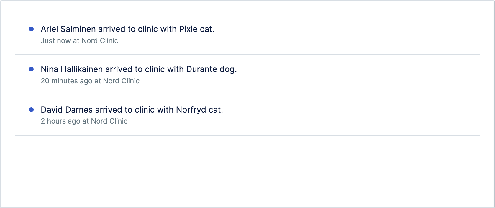
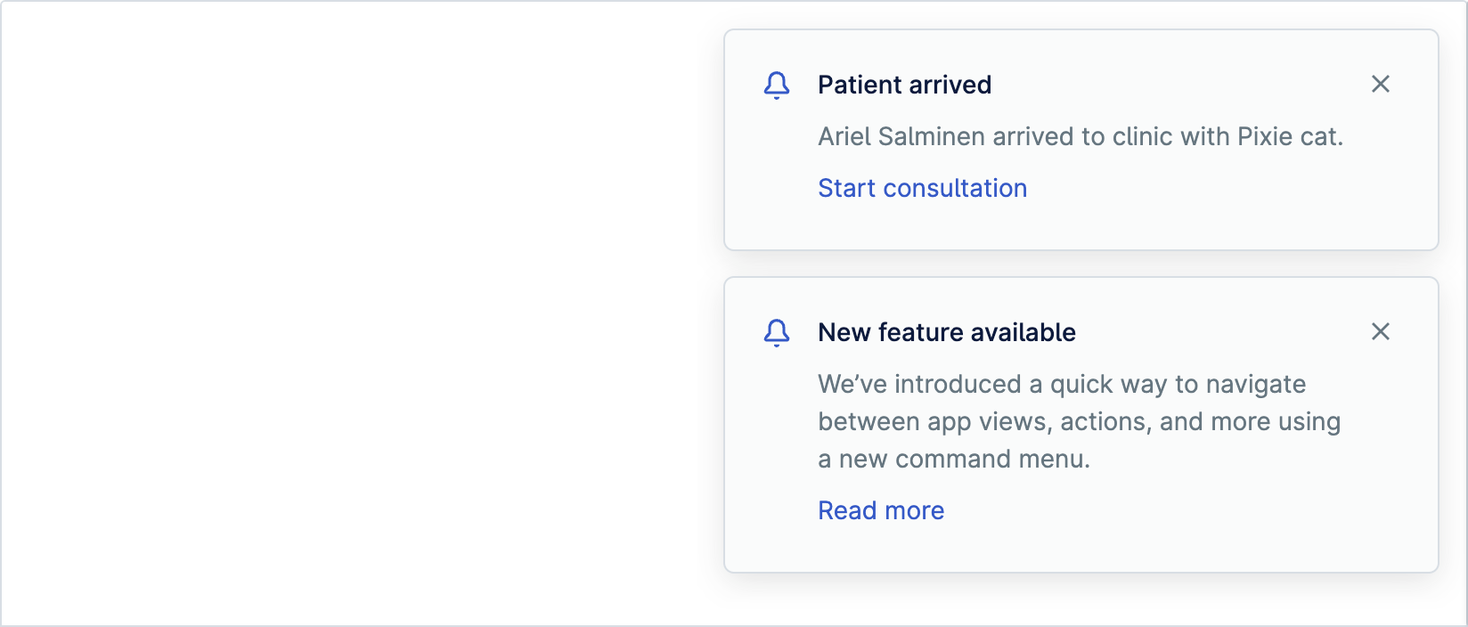
Notification group is used to position and style a group of notifications
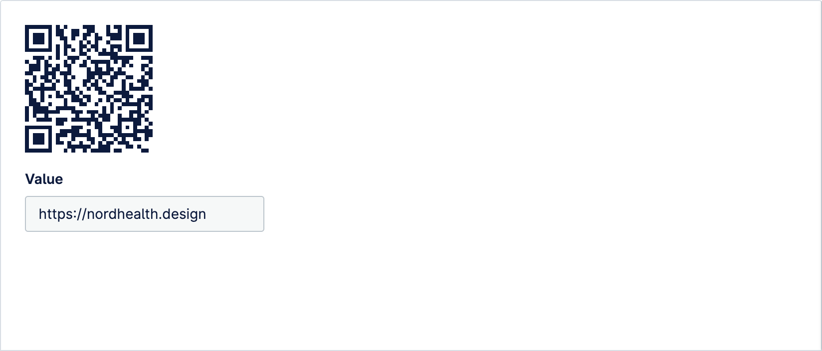
QR Code component is used for providing information or links to users which they can quickly scan with their smartphone
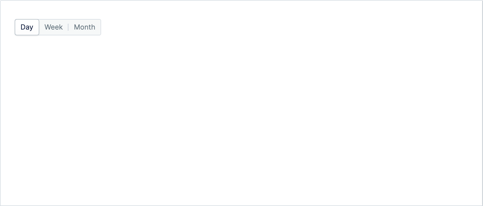
Segmented control is used to pick one choice from a set of closely related choices, and immediately apply that selection
Skeletons are used to provide a low fidelity representation of content before it appears in a view. This improves the perceived loading time for our users
Stack component manages layout of immediate children along the vertical or horizontal axis with optional spacing between each child
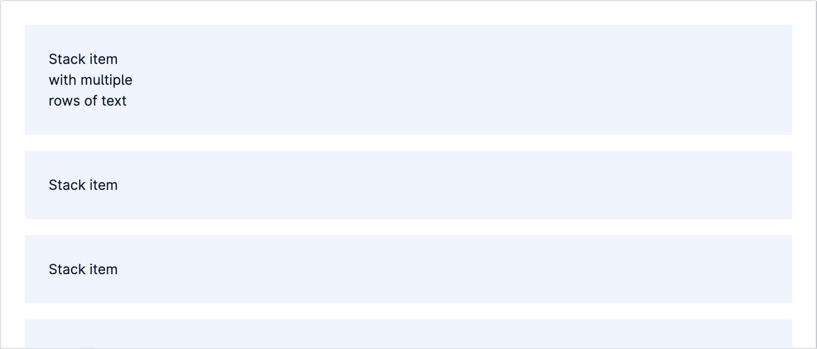
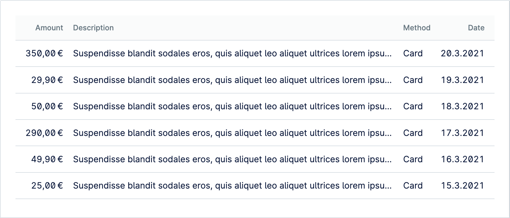
Table is used to organize and display information from a data set. Provides table styles in addition to features like sticky headers and support for narrow viewports
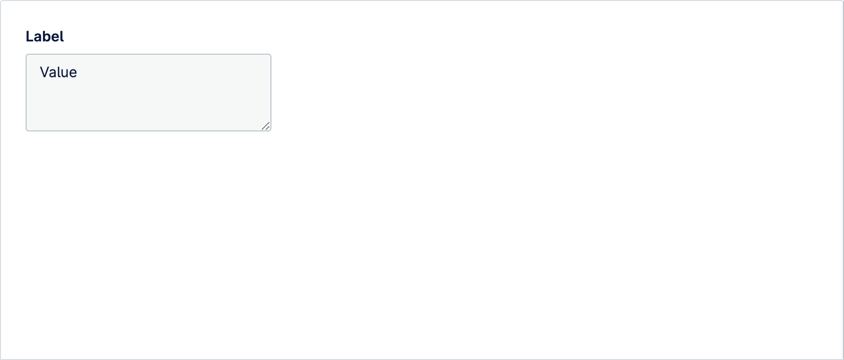
Textarea is a component that allows user to write text over multiple rows. Used when the expected user input is long. For shorter input, use the Input component
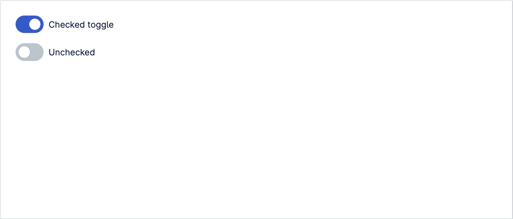
Toggle switch gives control over a feature or option that can be turned on or off. If a physical switch would work for the action, a toggle is probably the best component to use
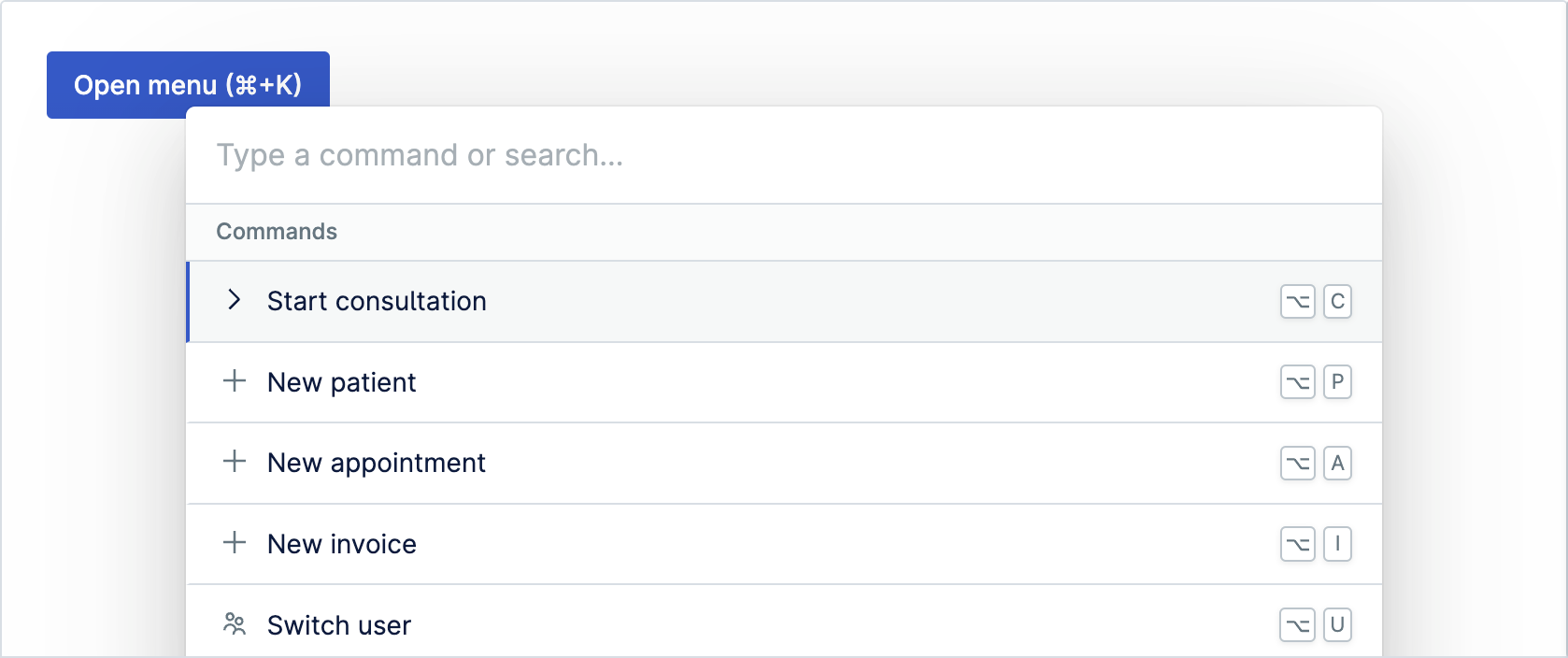
Command Menu allows users to navigate and use an app without touching the mouse and helps them transform into “power users” who can harness more advanced features far faster.
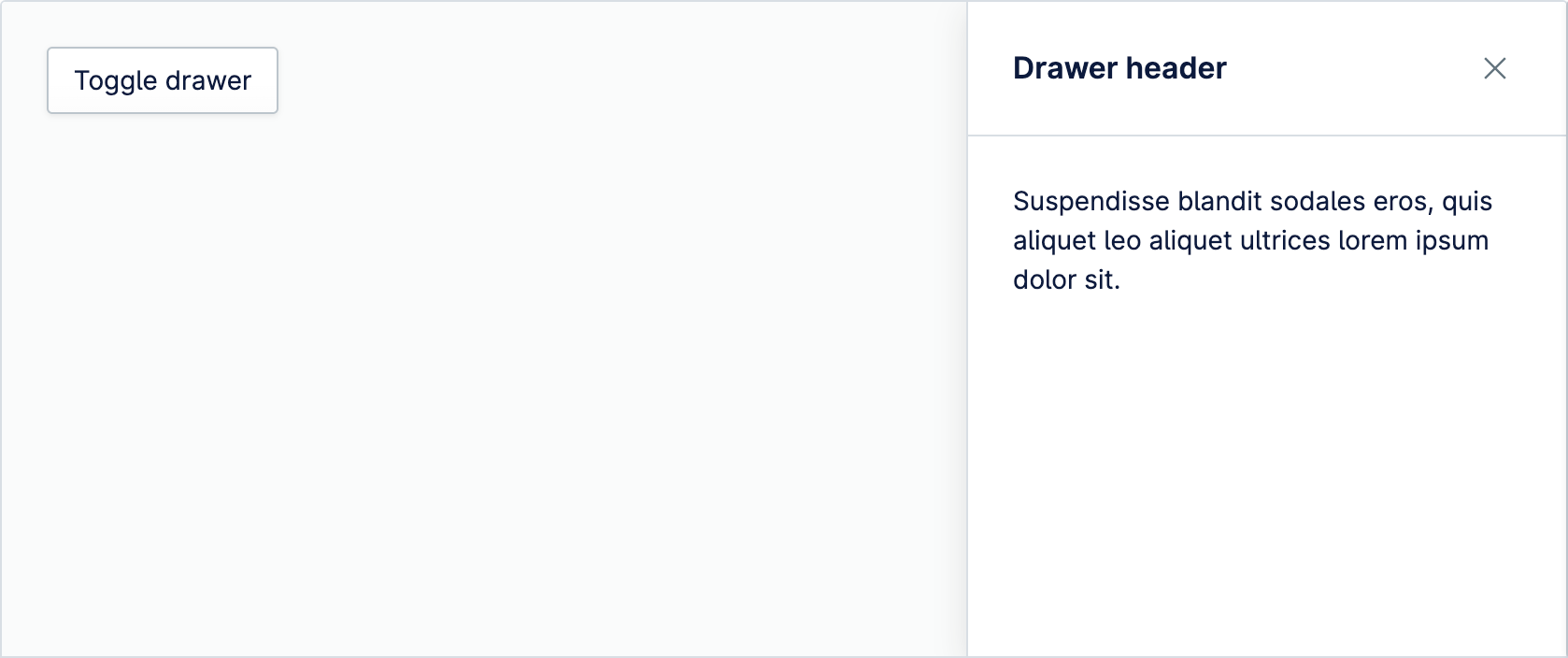
Drawer is used to display context-sensitive actions and information. Drawer doesn’t block users from completing their task, like a modal would.
Dropdown item populates dropdown with actions. Items can be placed either inside a dropdown group or directly inside a dropdown component
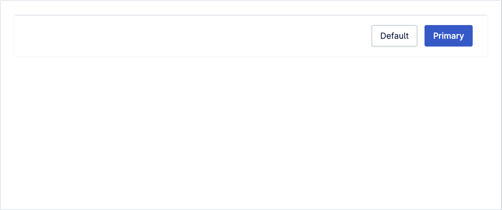
The footer is a block of designated space for providing additional information or actions that are positioned below the main content
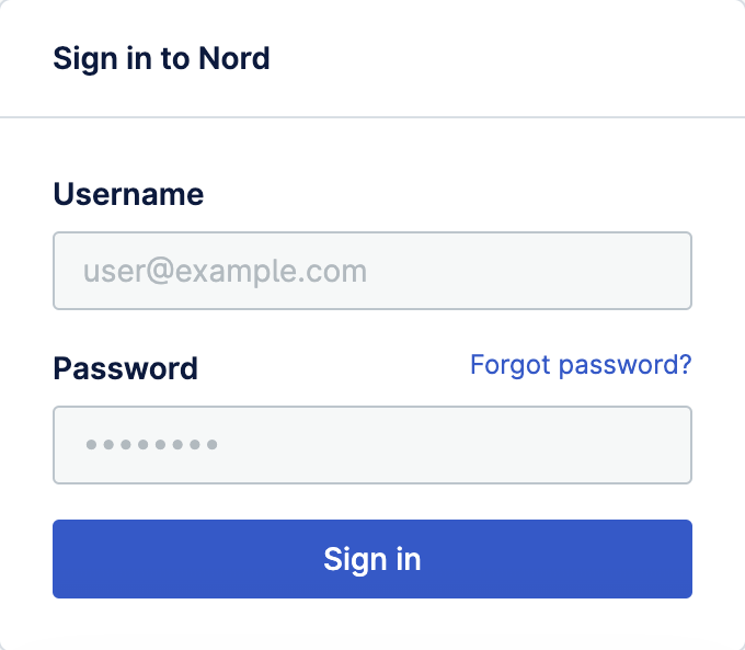
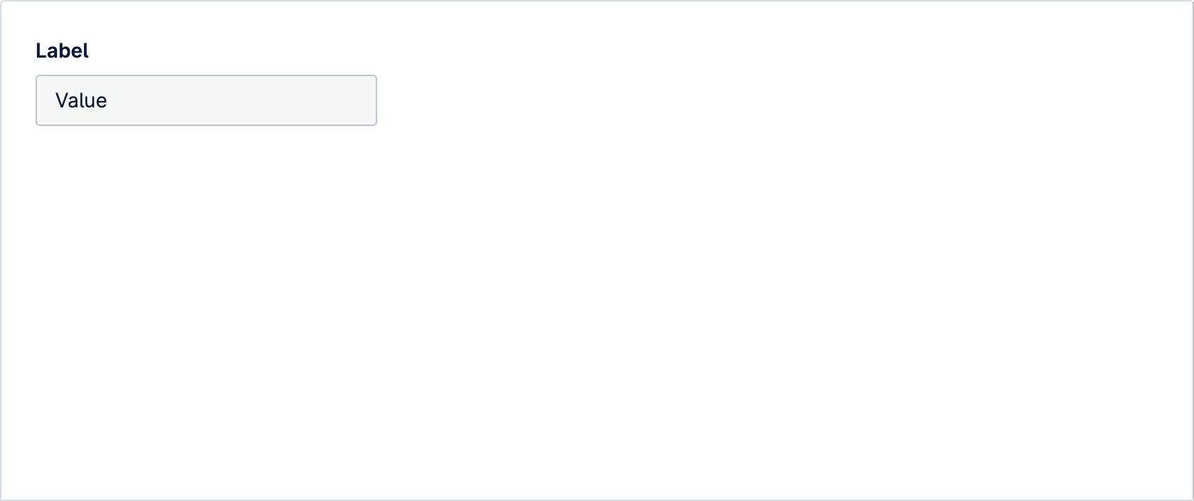
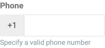
Inputs are used to allow users to provide text input when the expected input is short. As well as plain text, Input supports various types of text, including passwords and numbers.





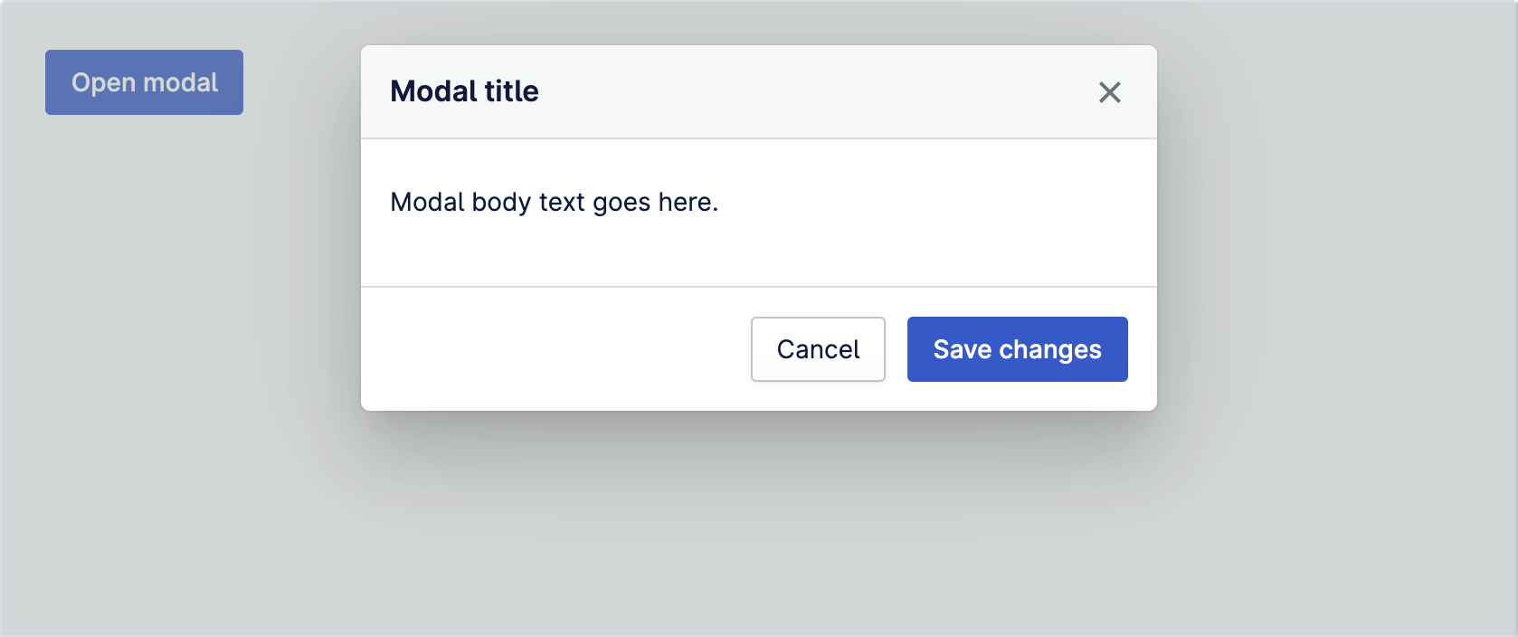
Modal component is used to display content that temporarily blocks interactions with the main view of an application. Modal should be used sparingly and only when necessary
Navigation item populates sidebar navigation with links. Every item should be placed inside a navigation group
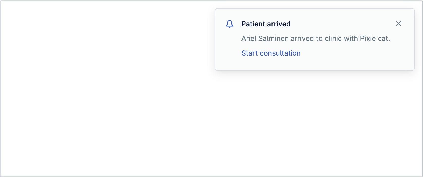
Notifications provide important information that requires action or acknowledgement. A notification is displayed until the user dismisses it
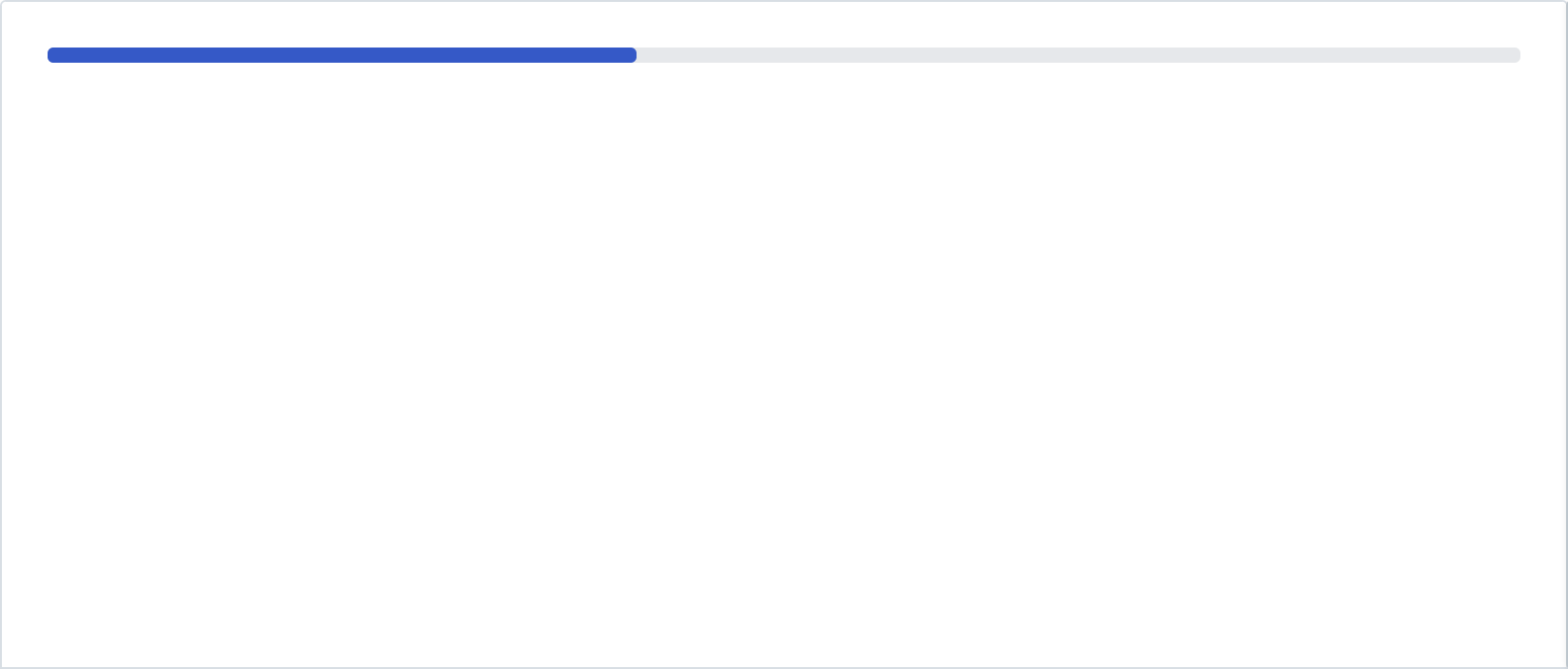
Progress Bar is used to visually represent the completion of a task or process. It shows how much of the task has been completed and how much is still left
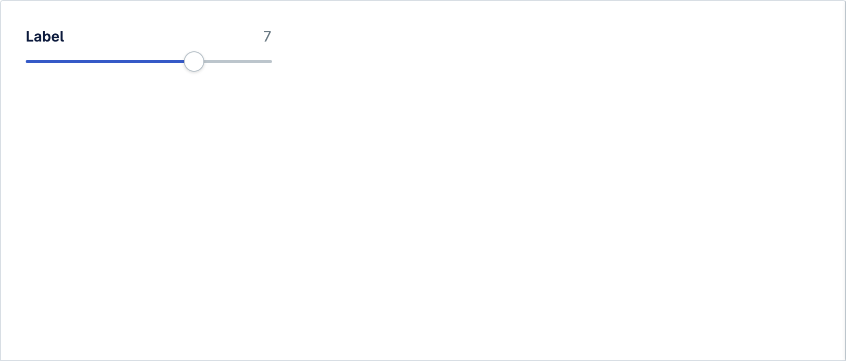
Range input lets user specify a numeric value using a slider which must be no less than a given value, and no more than another given value
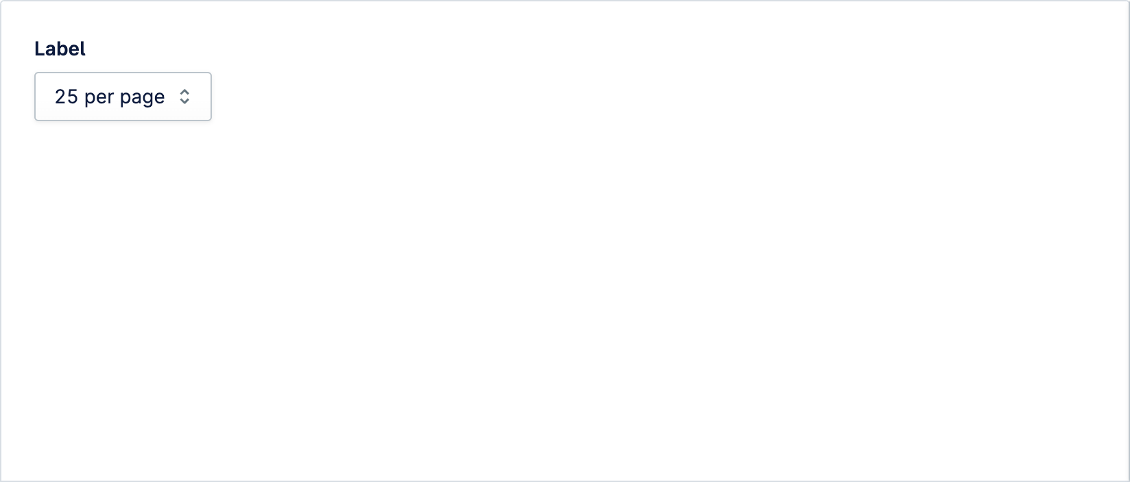
Select lets users choose one option from an options menu. Consider using select when you have 5 or more options to choose from

The interactive tab button for use within the tab group component

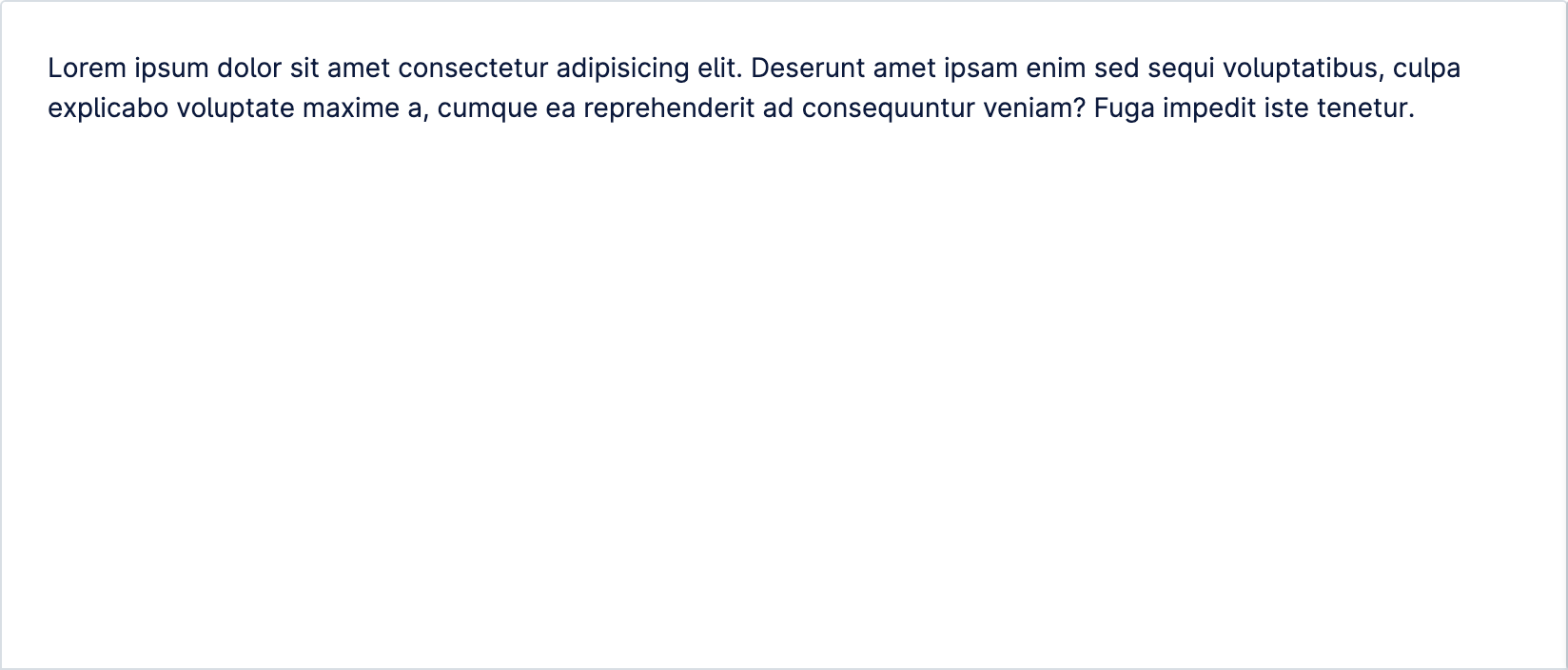
The panel which contains content that can be revealed using a tab in the tab group component
Tag groups are designed to bring together selectable tags that are of a similar nature. For example categories you can filter by
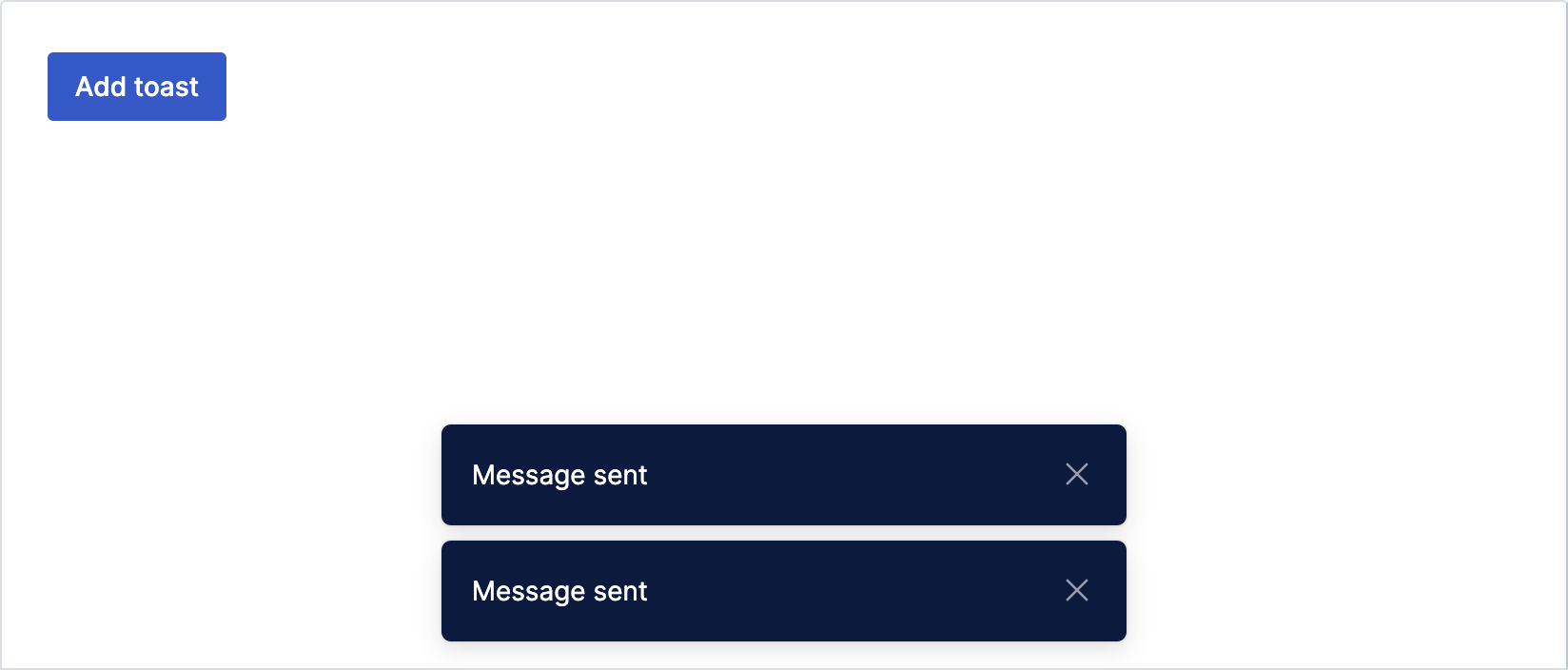
Toast group is used to position and style a group of toasts, whilst ensuring they are announced by screen readers
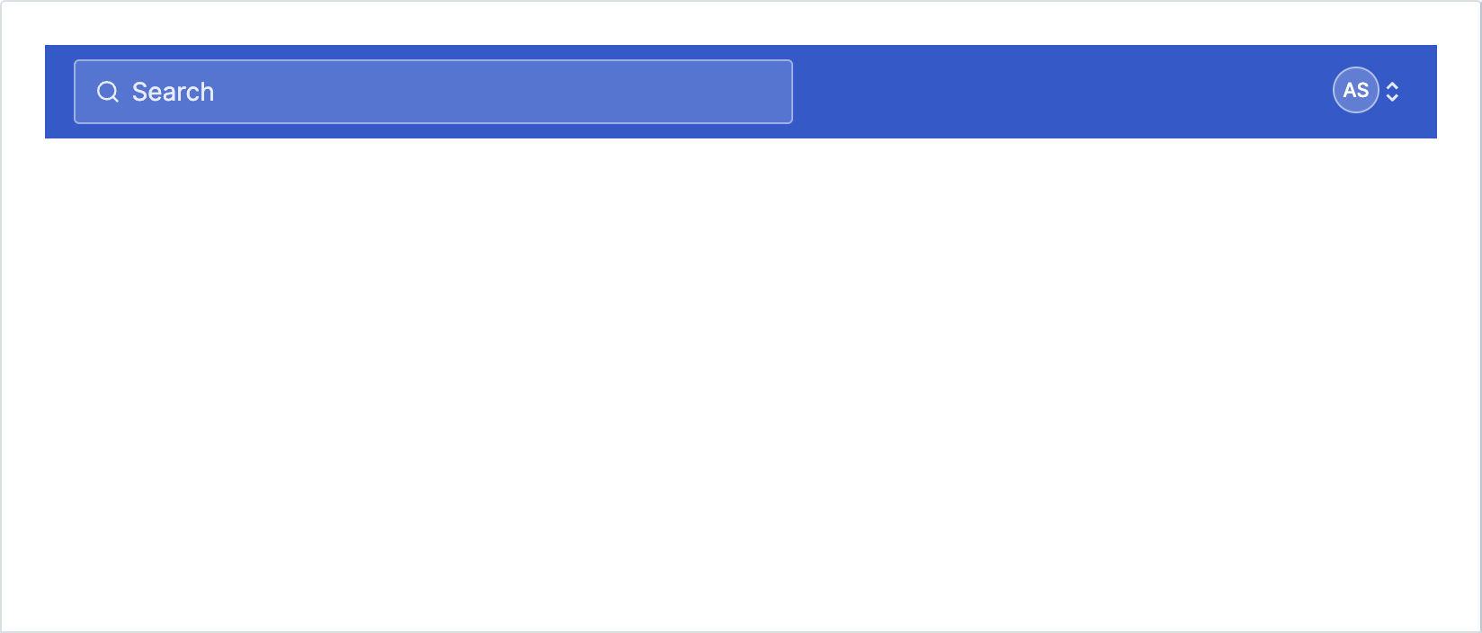
Top bar is a header component that is always visible at the top of the interface. Top bar allows functionality such as search and contextual menus to be placed at the top of the interface
Visually hidden is used when an element needs to be available to assistive technologies like screen readers, but be otherwise hidden