Infa.ai
Atlassian Design SystemComponents
A skeleton acts as a placeholder for content, usually while the content loads. ## Early Access This is an experiment. We may make frequent breaking changes with limited notice. We don't recommend using this without support from our team. ## Basic Styles Copy codeEdit in code sandbox (opens in a new window) import React from 'react'; import Skeleton from '@atlaskit/skeleton'; export default () => <Skeleton width="200px" height="16px" testId="skeleton" />; ## Shimmering effect The shimmering animation can be controlled via the isShimmering prop. Styles Copy codeEdit in code sandbox (opens in a new window) import React from 'react'; import Skeleton from '@atlaskit/skeleton'; export default () => <Skeleton width="200px" height="16px" isShimmering testId="skeleton" />; ## Customized color The default skeleton color can be overrided via the color prop. Styles Copy codeEdit in code sandbox (opens in a new window) import React from 'react'; import Skeleton from '@atlaskit/skeleton'; import { token } from '@atlaskit/tokens'; export default () => ( <Skeleton width="200px" height="16px" color={token('color.background.accent.gray.subtle')} testId="skeleton" /> ); ## Customized shimmering animation color The default shimmering animation from and to colors can be overrided via the color and ShimmeringEndColor prop. Styles Copy codeEdit in code sandbox (opens in a new window) import React from 'react'; import Skeleton from '@atlaskit/skeleton'; import { token } from '@atlaskit/tokens'; export default () => ( <Skeleton width="200px" height="16px" color={token('color.background.accent.gray.subtle')} ShimmeringEndColor={token('color.background.accent.gray.bolder')} testId="skeleton" /> );
A link takes people to a new location in the product or another website. Link is for use in text. If you need a non-text element to behave like a link, such as a card, use the anchor primitive. ## Default The default appearance of a link. Default link Styles Copy codeEdit in code sandbox (opens in a new window) import React from 'react'; import Link from '@atlaskit/link'; export default function Default() { return <Link href="https://www.atlassian.com/software/jira">Default link</Link>; } ## Subtle Use a subtle link if the default link appearance is too prominent. There is no underline in resting state, but one appears on hover. Ensure the surrounding context makes it clear that the link is interactive, such as in navigation or breadcrumbs. Avoid using subtle links in body copy because they're hard to distinguish from the surrounding text. Subtle link Styles Copy codeEdit in code sandbox (opens in a new window) import React from 'react'; import Link from '@atlaskit/link'; export default function Subtle() { return ( <Link href="https://www.atlassian.com/software/confluence" appearance="subtle"> Subtle link </Link> ); } ## Inverse Use an inverse link when displaying it on a bold background. Inverse link Styles Copy codeEdit in code sandbox (opens in a new window) import React from 'react'; import Link from '@atlaskit/link'; export default function Inverse() { return ( <Link href="https://www.atlassian.com/software/confluence" appearance="inverse"> Inverse link </Link> ); } ## Visited Links that have been visited will display in a different color. This is not supported for inverse links due to color contrast limitations. Default link Styles Copy codeEdit in code sandbox (opens in a new window) import React from 'react'; import Link from '@atlaskit/link'; export default function Visited() { return <Link href="/components/link/examples">Default link</Link>; } ## Links that open in a new window or tab It's important to indicate when links open in new windows or tabs. An icon will display next to the link, as well as visually hidden text "(opens new window)" for screen reader users. Opening links in a new window can be disorienting for people, so only do it when necessary. For more information see 'G200: Opening new windows and tabs from a link only when necessary'. Atlassian home , (opens new window) Styles Copy codeEdit in code sandbox (opens in a new window) import React from 'react'; import Link from '@atlaskit/link'; export default function NewWindow() { return ( <Link href="https://www.atlassian.com" target="_blank"> Atlassian home </Link> ); } ## In body text Links work in body copy, and will wrap onto new lines if necessary. Lorem ipsum dolor sit amet, consectetur adipiscing elit, sed do eiusmod tempor incididunt ut labore et dolore magna aliqua. Ut enim ad minim veniam, quis nostrud exercitation ullamco laboris nisi ut aliquip ex ea commodo consequat. Duis aute irure dolor in reprehenderit in voluptate velit esse cillum dolore eu fugiat nulla pariatur. Excepteur sint occaecat cupidatat non proident, sunt in culpa qui officia deserunt mollit anim id est laborum. , (opens new window) Styles Copy codeEdit in code sandbox (opens in a new window) import React from 'react'; import Link from '@atlaskit/link'; import { Text } from '@atlaskit/primitives/compiled'; export default function BodyCopy() { return ( <Text> Lorem ipsum dolor sit amet, consectetur adipiscing elit, sed do eiusmod{' '} <Link href="/components/link/usage">tempor incididunt ut labore et dolore magna aliqua.</Link>{' '} Ut enim ad minim veniam, quis nostrud exercitation ullamco laboris nisi ut aliquip ex ea commodo consequat.{' '} <Link href="/components/link/usage">Duis aute irure dolor in reprehenderit</Link> in voluptate velit esse cillum dolore eu fugiat nulla pariatur. Excepteur sint occaecat cupidatat non proident, sunt in{' '} <Link href="/components/link/usage" target="_blank"> culpa qui officia deserunt mollit anim id est laborum. </Link> </Text> ); } ## Inheriting font styles Links will inherit font styles of surrounding text. # The link inherits font styles Styles Copy codeEdit in code sandbox (opens in a new window) import React from 'react'; import Heading from '@atlaskit/heading'; import Link from '@atlaskit/link'; export default function FontStyleInheritance() { return ( <Heading size="xxlarge"> The <Link href="/components/link/code">link</Link> inherits font styles </Heading> ); } ## HTML attributes Link passes through all valid HTML attributes to the underlying <a> element. Loom home , (opens new window) Styles Copy codeEdit in code sandbox (opens in a new window) import React from 'react'; import Link from '@atlaskit/link'; export default function HtmlAttributes() { return ( <Link href="https://www.loom.com" rel="noopener noreferrer" target="_blank"> Loom home </Link> ); } ## Router links Link supports automatic configuration of router link components through the AppProvider. Here's an example of the router link configuration for the anchor primitive. ## Event tracking Link has utilities to make tracking events easier. Here's an example of tracking events with the anchor primitive.
The latest navigation system for Atlassian products. ## Early Access This package is experimental. We may make frequent breaking changes with limited notice. Navigation is how users get around a site to complete their tasks. ## Overview Atlassian’s navigation is made of these basic parts: - The layout defines clear areas for navigation elements - Side navigation menus create a consistent feel for actions and links - Top navigation elements provide familiar spots for common features These layout and menu areas contain the app switcher, search, and other key features in Atlassian products. ## Required: Compiled CSS configuration Compiled CSS must be configured in your application to ensure styles are correctly applied. See the get started page for steps. For Atlassian staff, you can also refer to go/configure-compiled , (opens new window) ## Basic example To see in full-screen, open the code sandbox below. Copy codeEdit in code sandbox (opens in a new window) import React, { useReducer } from 'react'; import Breadcrumbs, { BreadcrumbsItem } from '@atlaskit/breadcrumbs'; import { IconButton } from '@atlaskit/button/new'; import DropdownMenu, { DropdownItem, DropdownItemGroup } from '@atlaskit/dropdown-menu'; import Heading from '@atlaskit/heading'; import CloseIcon from '@atlaskit/icon/glyph/cross'; import NotificationIcon from '@atlaskit/icon/glyph/notification'; import PageIcon from '@atlaskit/icon/glyph/page'; import PersonIcon from '@atlaskit/icon/glyph/person'; import ProjectIcon from '@atlaskit/icon/core/project'; import IssuesIcon from '@atlaskit/icon/glyph/issues'; import { JiraIcon, JiraLogo } from '@atlaskit/logo'; import { LinkItem, MenuGroup, Section } from '@atlaskit/menu'; import { CreateButton, Help, NavLogo, Root, SideNav, SideNavContent, SideNavFooter, } from '@atlaskit/navigation-system'; import { Aside } from '@atlaskit/navigation-system/layout/aside'; import { Main } from '@atlaskit/navigation-system/layout/main'; import { Panel } from '@atlaskit/navigation-system/layout/panel'; import { PanelSplitter } from '@atlaskit/navigation-system/layout/panel-splitter'; import { SideNavToggleButton } from '@atlaskit/navigation-system/layout/side-nav'; import { TopNav, TopNavEnd, TopNavMiddle, TopNavStart, } from '@atlaskit/navigation-system/layout/top-nav'; import { ExpandableMenuItem, ExpandableMenuItemContent, ExpandableMenuItemTrigger, } from '@atlaskit/navigation-system/side-nav-items/expandable-menu-item'; import { LinkMenuItem } from '@atlaskit/navigation-system/side-nav-items/link-menu-item'; import { MenuList } from '@atlaskit/navigation-system/side-nav-items/menu-list'; import { Search, Settings } from '@atlaskit/navigation-system/top-nav-items'; import PageHeader from '@atlaskit/page-header'; import { Popup, PopupContent, PopupTrigger } from '@atlaskit/popup/experimental'; import { Box, Inline, Stack } from '@atlaskit/primitives'; import Skeleton from '@atlaskit/skeleton'; export const IntegrationLayoutExample = () => { const [isPanelVisible, toggleIsPanelVisible] = useReducer((isVisible) => !isVisible, true); const [isSettingsOpen, toggleIsSettingsOpen] = useReducer((isOpen) => !isOpen, false); return ( <Root> <TopNav> <TopNavStart> <SideNavToggleButton collapseLabel="Collapse sidebar" expandLabel="Expand sidebar" /> <NavLogo href="https://jira.atlassian.com" logo={JiraLogo} icon={JiraIcon} label="Home page" /> </TopNavStart> <TopNavMiddle> <Search label="Search" /> <CreateButton>Create</CreateButton> </TopNavMiddle> <TopNavEnd> <Help label="Help" onClick={toggleIsPanelVisible} /> <Popup isOpen={isSettingsOpen}> <PopupTrigger> {({ ref }) => <Settings ref={ref} onClick={toggleIsSettingsOpen} label="Settings" />} </PopupTrigger> <PopupContent onClose={toggleIsSettingsOpen} placement="bottom"> {() => ( <MenuGroup> <Section title="Personal Jira settings"> <LinkItem href="/" description="Manage language, time zone, and other personal preferences" iconBefore={<PersonIcon label="" />} > General settings </LinkItem> <LinkItem href="/" description="Manage email and in-product notifications from Jira" iconBefore={<NotificationIcon label="" />} > Notification settings </LinkItem> </Section> <Section title="Atlassian admin settings"> <LinkItem href="/" description="Update your billing details, manage subscriptions, and more" iconBefore={<PageIcon label="" />} > Billing </LinkItem> </Section> </MenuGroup> )} </PopupContent> </Popup> </TopNavEnd> </TopNav> <SideNav defaultWidth={100}> <SideNavContent> <MenuList> <LinkMenuItem href="#">Your work</LinkMenuItem> <ExpandableMenuItem isDefaultExpanded> <ExpandableMenuItemTrigger elemBefore={ <ProjectIcon label="" LEGACY_fallbackIcon={IssuesIcon} color="currentColor" /> } > Projects </ExpandableMenuItemTrigger> <ExpandableMenuItemContent> <LinkMenuItem href="#" isSelected> Design System </LinkMenuItem> </ExpandableMenuItemContent> </ExpandableMenuItem> </MenuList> </SideNavContent> <SideNavFooter>Give feedback</SideNavFooter> <PanelSplitter label="Resize side nav" /> </SideNav> <Main> <Box paddingInline="space.300"> <PageHeader breadcrumbs={ <Breadcrumbs> <BreadcrumbsItem text="Projects" key="Projects" /> <BreadcrumbsItem text="Design System" key="Design System" /> </Breadcrumbs> } > Issue name </PageHeader> <Stack space="space.300"> <Stack space="space.100"> <Skeleton width="100%" height={16} borderRadius={3} /> <Skeleton width="100%" height={16} borderRadius={3} /> <Skeleton width="66%" height={16} borderRadius={3} /> </Stack> <Stack space="space.100"> <Skeleton width="100%" height={16} borderRadius={3} /> <Skeleton width="100%" height={16} borderRadius={3} /> <Skeleton width="100%" height={16} borderRadius={3} /> <Skeleton width="33%" height={16} borderRadius={3} /> </Stack> </Stack> </Box> </Main> <Aside defaultWidth={100}> <Box paddingBlock="space.300"> <DropdownMenu trigger="To do" shouldRenderToParent> <DropdownItemGroup> <DropdownItem>To do</DropdownItem> <DropdownItem>In progress</DropdownItem> <DropdownItem>Done</DropdownItem> </DropdownItemGroup> </DropdownMenu> </Box> </Aside> {isPanelVisible && ( <Panel defaultWidth={200}> <Box padding="space.150"> <Stack space="space.200"> <Inline alignBlock="center" spread="space-between"> <Heading size="small" as="h2"> Help </Heading> <IconButton icon={CloseIcon} label="" appearance="subtle" onClick={toggleIsPanelVisible} /> </Inline> <Stack space="space.300"> <Stack space="space.100"> <Skeleton width="100%" height={16} borderRadius={3} /> <Skeleton width="100%" height={16} borderRadius={3} /> <Skeleton width="66%" height={16} borderRadius={3} /> </Stack> <Stack space="space.100"> <Skeleton width="100%" height={16} borderRadius={3} /> <Skeleton width="100%" height={16} borderRadius={3} /> <Skeleton width="100%" height={16} borderRadius={3} /> <Skeleton width="33%" height={16} borderRadius={3} /> </Stack> </Stack> </Stack> </Box> </Panel> )} </Root> ); };
A table is used to display data. ## Caution This package was an experiment, and is currently deprioritized. It is not recommended for use in production, and we are not providing support for it at this time. Consider using @atlaskit/dynamic-table instead. ## Basic A table is composed of simple composable elements. In its base form these UI elements are purely presentational. Name Party Year George Washington None, Federalist 1789-1797 John Adams Federalist 1797-1801 Thomas Jefferson Democratic-Republican 1801-1809 James Madison Democratic-Republican 1809-1817 James Monroe Democratic-Republican 1817-1825 John Quincy Adams Democratic-Republican 1825-1829 Andrew Jackson Democrat 1829-1837 Martin van Buren Democrat 1837-1841 William H. Harrison Whig 1841 John Tyler Whig 1841-1845 ## Basic data table A data table is used to display dynamic data. Select all rows Name Party Year Select row 1 George Washington None, Federalist 1789-1797 Select row 2 John Adams Federalist 1797-1801 Select row 3 Thomas Jefferson Democratic-Republican 1801-1809 Select row 4 James Madison Democratic-Republican 1809-1817 Select row 5 James Monroe Democratic-Republican 1817-1825 Select row 6 John Quincy Adams Democratic-Republican 1825-1829 Select row 7 Andrew Jackson Democrat 1829-1837 Select row 8 Martin van Buren Democrat 1837-1841 Select row 9 William H. Harrison Whig 1841 Select row 10 John Tyler Whig 1841-1845 ## Expandable Expanding row functionality can be added using composable elements. Expand row Item Category Quantity Cost Date Expand row Banana Groceries 5 $5.62 11/01/2023 2 $2.03 21/01/2023 3 $3.59 29/01/2023 Expand row Chair Homeware 1 $74.87 03/02/2023 Shirt Clothing 2 $89.62 19/02/2023
Text is a token-backed typography component to display body text. ## Basic Use a Text component for main content. Text typically appears after headings or subheadings as detailed descriptions and messages, but also as standalone text in components. The size prop expresses the visual appearance of the text element: - 'large' is for long-form content. Use this size for a comfortable reading experience such as in blogs. - 'medium' is the default size in components or where space is limited, for detailed or descriptive content such as primary descriptions in flags. - 'small' should be used sparingly and is for secondary level content such as fine print or semantic messaging. ## Color Text uses the color.text token which automatically switches colors to be legible across both light and dark modes. Text will automatically apply the correct inverse color token if placed within a box component with a bold background color. The color prop can be used with any text color token. If Text is nested inside another Text component, color will automatically inherit from its parent. ## Font weight Font weight defaults to regular (400) and can be set using the weight prop. More information about the available weights can be found on the typography foundations page. ## Alignment Text can be aligned using the align prop. ## Rendered HTML element Text renders a HTML <span> element by default. Use the as prop to change the rendered HTML element. ## Arrangement with other text styles Text does not apply any vertical margin or spacing. To control space between text and other content, use a stack component. ## Truncation Truncation in product experiences should be avoided. However if truncation cannot be avoided, for example when displaying user-generated content, use the maxLines prop to indicate how text should be truncated. ## Customization A restricted set of styles can be customized using the xcss prop, using cssMap.
MetricText is a token-backed typography component to display metrics. ## Basic Use a MetricText component to display numerical information. There are three sizes available via the size prop: - 'large' for numbers in the middle of large donut charts. - 'medium' for numbers in the middle of medium donut charts. - 'small' for numbers in the middle of small donut charts and single-value tiles. ## Alignment MetricText can be aligned using the align prop.
An avatar is a visual representation of a user or entity. The avatar component is made of three parts: Body, status, and presence. 1. Body: The image representing the user or entity. This can be round or square. 2. Status: An icon that displays the avatar’s status. This is positioned at the top right of the avatar component. 3. Presence: Indicates if a user is available, away, focused, or busy. This is positioned at the bottom left of the avatar component.


A horizontal navigation component for Atlassian products.


An avatar group displays a number of avatars grouped together in a stack or grid. 1. Avatar group: Stacked groups are limited to five avatars, and should only be used with medium or small avatars. 2. Truncated: For groups larger than six, five avatars are displayed. Additional avatars are represented as an avatar with the text +N (where N is the remaining number of avatars above five). 3. States: The avatar state will change when a person interacts with it, for example: displaying a tooltip on hover. 4. Dropdown menu: When hovering over the truncated avatar, a dropdown menu shows the truncated user names. [](https://atlassian.design/components/avatar-group/usage#grid)

A badge is a visual indicator for numeric values such as tallies and scores.


A banner displays a prominent message at the top of the screen. 1. Icon: Only use the error and warning icons. 2. Message: A short description of the severity of the issue, products affected, and any actions to remedy the situation. 3. Actions (optional): A link to a call to action or next steps. Any links to documentation should open in a new tab.

A blanket covers the underlying UI for a layered component, such as a modal dialog or a tooltip.
Breadcrumbs are a navigation system used to show a user's location in a site or app. 1. Item name: The section or page within the product, usually a link. 2. Separator: The separator is positioned between each item in the list. It provides visual distinction between individual links using the same font as the rest of the breadcrumbs. Usually a forward slash symbol /. 3. Icon or avatar (optional): Some links may have an icon or avatar before or after the corresponding page title.


A button triggers an event or action. They let users know what will happen next. Buttons typically have a label and can include an icon before or after the label. 1. Icon (optional): Most buttons don't need an icon. Use an icon to add additional affordance where the icon has a clear and well-established meaning. 2. Label: Text that explains the result of selecting the button. Use action verbs or phrases to tell the user what will happen next, and follow the button label content guidelines.

An interactive calendar for date selection experiences.
A checkbox is an input control that allows a user to select one or more options from a number of choices. 1. Checkbox: The selection control. 2. Checkbox label: Use this text label to describe what the checkbox is for.
Code highlights short strings of code snippets inline with body text. 1. Code snippet: The code snippet is a block of monospaced text used to display lines of code. 2. Line numbers (optional): If enabled, line numbers show to the left of the code snippet.
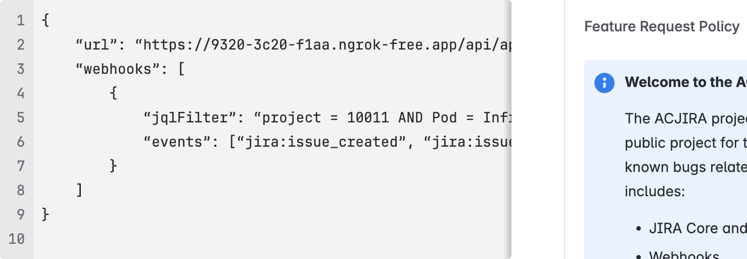
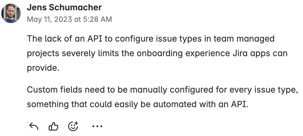
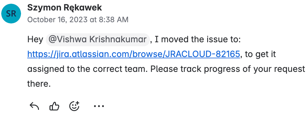
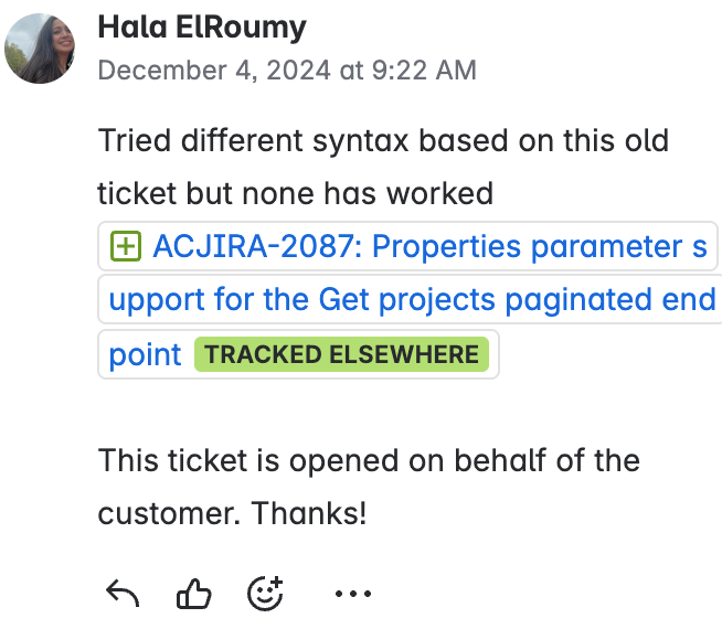
A comment displays discussions and user feedback.
A date time picker allows the user to select an associated date and time. 1. Label: Labels should indicate what information the field requires. The label is left-aligned above the input area. 2. Date input field: Selecting this field opens the calendar component. Users can also input dates into the field. Once a date is selected, the option will be shown in the text input. This example shows date formatted in ‘dd/mm/yyyy’ but this can be customized using the dateFormat prop. 3. Time input field: Selecting this field opens the select menu showing available times on the selected date. Once a time is selected, the option will be shown in the text input. This example shows time formatted in AM/PM but this can be customized using the timeFormat prop. 4. Calendar: A menu that contains the list of all dates. Selecting the previous or next arrows moves the calendar through months. The selected date area is highlighted by a different color fill. 5. Time dropdown: A menu that contains the list of all selectable times relating to the selected date. This example shows time increments of 30 minutes but can be customized using the times prop.
A drawer is a panel that slides in from the left side of the screen.
A dropdown menu displays a list of actions or options to a user. 1. Control: A button that may contain an icon, or be labeled with text. 2. Trigger: Used if the button is labeled with text. 3. Menu: Container for links and action items.

A dynamic table displays rows of data with built-in pagination, sorting, and re-ordering functionality. 1. Header label: Use this to indicate what type of information is in each column. 2. Row: Displays a relationship between separate table cells. 3. Pagination: If there's more than the maximum number of rows for one page, the pagination component appears at the end of the table, enabling people to navigate between pages.
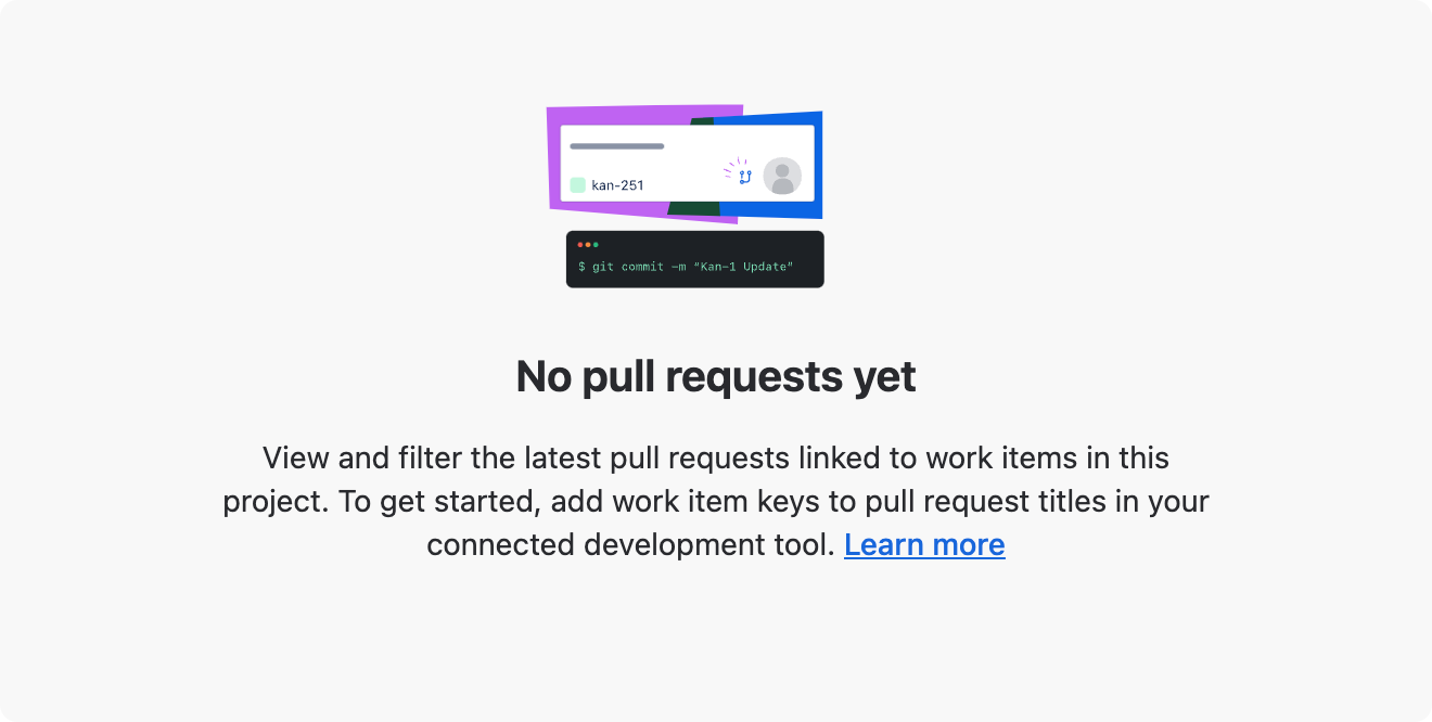
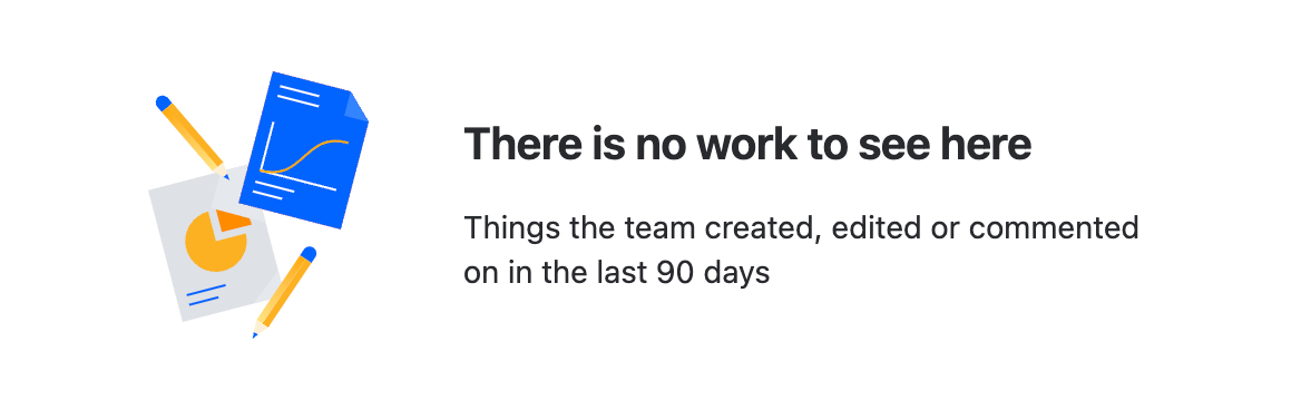
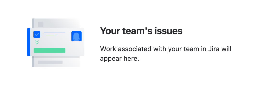
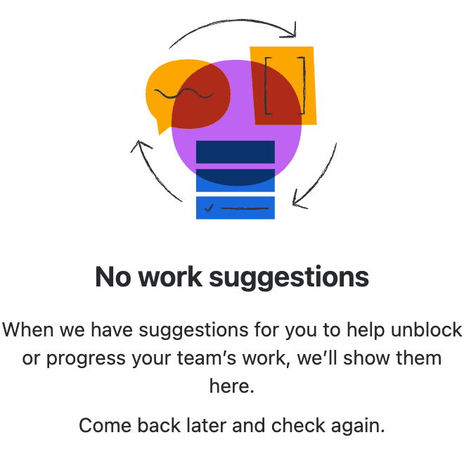
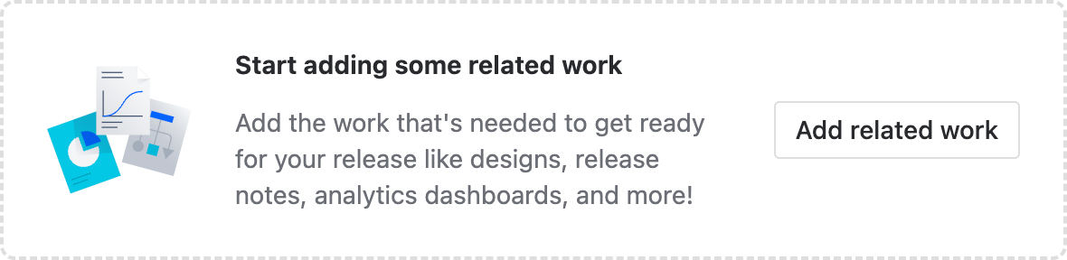
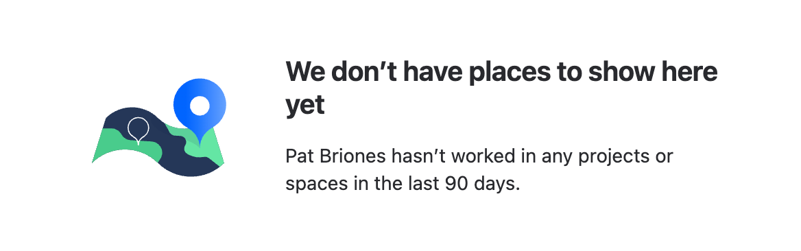
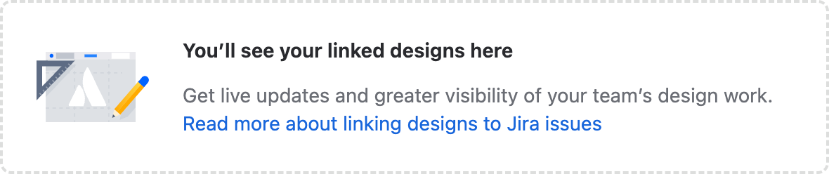
An empty state appears when there is no data to display and describes what the user can do next. 1. Illustration (optional): A spot illustration that relates to the message literally or as a metaphor (see illustration best practices below). 2. Header: A title that provides a concise description of the current state. 3. Description (optional): A short message describing the reason for the state and what to do next. See content guidelines below for details. 4. Buttons (optional): Next steps or a way to dismiss the message. Can be a primary button, secondary button, or link-styled button.
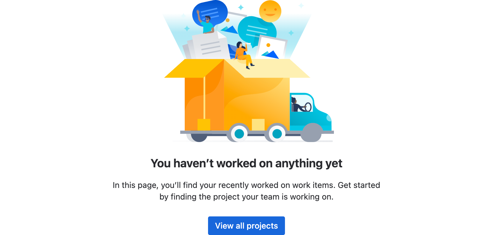
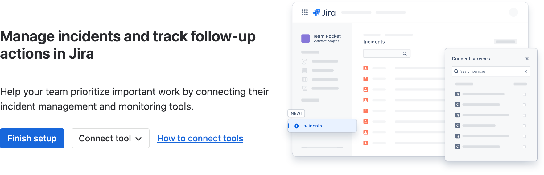
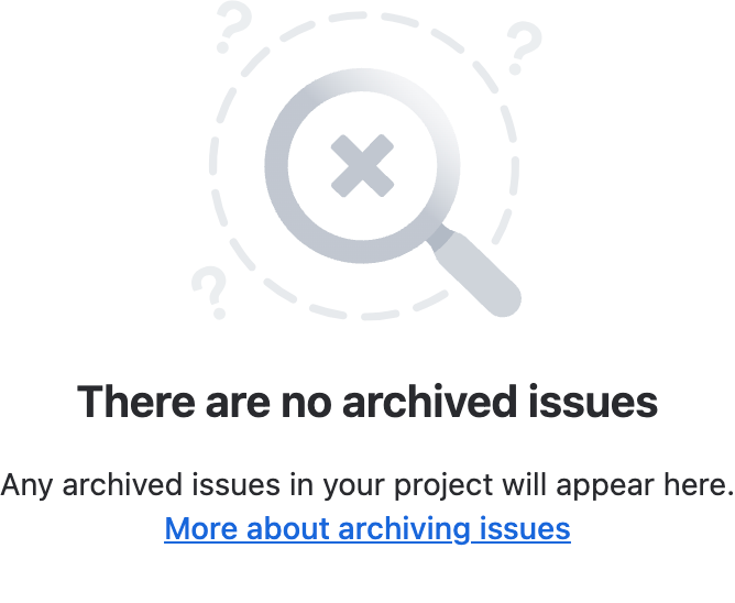
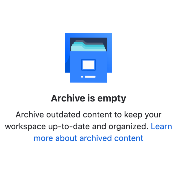
A flag is used for confirmations, alerts, and acknowledgments that require minimal user interaction, often displayed using a flag group. 1. Icon (or avatar) and title: The title should always summarize the reason for the flag. Titles longer than the width of the flag will wrap. Include an appropriate icon color or user avatar. 2. Message (optional): Provide additional information that will help users understand the flag, such as what went wrong or why this is important. Text longer than 5 lines will scroll. Try to make text as short as possible. 3. Actions (optional): A maximum of two links that enable users to act on the flag's content. 4. Dismiss: Used to close the flag. This is for default flags only.
A form allows users to input information. 1. Title: Use a concise form title to explain the form’s context. 2. Labels: Labels are required for all form inputs. Standard label alignment is left-aligned with the field underneath. Use a combination of a concise label and helper text to explain the field input. 3. Placeholder text: Avoid placeholders whenever possible. Never use placeholder text to communicate critical information — this is not accessible. Instead, use field labels or helper text to describe the purpose of the field and how to use it. Placeholders can, however, be used for search fields or short example entries. 4. Required field: Clearly communicate fields that are required. Don’t rely on asterisks alone to communicate which fields are required, make sure there is also a legend at the top of the form. 5. Form section: Use sections to group the form fields into smaller parts. 6. Disabled fields: Show disabled fields if users need to know what controls might not be available to them. 7. Form footer: Always use a submit button and distinguish primary and secondary buttons.
A heading is a typography component used to display text in different sizes and formats.
An icon is a visual representation of a command, device, directory, or common action. 1. Canvas area: The full boundary of an exported icon – includes grid area and icon. 2. Icon. 3. Grid area: The boundaries that an icon can be placed within.
An object icon is used to represent an Atlassian-specific content type.
An image that changes in light or dark themes.
An inline dialog is a pop-up container for small amounts of information. It can also contain controls. 1. Trigger: Indicates what information the inline dialog will surface. 2. Window: Displayed when the trigger is selected. 3. Controls: Control items can include buttons, checkboxes, and text fields.
An inline edit displays a custom input component that switches between reading and editing on the same page. 1. Label: Labels are concise, sentence case text describing what to enter in the field. 2. Field: When in read view, the field is hidden and aligned with the label. When in an empty state, you can customise what placeholder text is shown here. 1. Label: Labels are concise, sentence case text describing what to enter in the field. 2. Field: When in edit view, the field snaps to the width of the column and the text remains aligned with the label. 3. Controls: Options to save or cancel the current data entry appear at the end of the field.
An inline message lets users know when important information is available or when an action is required. 1. Icon: Indicates the status of the message. The icon's color and symbol give a quick visual indicator of the type and urgency of the message. 2. Title (optional): Should be concise and bolded when in use. 3. Message: Use regular text for the message body. The message is restricted to five lines in length.
A logo is a visual representation of a brand or product. It can be a word or an image, or a combination of both.
A lozenge is a visual indicator used to highlight an item's status for quick recognition.
A list of options to help users navigate, or perform actions. 1. Section. Menus are made up of a section or multiple sections. 2. Separator. Graphic device to separate a section of similar menu items. If there is more than one section, a separator is not needed in the first section. 3. Section header. Contains a heading to name a section of a group of similar menu items. 4. Menu items. Menu items can include an optional description and/or icons before and after.
A modal dialog displays content that requires user interaction, in a layer above the page. * Header: Contains the modal title. * Body: Provides an overview of the modal's purpose and, optionally, controls to complete a task. * Footer: Contains a primary action and the ability to cancel and close the dialog.
An onboarding spotlight introduces new features to users through focused messages or multi-step tours. 1. Spotlight target: The section of the UI that you want to call attention to. It can be rectangular or circular. Typically this surrounds an isolated element like an icon, button, or text field. 2. Message: Try to restrict messages to two lines in length. Showcase a single change and how it benefits the person reading your message. Try to avoid just naming the function. 3. Action: In a multi-step tour, these will be the skip and next buttons. In spotlights where you want people to try an action, the button should lead to that new action. 4. Pulse: A pulse animation to draw attention to the spotlight target. 5. Blanket: A translucent overlay that covers the rest of the screen that is not being spotlit.
A page header defines the top of a page. It contains a title and can be optionally combined with breadcrumbs buttons, search, and filters. 1. Page grid: The content area where the page header sits. Each page requires grid spacing to be set to account for page size and fixed/fluid pages. 2. Breadcrumbs: Breadcrumbs are an optional navigation aid that shows people their current location in relation to the rest of the site. 3. Title: The page title summarizes the page content. The title wraps onto multiple lines when using fluid grid alignment and truncates when using fixed grid alignment. 4. Actions: This area contains buttons that modify the page and its content. Use primary, secondary, subtle, compact, or other buttons defined in the button guidelines. 5. Search bar and filters: The search and filter bar allows people to refine the page content using search or select.
A collection of components which let you compose an application's page layout.
Pagination allows you to divide large amounts of content into smaller chunks across multiple pages. 1. Previous and next: Arrow icons that people use to move backward and forward from the currently selected page. 2. Page navigation: Numbers that people can select to move to a specific page. 3. Truncation: When a threshold of pages is reached, the list is truncated using an ellipsis.
A popup displays brief content in an overlay.
A progress bar communicates the status of a system process. 1. Progress line: Progress is visually represented by a filled line. It can be partially filled, complete, or indeterminate (partial completion of an unknown amount). 2. Progress bar container: This determines the length of the bar within the available screen space.
A progress indicator shows the user where they are along the steps of a journey. 1. Current progress: A visual indicator that shows the current step in the journey. 2. Steps: A visual indicator that shows all the steps in the sequence.
A progress tracker displays the steps and progress through a journey. 1. Progress bar: A filled horizontal bar that shows people their progress and the number of steps required to complete the task. 2. Current step: The current step in the progress aligns with the color fill and has colored text. 3. Unvisited: Shows steps that haven't been visited yet. The step and label are more subtle to indicate this. 4. Visited: Steps that have already been visited are higher contrast and have clickable links, so that people can navigate back to them. 5. Disabled: A grayed-out label indicates a step that people can't revisit.
A radio input allows users to select only one option from a number of choices. Radio is generally displayed in a radio group. The radio button can appear in two states: a selected state (a filled circle), or unselected (an empty circle). 1. Current selection: Indicates the selected option. 2. Option: Clicking on another option will de-select the current option.
A range lets users choose an approximate value on a slider. 1. Track: The track is a horizontal line that displays the range available for the user to select from. 2. Handle: A circular position indicator that people can move along the track to change the value.
A section message is used to alert users to a particular section of the screen. 1. Icon and background color: These colors are set to the default that matches the message type. For example, warning messages are yellow with an exclamation point icon. 2. Title (optional): Titles should clearly indicate the purpose of the message. 3. Description: Describe the issue and any action the person needs to take to resolve it, if applicable. The message area will grow along with the length of the description but should be as succinct as possible. 4. Actions (optional): One or more links that enable people to act on the section message content. [](https://atlassian.design/components/section-message/usage#accessibility)
Select allows users to make a single selection or multiple selections from a list of options. 1. Field label: Use the field label to indicate what information the field requires. The label is usually left-aligned above the input area. 2. Text input field: The field people click in to receive the options they can choose from. Once selected, the option will be shown in the text input. 3. Menu: Contains the list of all selectable items. These can be grouped into sub-categories under headings. 4. Placeholder text (optional): Includes information that supports the field label and other contextual cues, for example, “Start typing to see names”. It should not be necessary to understand how to use the component.
A highly composable side navigation component that supports nested views.
A spinner is an animated spinning icon that lets users know content is being loaded.
A table tree is an expandable table for showing nested hierarchies of information.
Tabs are used to organize content by grouping similar information on the same page. 1. Selected: The active tab is blue and underlined. 2. Unselected: The other available tabs have text that is lighter. 3. Divider: A light visual line separates the tab navigation and content.
A tag labels UI objects for quick recognition and navigation.


A tag group controls the layout and alignment for a collection of tags.
A text area lets users enter long form text which spans over multiple lines. 1. Label: Indicates the type of information the text area requires. 2. Placeholder text (optional): Avoid placeholders when possible. Never use placeholder text to communicate critical information — this is not accessible. Instead, use field labels or helper text to describe the purpose of the field and how to use it. Placeholders can be used for example entries that help clarify the text input. 3. Input area: This is where users enter text. 4. Helper text: Use this to provide a hint about specific formats the text area will accept (for example, Enter up to 250 characters).
A text field is an input that allows a user to write or edit text. 1. Label: Must indicate what sort of information the field requires and is left-aligned directly above the input area. 2. Placeholder text (optional): Avoid placeholders when possible. Never use placeholder text to communicate critical information — this is not accessible. Instead, use field labels or helper text to describe the purpose of the field and how to use it. Placeholders can be used for search fields or some short example entries. 3. Input area: This is where people enter text. 4. Helper text (optional): Use this to provide a hint about specific formats the text field will accept (for example, Passwords must contain at least 8 characters)
A toggle is used to view or switch between enabled or disabled states.









A tooltip is a floating, non-actionable label used to explain a user interface element or feature.
A utility that hides content from the screen while retaining readability by screen readers for accessibility.