Infa.ai
/
Uber Base Design System/Components
Search board...
⌘ K
Filter
Components55

Components

55 components in this board.
  • Button

    Base Web component documentation for Button.

  • Pin Code

    Base Web component documentation for Pin Code.

    All Base Pin Code
    All Base Pin Code
  • Fixed Marker

    Base Web component documentation for Fixed Marker.
    All Base Fixed Marker
    All Base Fixed Marker
  • Toast

    Base Web component documentation for Toast.

    All Base Toast
    All Base Toast
  • Data Table

    Base Web component documentation for Data Table.

  • Icon

    Base Web component documentation for Icon.

    All Base Icon
    All Base Icon
  • Floating Route Marker

    Base Web component documentation for Floating Route Marker.

    Floating Marker
  • Floating Marker

    Base Web component documentation for Floating Marker.

    All Base Floating Marker
    All Base Floating Marker
  • Avatar

    Base Web component documentation for Avatar.
    All Base Avatar
    All Base Avatar
  • Tabs

    Base Web component documentation for Tabs.
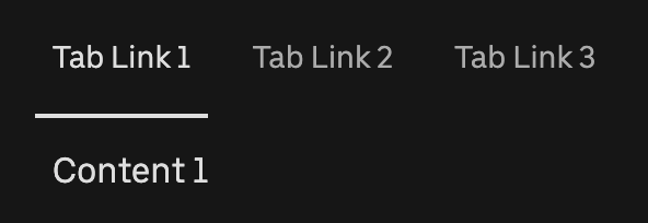
    All Base Tabs
    All Base Tabs
    Page Navigation Tabs
    Page Navigation Tabs
    New Base Motion Tabs
  • Pagination

    Base Web component documentation for Pagination.

    All Base Pagination
    All Base Pagination
  • Menu

    Base Web component documentation for Menu.
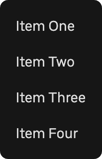
    All Base Menu
    All Base Menu
  • File Uploader

    Base Web component documentation for File Uploader.
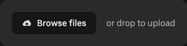
    All Base File Uploader
    All Base File Uploader
  • Phone Input

    Base Web component documentation for Phone Input.

    All Base Phone Input
    All Base Phone Input
  • Table Semantic

    Base Web component documentation for Table Semantic.
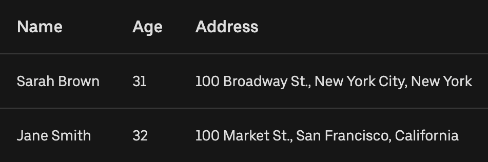
    All Base Table Semantic
    All Base Table Semantic
  • Tag

    Base Web component documentation for Tag.

    All Base Tag
    All Base Tag
  • List

    Base Web component documentation for List.

  • Heading

    Base Web component documentation for Heading.

    All Base Heading
    All Base Heading
  • Side Navigation

    Base Web component documentation for Side Navigation.

  • Timezone Picker

    Base Web component documentation for Timezone Picker.

    All Base Timezone Picker
    All Base Timezone Picker
  • Select

    Base Web component documentation for Select.

    All Base Select
    All Base Select
    Payment Method Select
  • Rating

    Base Web component documentation for Rating.

  • Textarea

    Base Web component documentation for Textarea.

    All Base Textarea
    All Base Textarea
  • Location Puck

    Base Web component documentation for Location Puck.

  • Tooltip

    Base Web component documentation for Tooltip.

  • Drawer

    Base Web component documentation for Drawer.
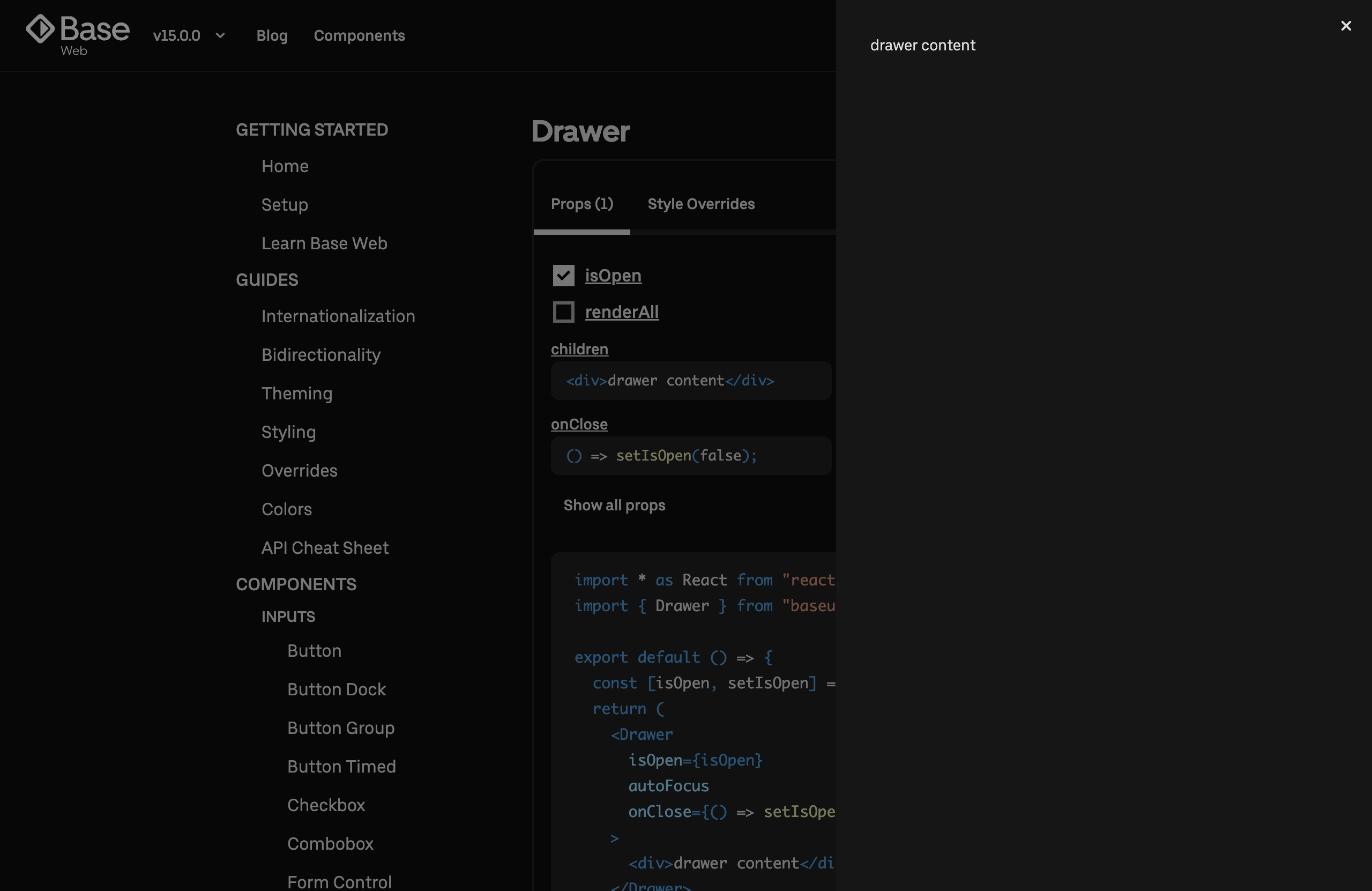
    All Base Drawer
    All Base Drawer
  • Spinner

    Base Web component documentation for Spinner.

  • Progress Bar

    Base Web component documentation for Progress Bar.

    All Base Progress Bar
    All Base Progress Bar
  • Breadcrumbs

    Base Web component documentation for Breadcrumbs.

    All Base Breadcrumbs
    All Base Breadcrumbs
  • Datepicker

    Base Web component documentation for Datepicker.

    All Base Datepicker
    All Base Datepicker
  • File Uploader Basic

    Base Web component documentation for File Uploader Basic.
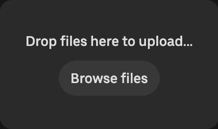
    All Base File Uploader Basic
    All Base File Uploader Basic
  • Popover

    Base Web component documentation for Popover.

    All Base Popover
    All Base Popover
  • Modal

    Base Web component documentation for Modal.
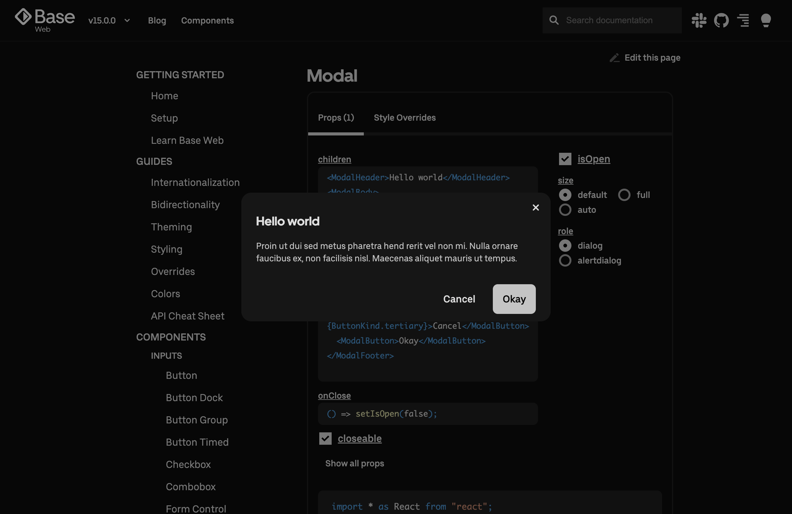
    All Base Modal
    All Base Modal
  • Card

    Base Web component documentation for Card.

  • Progress Steps

    Base Web component documentation for Progress Steps.
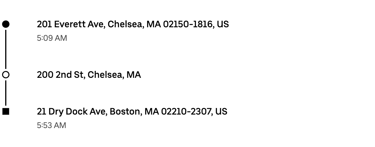
    Route
    Route
    All Base Progress Steps
    All Base Progress Steps
  • Notification

    Base Web component documentation for Notification.

    All Base Notification
    All Base Notification
  • Table Grid

    Base Web component documentation for Table Grid.
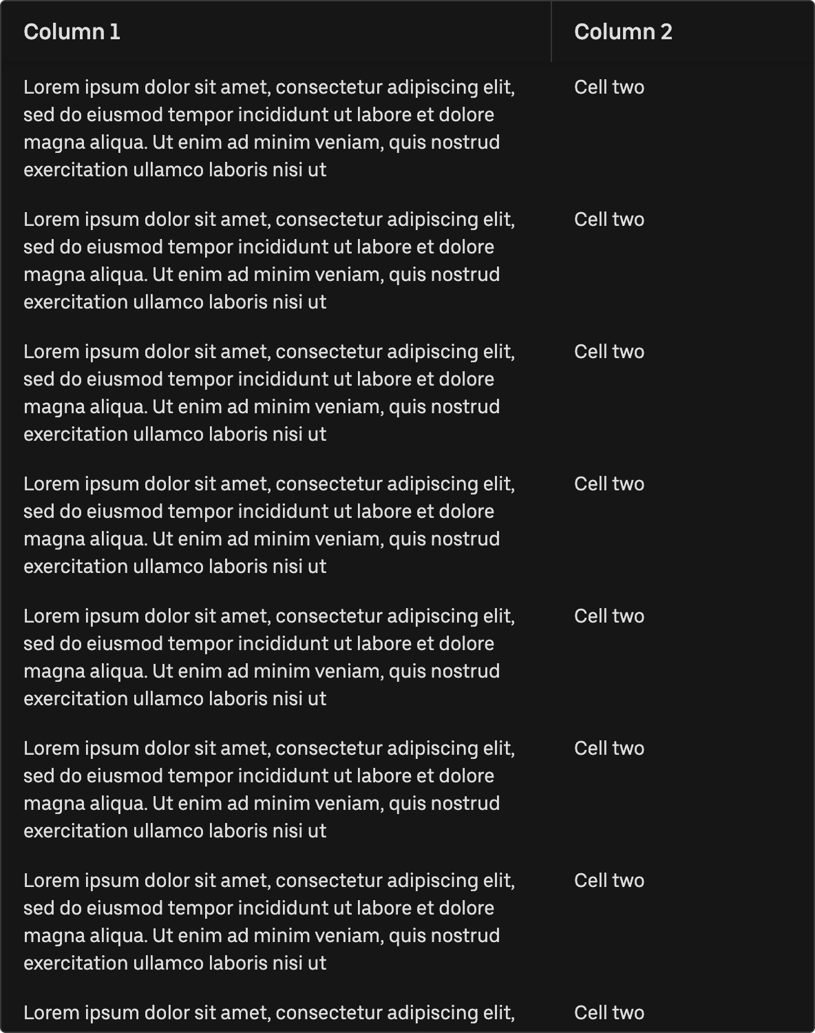
    All Base Table Grid
    All Base Table Grid
  • Table

    Base Web component documentation for Table.
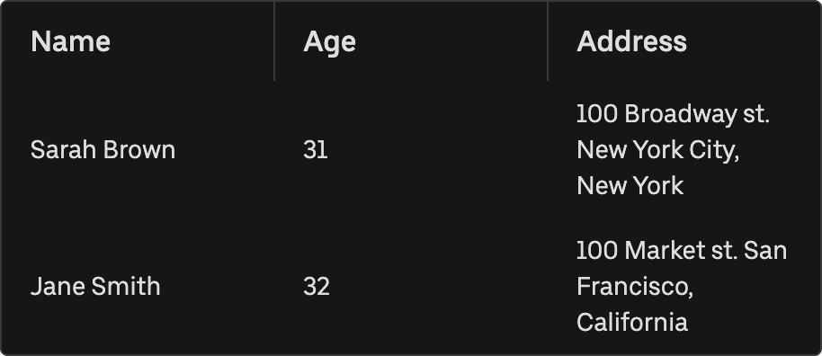
    All Base Table
    All Base Table
  • Tree View

    Base Web component documentation for Tree View.

  • Drag and Drop List

    Base Web component documentation for Drag and Drop List.
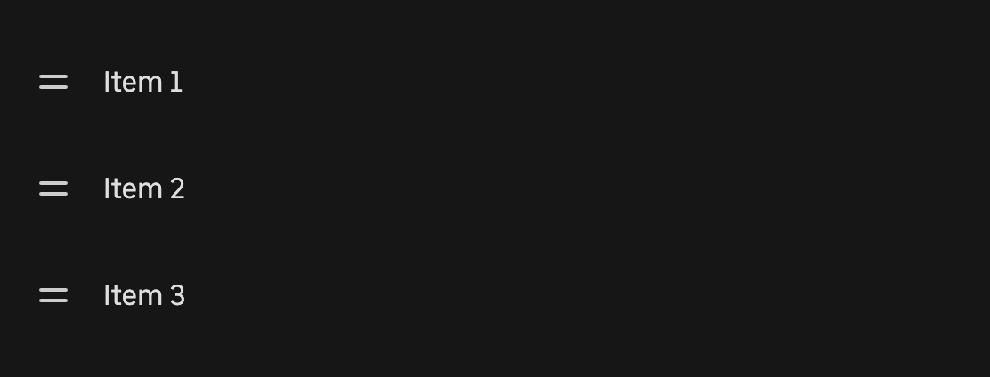
    All Base Drag and Drop List
    All Base Drag and Drop List
    Stop List
  • Accordion

    Base Web component documentation for Accordion.
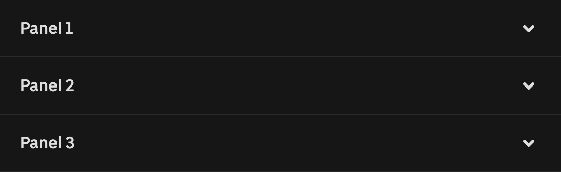
    All Base Accordion
    All Base Accordion
  • Link

    Base Web component documentation for Link.

  • Header Navigation

    Base Web component documentation for Header Navigation.

    All Base Header Navigation
    All Base Header Navigation
    Base Header Navigation
    Base Header Navigation
    Drive with Uber Base Header Navigation
    Drive with Uber Base Header Navigation
    Uber for Business Base Header Nav
    Uber for Business Base Header Nav
  • Time Picker

    Base Web component documentation for Time Picker.

    All Base Time Picker
    All Base Time Picker
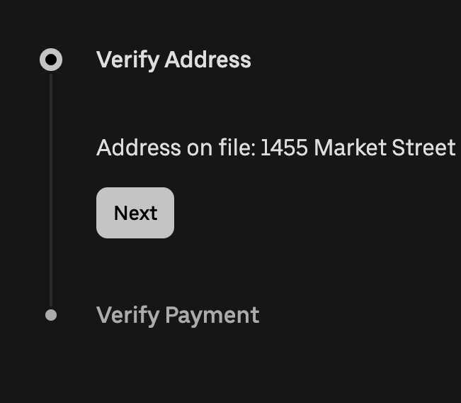
  • Payment Card

    Base Web component documentation for Payment Card.

    All Base Payment Card
    All Base Payment Card
  • Radio

    Base Web component documentation for Radio.

    All Base Radio
    All Base Radio
  • Input

    Base Web component documentation for Input.

    All Base Input
    All Base Input
  • Button Group

    Base Web component documentation for Button Group.
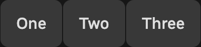
    All Base Button Group
    All Base Button Group
  • Checkbox

    Base Web component documentation for Checkbox.

    All Base Checkbox
    All Base Checkbox
  • Form Control

    Base Web component documentation for Form Control.

    All Base Form Control
    All Base Form Control
  • Slider

    Base Web component documentation for Slider.

    All Base Slider
    All Base Slider
  • Tile

    A tile is a button-like component that may contain additional controls for selection patterns. The elements inside a tile are stacked in a way that lends themselves to a tile shape which can be square or rectangular, depending on the layout.

    All Base Tiles
  • Badge

    Badges are small supplemental elements that highlight feature information or promotions within a user flow.

    Price Badge to Discuss
  • Segmented Control

    A segmented control is a linear set of two or more options with one segment selected at a time. A segmented control allows users to input, filter, change the presentation, or browse content in a view

    All Base Segmented Lists
  • Application navigation bar

    The navigation bar standardizes and creates a shared navigation experience across the applications and products. It enables users to orient and navigate different sections of applications reliably

    Uber Navigation Bar
Floating Marker
All Base Floating Route Marker
New Base Motion Tabs
Payment Method Select
Pickup Button
Pickup Button
Stop List
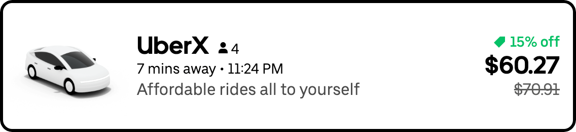
All Base Tiles
Similar to tiles but not
Ride Tiles to Discuss
Ride Details Tile
Ride Details Tile
Price Badge to Discuss
All Base Segmented Lists
Ride Option
Ride Option
Courier Options
Courier Options
Uber Navigation Bar