Infa.ai
Spectrum Design SystemComponents
Donut charts are ideal for comparing proportions of a whole. Each segment of a donut chart is mapped to a dimension value with an arc length determined by a metric.
A histogram shows distributions or the frequency at which specific metric values occur. It’s a useful way to show a more granular version of an average.
Line charts illustrate change over time. They’re useful for displaying chronological data.
A color loupe shows the output color that would otherwise be covered by a cursor, stylus, or finger during color selection.
In-line alerts display a non-modal message associated with objects in a view. These are often used in form validation, providing a place to aggregate feedback related to multiple fields.
Checkboxes allow users to select multiple items from a list of individual items, or to mark one individual item as selected.
A search field is used for searching and filtering items.










A swatch shows a small sample of a fill — such as a color, gradient, texture, or material — that is intended to be applied to an object.
Primarily for usage in timelines, a scroll-zoom bar lets a user scroll or zoom with the same control.
Code is a typography component used for text that represents code.
The close button is used inside of other components, like a [](https://spectrum.adobe.com/page/toast/)toast or an [](https://spectrum.adobe.com/page/action-bar/)action bar, for closing or dismissing its parent component.
Links allow users to navigate to a different location. They can be presented inside a paragraph or as standalone text.
Menus help users take actions, choose from a list of options, configure settings, and more. They can be placed in a transient container, like a [](https://spectrum.adobe.com/page/popover/)popover or [](https://spectrum.adobe.com/page/tray/)tray.
Scatter plots are useful for comparing the relationship of two metrics across many items.
Alert dialogs display important information that users need to acknowledge. They appear over the interface and block further interactions until an action is selected.
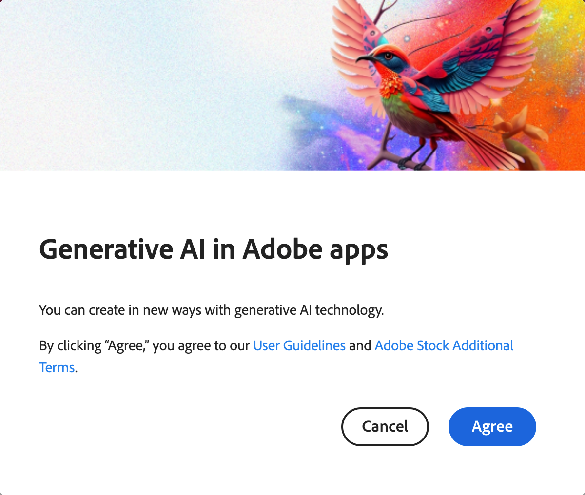
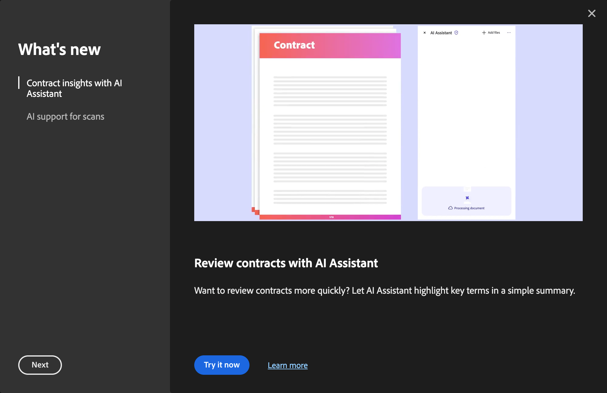
Coach marks are temporary messages that educate users through new or unfamiliar product experiences. They can be chained into a sequence to form a tour.
Contextual help shows a user extra information about the state of either an adjacent component or an entire view. It explains a high-level topic about an experience and can point users to more information elsewhere.
Tooltips show contextual help or information about specific components when a user hovers or focuses on them.
A color area allows users to visually select two properties of a color simultaneously. It's commonly used together with a color slider or color wheel.
A color slider lets users visually change an individual channel of a color.
A color wheel lets users visually change an individual channel of a color on a circular track.
Combo boxes combine a text entry with a picker menu, allowing users to filter longer lists to only the selections matching a query.
Field labels give context to the information that a user needs to input. They're commonly used in forms.
Pickers (sometimes known as "dropdowns" or "selects") allow users to choose from a list of options in a limited space. The list of options can change based on the context.
The rating component lets users apply a rating to an item or experience, such as an image, a forum post, an item for sale in a marketplace, and more.
Dividers bring clarity to a layout by grouping and dividing content in close proximity. They can also be used to establish rhythm and hierarchy.
Toasts display brief, temporary notifications. They're meant to be noticed without disrupting a user's experience or requiring an action to be taken.
A checkbox group is a grouping of [](https://spectrum.adobe.com/page/checkbox/)checkboxes that are related to each other.
Help text provides either an informative description or an error message that gives more context about what a user needs to input. It’s commonly used in forms.
A radio group is a grouping of radio buttons that are related to each other.
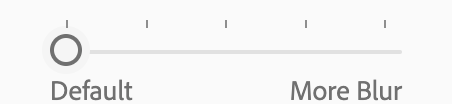
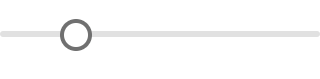
Sliders allow users to quickly select a value within a range. They should be used when the upper and lower bounds to the range are invariable.
A swatch group is a grouping of swatches that are related to each other.
Meters are visual representations of a quantity or an achievement. Their progress is determined by user actions, rather than system actions.
Trays are containers that display transient content such as menus, options, additional actions, and more. They only exist on mobile experiences and are used for exposing types of content that may be too overwhelming for [](https://spectrum.adobe.com/page/popover/)popovers.
An area chart shows changes to a metric over time, and can also show the breakdown (through a dimension) of a metric over time. This type of chart is great for showing overall trends, and is most useful when a metric has multiple dimensions and large differences between values.
Alert banners show pressing and high-signal messages, such as system alerts. They're meant to be noticed and prompt users to take action.




Most charts use a Cartesian coordinate system, with a vertical y-axis and a horizontal x-axis. Every axis uses a categorical, ordinal, interval, or ratio [](https://spectrum.adobe.com/page/data-visualization-fundamentals/#Glossary-of-terms)scale.
Legends (also known as keys) help users understand the relationship between data and its visual representation.
Bar charts are ideal for comparing different values that are hierarchically equivalent. Each bar is mapped to a dimension value with a length determined by a metric.
Heading is a typography component used to create various levels of hierarchies between text.
Action bars are used for single and bulk selection patterns, when a user needs to perform actions on either a single or multiple items at the same time.
Action buttons allow users to perform an action or mark a selection. They’re used for similar, task-based options within a workflow, and are ideal for interfaces where buttons aren’t meant to draw a lot of attention.
An action group is a grouping of [](https://spectrum.adobe.com/page/action-button/)action buttons that are related to each other.
Buttons allow users to perform an action or to navigate to another page. They have multiple styles for various needs, and are ideal for calling attention to where a user needs to do something in order to move forward in a flow.
A button group is a grouping of buttons whose actions are related to each other.
A big number is a table with one column and one row, displaying a metric value and a metric label. It is never used in isolation and relies on other elements in a view for context.
Switches allow users to turn an individual option on or off. They are usually used to activate or deactivate a specific setting.
Text fields allow users to input custom text entries with a keyboard. Various options can be shown with the field to communicate the input requirements.
An avatar is a thumbnail representation of an entity, such as a user or an organization.
Breadcrumbs show hierarchy and navigational context for a user’s location within an app.
Tabs organize content into multiple sections and allow users to navigate between them. The content under the set of tabs should be related and form a coherent unit.
A text area lets a user input a longer amount of text than a standard text field. It can include all of the standard validation options supported by the [](https://spectrum.adobe.com/page/text-field/)text field component.
Tags allow users to categorize content. They can represent keywords or people, and are grouped to describe an item or a search request.

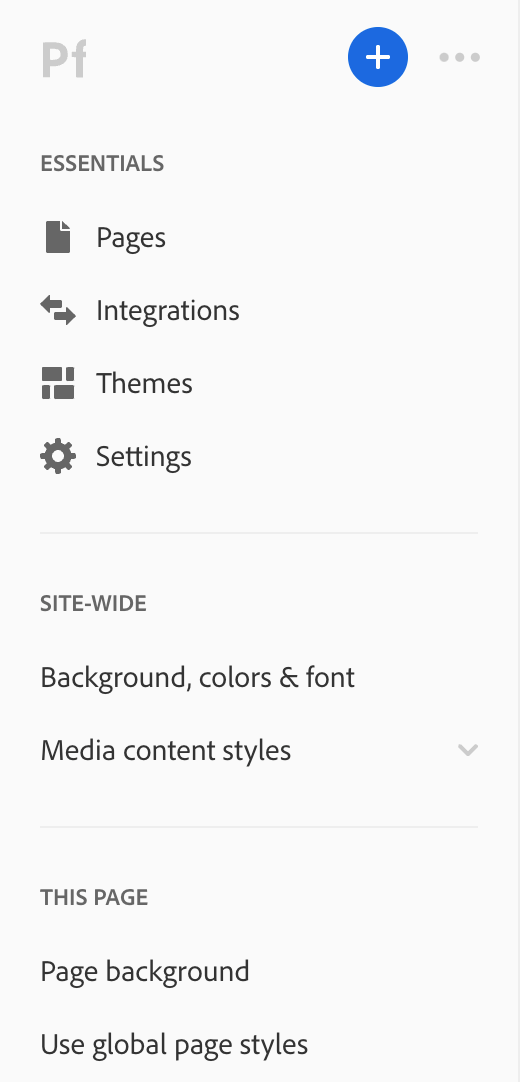
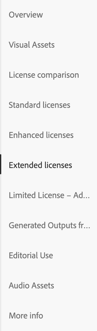
Side navigation lets users navigate the entire content of a product or a section. These can be used for a single level or a multi-level navigation.
A tree view provides users with a way to navigate nested hierarchical information.
Similar to [](https://spectrum.adobe.com/page/status-light/)status lights, badges are for showing a small amount of color-categorized metadata. They're ideal for getting a user's attention.
Progress bars show the progression of a system operation: downloading, uploading, processing, etc., in a visual way. They can represent either determinate or indeterminate progress.
Progress circles show the progression of a system operation such as downloading, uploading, processing, etc. in a visual way. They can represent determinate or indeterminate progress.
Status lights describe the condition of an entity. They can be used to convey semantic meaning, such as statuses and categories.
Body is a typography component primarily used within Spectrum components and for blocks of text.
Detail is a typography component used for disclosing extra information or smaller items in hierarchical relationships of text.