Infa.ai
Vibe Design SystemComponents
Accordion is a vertically stacked list of items. Each item can be "expanded" or "collapsed" to reveal the content within with that item.
Alert banners show pressing and high-signal messages, such as system alerts. They are meant to be noticed and prompt users to take action.
Use this component if you need to stack avatars as a group.

Attention box lets users know important information within content areas, as close as possible to the content it’s about. An optional smooth entrance animation can be used to enhance visibility.


Avatar is a graphical representation of a person through a profile picture, image, icon, or set of initials.

Badge component is responsible for layout an indicator/counter on a child component

Breadcrumbs allow users to keep track and maintain awareness of their location as they navigate through pages, folders, files, etc.
Buttons allow users to trigger an action or event with a single click. For example, you can use a button for allowing the functionality of submitting a form, opening a dialog, canceling an action, or performing a delete operation.






ButtonGroup can be used to group related options. To emphasize groups of related toggle buttons, a group should share a common container.
Checkboxes allow users to select one or more items from a set of options.
Chips are compact elements that represent an input, attribute, or action. They may display text, icons, or both.
Box component is used as a wrapper component. Its purpose is to help scaffold compositions while using Vibe's prop keys without writing new CSS. It can be used as a container for atom based compositions, it can accept all Vibe style related props and have a semantic html tag.
ColorPicker is our component for selecting our content colors
Combobox allowing users to filter longer lists to only the selections matching a query.
The dialog component's purpose is to position a popup component nearby another element, such as any kind of a button. Please be aware that the dialog component is not responsible for the appearance features of the popup, such as its background color or size.
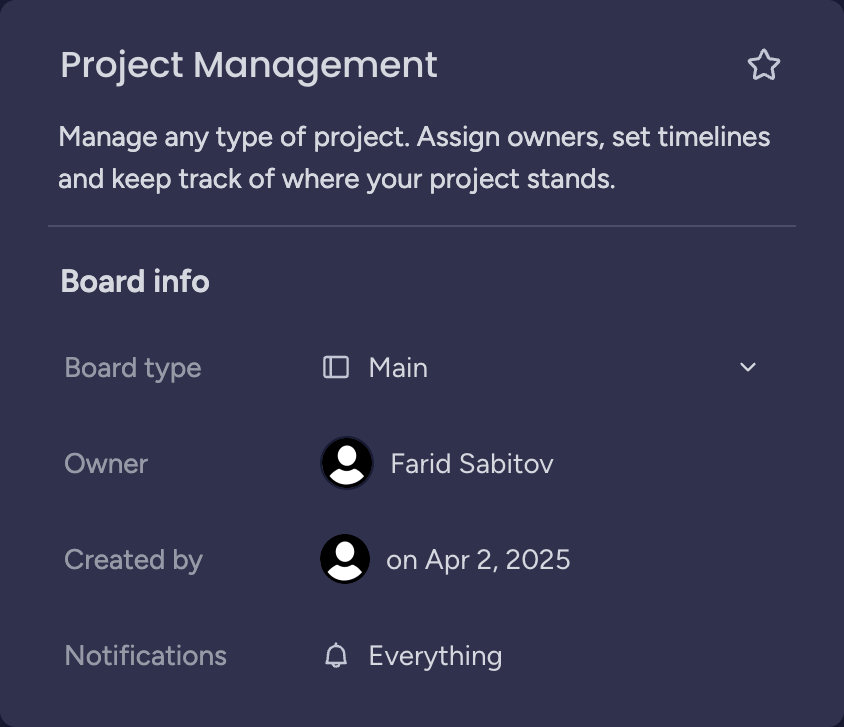
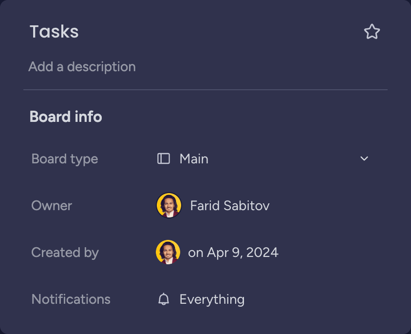
Editable text allows users to seamlessly and dynamically edit in-line content. Its default state is a read-view, based on the Text component, and it becomes editable after clicking on it.

Icon button is a square button contains only icon with no visible text labels used mostly in control bars.


Link is an actionable text component with connection to another web pages.

Circular loader indicates to user waiting state.
Use menu divider for create separation between to menu items inside a menu

The Side-by-side Modal offers a layout with two distinct sections. The left side is reserved for providing information or inputs, like text fields or dropdown. The right side is reserved for visual media that supports the content on the left, like an image that adds context. This layout works best when users need to reference visual elements alongside textual information. Open Modal
Skeleton loading componet used to indicate content and ui loading that will appear after its loaded. It helps to decrease perceived duration time
A split button is a dual-function menu button that offers a default action as well as the possibility of choosing a secondary action, by selecting from a set of alternatives.


A field that allows users to write multiple lines of text. Text area includes a label and a field that users can type into. It can also come with helper text.
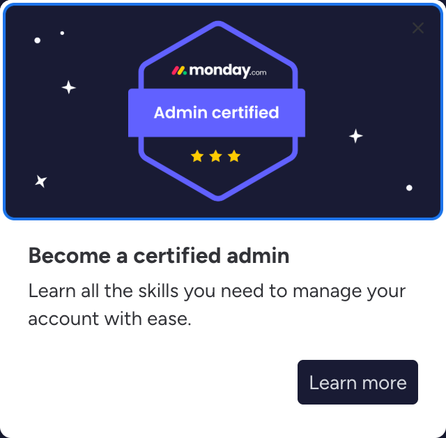
Tipseen is a virtual unboxing experience that helps users get started with the system and discover new features.
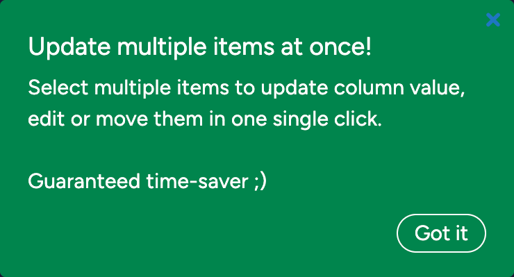
A toast notification is a message object that presents timely information, including confirmation of actions, alerts, and errors.
Tooltips provide helpful information and can include detailed context about a specific component when a user hovers on it.
Counters show the count of some adjacent data.
This component is a style component, it provide the look and feel of elevation.
Editable Heading allows users to seamlessly and dynamically edit in-line content. Its default state is a read-view, based on the Heading component, and it becomes editable after clicking on it.


Icon component is our component to unify the supported icon types (Vibe Icons, FontIcon and Custom SVG Icons)
Progress bars show continuous progress through a process, such as a percentage value. They show how much progress is complete and how much remains.
An item of a List component
MenuGridItem can be used to place a grid-like, keyboard navigable container, inside a Menu. The user will be able to interact and navigate into and from the grid in a natural way.
The Basic Modal is intended for straightforward tasks, like selecting items or gathering basic information. Basic Modals help users focus on a single task without distractions. These modals do not support images or videos.
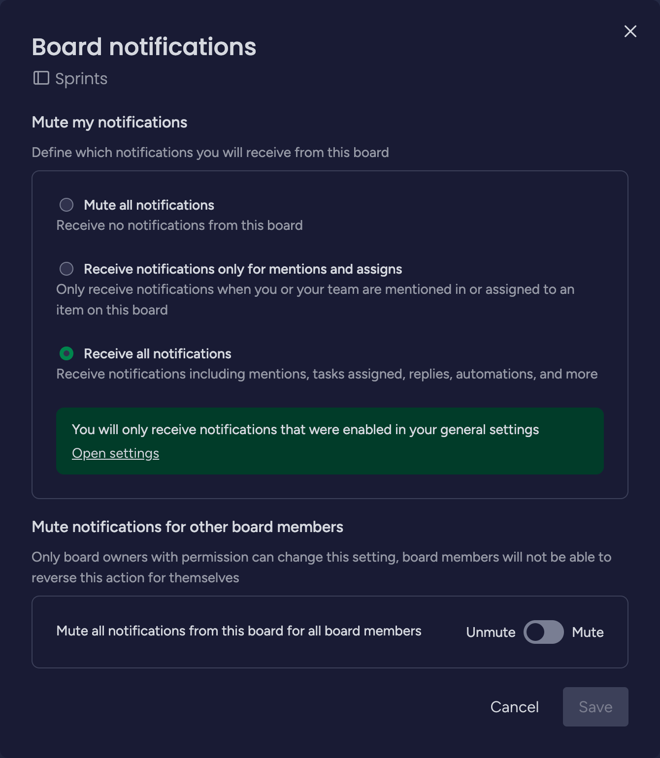
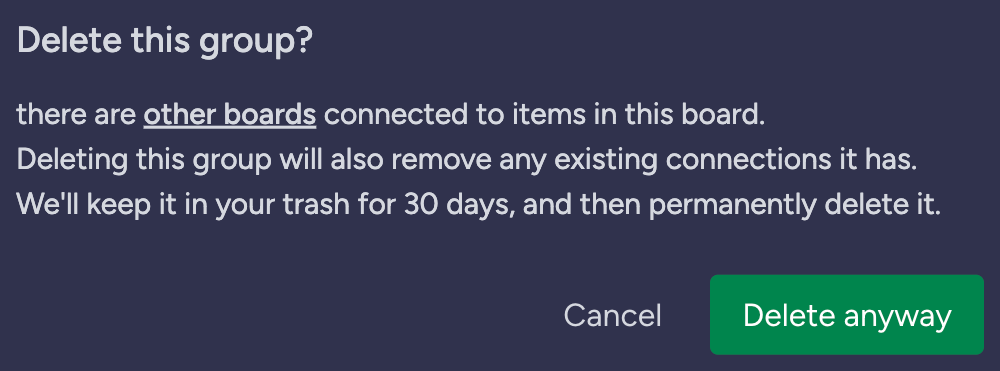
A radio represents an item in a single selection list.
Search lets users quickly find relevant content. A search field allows a user to type a word or phrase to filter through a large amount of data without navigation.




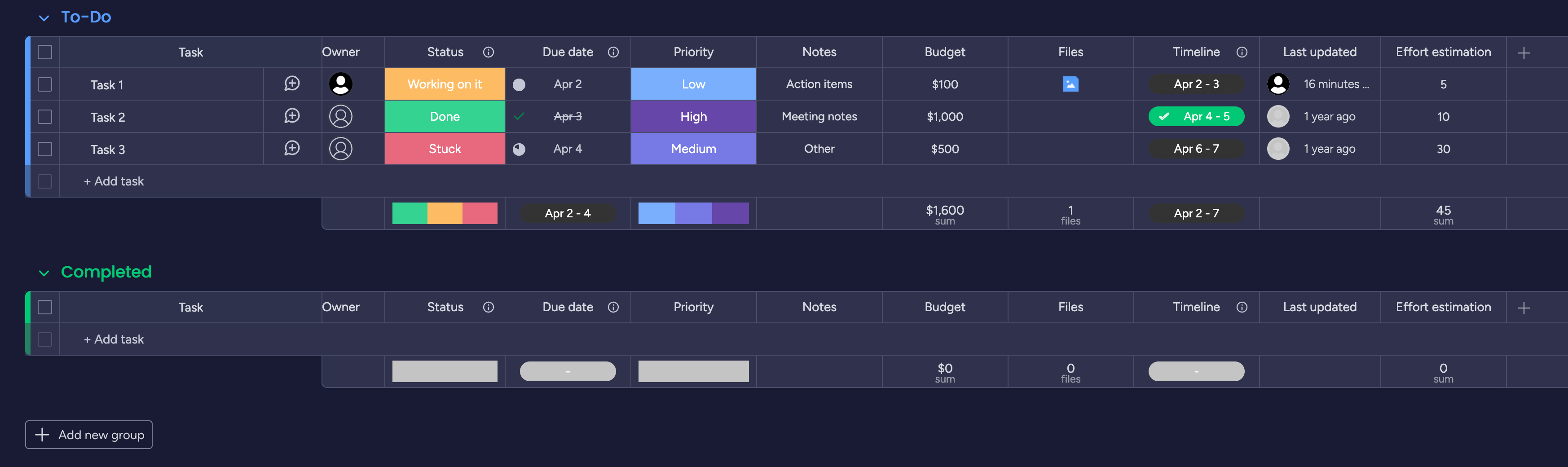
Tables are used to organize data, making it easier to understand.
An input field includes a label and a text field users can type text into. They typically appear in forms and dialogs.




Allow users to turn an single option on or off. They are usually used to activate or deactivate a specific setting.
VirtualizedList is a component which only renders visible list items, it is a logic component and doesn't change and look and feel
A simple and reusable Datepicker component
Divider create separation between two UI elements
Dropdown present a list of options from which a user can select one or several.


ExpandCollapse is a component that allows you to hide and show content.

A label indicates the status of an item.

Lists is a group of actionable items containing primary and supplemental actions, which are represented by icons and text.
A menu is a navigable contextual list of items that can be selected
Use menu item for drawing one options that displayed inside a menu.


MenuButton is a component that opens a Dialog next to a button, the content of the dialog could be anything you want.
The Media Modal includes a highlighted media section, followed by a textual content area. This modal is intended for cases when you need to catch the user’s attention using visual elements before they interact with the text. It’s ideal for introducing new features or short onboarding flows
Tabular navigation component that helps users visualize and interact with a multi-step process
Slider is a visual input component that reflects current state status in its appearance.
Steps display progress through a sequence of logical and numbered steps. They may also be used for navigation.
Tabs allow users to navigate between related views of content while remaining in the context of the page.



VirtualizedGrid is a component which only renders visible grid items, it is a logic component and doesn't change and look and feel