Infa.ai
Microsoft Fluent 2Components
A field is a combination of a label and any form component, like an input or a select. Optionally, fields can also have info buttons, helper text, and validation states to give people clues about the information they need to enter. Types ----- Fields can be used with any component that asks someone to enter information. For more information on which type of field is best for your use case, see the following pages: * Behavior -------- ### Validation Fields have styles baked in to support inline feedback after validation. Validation states will change the visual presentation of the field, for example changing to a red border in the error state. Validation states also allow for a validation message to guide people in how to move forward. Use the validationMessage prop to display a message describing the state. Validation messages have default icons but you can choose to override the default icon with validationMessageIcon. Success Warning Error
A toolbar gives access to frequently used actions related to someone’s current view or task, like text formatting in an editor. ### Overflow A toolbar will grow to fit its parent container but will never wrap onto a second line. In cases where there are more options than can fit, use the overflow utility. This changes the last option to an overflow menu button that surfaces the rest of the toolbar options. Use a text label along with the toolbar item icon in the overflow menu.
An info label is a label paired with an info button that shows additional content in a popover when selected. Use an info label whenever you need to show supplemental info in a popover. If you don’t need to show additional info, use a standard Label for better performance. Don’t use the info button for critical information needed to complete a task. Instead, put critical content where it’s always visible, like in helper text. For more info on surfacing information, go to Field and Popover. Layout ------ The info label accounts for proper placement between the label, info button, and popover. When the popover appears, its beak is centered on the info button, and the popover appears above, below, or to either side of the info button. Placement of the popover is programmatically determined so that it is least likely to block essential information. Avoid cluttering an interface with multiple info labels, as this can result in cognitive overload, especially for people using keyboards and screen readers. If you think you need more than a two or three in one area, it may point to larger design issues that prevent at-a-glance clarity and ease of use. Consider simplifying the experience if possible. If the information in the popover is long or critical to completing the task, consider summarizing some or all of it in an introductory paragraph instead of using an info label with popover.
A tooltip provides supplemental, contextual information elevated near its target component. Tooltips should be used to provide helpful but non-essential, plaintext information. Don't use them to communicate system feedback. If you need to deliver robust, formatted information, use a popover instead. Content ------- Use tooltips to provide additional—not redundant—information. Limit the content in a tooltip to just the essentials. If a component is unlabeled, use a simple descriptive noun phrase in sentence case with no end punctuation. For enabled components that could use some explanation, tooltips should describe what the component lets someone do, i.e. “Find text in this file.” Don’t use end punctuation unless there’s at least one full sentence. For disabled components, tooltips should provide the circumstances that can enable the control. Only use periods for complete sentences.
An input allows people to enter short, free-form text data. If you need to collect more than one line of information, try a textarea. ### Masks Inputs can be masked or have custom type attributes that will affect their formatting. Input masking can work like placeholder text to help people enter data in a specific format, like a phone number with hyphens at particular intervals. Fluent doesn’t currently apply custom styling to masked inputs and some input types may trigger browser-based formats that don’t align with Fluent’s design language.

Labels give a name to a component or group of components. Pair them with components like checkboxes and inputs to prompt someone to enter certain information, or with plain text to categorize information. When using a label with a form component to gather information, use the asterisk to indicate whether the information is required before moving on. Don’t use placeholder text in place of labels.
A link is interactive text that lets people navigate somewhere else, either within an experience or to a different app or site. Don't use links for triggering actions other than navigation. To create a secondary action with low visual emphasis, try a transparent or subtle button instead. Types ----- Default Default links are styled the theme color. These are the most accessible link style and should be used most of the time. Subtle Subtle links are the same color as body copy and are less accessible than default links. Use subtle links for less visual weight but consider adding other cues that they’re selectable, like an icon.
A menu is a hidden list of options that is shown when someone interacts with a trigger component, like a button, an avatar, or an icon. Usually, the options in a menu initiate an immediate action or navigate someone to a new context. If you need to collect information from people, try a select, dropdown, or combobox instead.
An accordion groups sections of related content that can be opened and closed. Accordions decrease cognitive load by letting people choose which sections of content they see, like questions in an FAQ. Never put information that's required for the current task inside an accordion. Consider a treatment that gives it more prominence. ### Closed by default By default, accordions items are closed. If it’s helpful to give information prominence and have it be seen automatically, specify which accordion items should be open by default. ### Multiple open items Accordion items automatically close when another is opened. Sometimes, people may prefer to have multiple items open at once. Allow this in scenarios where multiple open items won’t be overwhelming. Never put information in one accordion item that needs to be referenced in another accordion item.
A message bar communicates important information about the state of the entire product or the surface where it appears, such as a page, drawer, dialog, or card. If the message is intended to prevent a destructive action, try a dialog instead. If the message is time-sensitive, but relates to an activity or status from a different location, try a toast notification instead. Types ----- Info Use an info message bar to communicate helpful information that doesn’t require immediate action but that could improve an experience. For example, when an app has updates or a report can be personalized. Link and buttons are optional. Success Use a success message bar to communicate that something went right related to the surface where it appears, the whole app, or a task someone just completed. Link and buttons are optional. Warning Use a warning message bar to inform about temporary states, like connectivity issues, or states that could become harmful or destructive. Warnings alert people to potential consequences, but don’t prevent them from moving forward in a task. Warnings must include a button, link, or both to help prevent a problem. Error Use an error message bar when something goes wrong that needs to be addressed before continuing, like an application losing connection or entering invalid information. Errors block people from moving forward in a task. Error message bars must include a button, link, or both to help resolve the problem. *
An avatar shows an image or text to represent a person or group as well as give additional information like their status and activity. If you need to represent many avatars, try avatar group. Types Standard Standard avatars are circular containers that generally represent an individual. Group Group avatars are square containers and represent many people, like teams, organizations, or companies. Behavior -------- Avatars can include presence badges to indicate the status of an associated person. Avatars can include activity rings to indicate when a person is currently collaborating in a shared activity, like speaking in a Teams call or typing in an Office document.
A persona is a representation of a person with additional contextual information. Personas usually include an avatar, a presence badge, and up to four lines of text content that provide additional data about that person. Layout ------ ### Text slot wrapping By default, the text slots in the persona will wrap to the next line when the container becomes too small. ### Presence only In busy layouts, or layout where space is confined, use the presenceOnly prop to remove the avatar from the persona. This results in the presence badge showing near the person’s name.

An avatar group shows multiple avatars. Types ----- Avatar spread The avatar spread is the default configuration for multiple avatars. Avatar stack The avatar stack is a more condensed configuration in which the avatars overlap each other. Avatar pie The avatar pie shows two to three avatars in a single circular container. It’s used in cases where space is extremely limited, like the Teams group chats.

A popover is a small surface that appears when someone interacts with a component to give nonessential, contextual information without blocking them. Popovers can have structured content and interactive components. If you need to show a more complex layout or block the page behind, try a dialog. For unstructured plain text, try a tooltip. Layout ------ ### Sizing and overflow By default, there are no size constraints on popovers. They’ll grow to accommodate the content within them. For the best user experience, limit the dimensions of popovers so that they fit the needs of your layout without blocking any important information in the main UI. For overflow content in a popover, set overflow: scroll to make any hidden content accessible. Vertical scroll Horizontal scroll If content exceeds the available width or height of the popover. The overflow content is available through scrolling. Scrollbars should ideally only be used in 1 axis - Horizontal or Vertical. Except for parts of the content which require two-dimensional layout for usage or meaning. ### Positioning Position popovers so that people can tell what the information relates to. Don’t cover important information that’s helpful to see at the same time as the popover content. In Figma, set the beak position with the beak component property. In code, use the positioning prop and positioning shorthand .
A badge is a visual indicator that communicates a status or description of an associated component. They use short text, color, and icons for quick recognition and are placed near the relavant content. Layout ------ ### Placement Badges should be placed on or near the component they describe. They should be close enough that people can make intuitive connections between a badge and its associated component. For example, an online status badge can be placed on top of or offset on an avatar component. Placed on top Placed next to ### Color Use badge color intentionally within a layout to draw focus to the areas of highest importance. If you need to use warning and danger colors on a badge, give people a way to resolve the problem whenever possible. Use color, especially semantic color, to show what to do next. ### Size Avoid mixing badge sizes in the same context. * Accessibility ------------- ### Focus By default, badges don’t receive focus. If you build interaction into a badge, like including a tooltip for more context, make sure to include focus. Tooltips can help surface additional information without cluttering a layout. ### Aria labeling If a badge is only an icon, its information needs to be communicated with an aria label. If the badge is connected to another component, that component’s aria label should communicate the badge’s information. * Content ------- Badges with text should be short and descriptive. Aim for one or two words that describe a state. Don’t try to include too much. Use sentence style capitalization—only capitalize the first letter of the first word. For more info, see Capitalization in the Microsoft Writing Style Guide. Use words that describe a state or status. Avoid labels that will truncate.
Progress bars communicate system information, like how much cloud storage someone is using in OneDrive, or task information, like how long until a download is complete. Progress bars should only be used for tasks that take longer than a second. If you’re loading new content with a known structure that doesn’t block the UI, try a skeleton. ### Static progress bars Use progress bars with no animation to communicate a static percentage. For example to show system progress scenarios, like indicating how much storage is left. ### Determinate and indeterminate Progress bars can be either determinate or indeterminate, depending on the needs of your app and the capabilities of the technology you’re building on. Determinate Determinate progress bars let people know how much of a task has been completed and how much remains. Use determinate progress bars whenever possible. They offer a better user experience than indeterminate progress bars since they communicate status and assure people things are still working. Indeterminate Sometimes, it’s not possible to gauge how long something will take and it’s necessary to use an indeterminate progress bar. Indeterminate progress bars don’t provide any reassurance that things are still working, so only use them for short tasks. Watching the bar cycle for too long could make people think something’s gone wrong. If enough data is gathered after a task starts and it becomes possible to communicate how much time is left, switch to a determinate progress bar. If there’s very little time left, complete an animation cycle before transitioning from the loading state. Don’t interrupt an indeterminate progress bar in the middle of an animation.
A breadcrumb helps people understand and move through the hierarchy of a complex site or app. It lists at least two location names, usually links, separated by dividers. Breadcrumbs are secondary navigation. They provide wayfinding and fast access to higher levels of the hierarchy. Don’t use breadcrumbs alone. Always combine them with other navigation elements, like top or sidebar navigation. For the best experience, include a tooltip on hover to give people an indication of the overflow items without having to open the menu. ### Non-interactive file paths If you need to communicate a file path that provides context but no navigation, use a text string following the non-interactive file path pattern. The non-interactive file path is a text-only variant that’s purely informational. It’s best used for file paths in a task flow where people can’t navigate or wouldn’t want to leave their current context. The divider can be either a chevron or a forward-slash. Include a space on either side of the divider to differentiate it from a conventional file path without spaces. * Layout ------ 1. Divider creates a visual delineation between breadcrumb items. 2. Current item visually indicates the current location.
Radio groups let people select a single item from a short list. Use them in layouts that offer enough space to list up to five options or if it's important to view all options at once. If there isn't enough space, try a dropdown instead. If you need to let people select more than one option, use checkboxes. To let them immediately turn a setting on or off, try a switch. Behavior -------- ### Default selection Present a selected option in radio groups by default. The default selection should be placed first and should be the most logical response. Remaining options should be listed in a logical order. For more information, see the Content section. *
A slider lets someone set a value from a given range. Sliders can take immediate effect, like a volume control, or can require a submission, like in a form. Use a slider for imprecise values. Don't use them for ranges that are very small or very large. For precise numerical inputs, like a dollar amount, try an input. Types ----- Default Default sliders let someone choose any approximate value along an unmarked range, like brightness controls. Step Step sliders divide a track into discrete values, like screen resolutions settings, and will snap the thumb to the specific value closest to the where the track was selected.
A button triggers a single action or event. Use buttons for important actions like submitting a response, committing a change, or moving to the next step. For navigating to another place, try a link instead. Types ----- Button A standard button initiates a single action or event. Split button A split button lets someone take one of several related actions. The dominant action is the button label and additional actions are tucked away in a menu. The dominant action should not be repeated in the menu. Menu button A menu button toggles the display of a menu of options. Unlike the split button, the menu button does not surface a primary action. Compound button A compound button includes a main title and an additional description of the title. Use it when it’s helpful to include more detail. *



A select lets people choose a single option from a list of at least four options. Selects use browser native styling for the listed options. They are ideal for data submission in forms and ease of use on mobile platforms. If you need to control the styles or format the options in the list, try a dropdown. If you need to let someone type in the visible field to submit a free form answer, or to filter the list of options, try a combobox. For a standardized form component including helper text and validation styles, use the select field component. Behavior -------- ### Default selection On first render, selects will show the first option in the menu as the default selection. You can change the default selection by defining the defaultValue prop on the select element or by using the selected prop on the appropriate option element. Default selection behavior
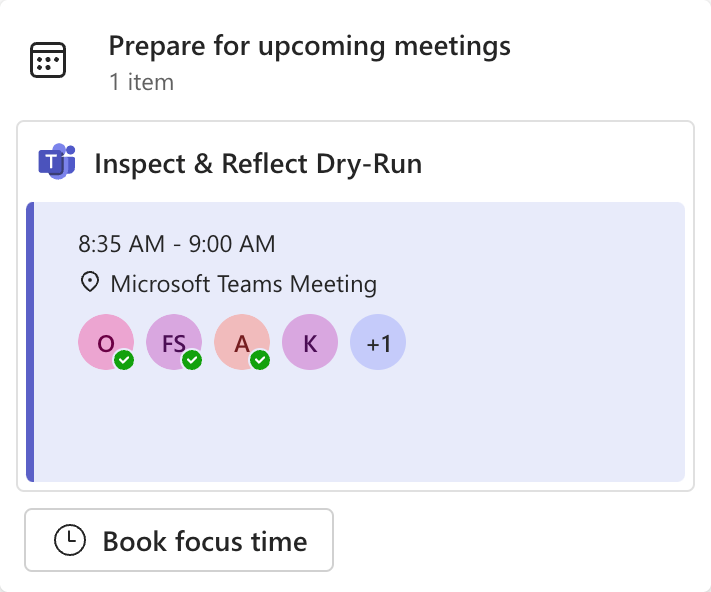
A card is a container that holds information and actions related to a single concept or object, like a document or a contact. Cards can give information prominence and create predictable patterns. While they're very flexible, it's important to use them consistently for particular use cases across experiences. Layout ------ ### Anatomy Card anatomy is flexible based on the needs of the card. Use the CardPreview, CardHeader, and CardFooter components to organize images, titles, body content, and actions within the card. Consider the hierarchy of information within the card and how it can be organized into sections. For example, names and titles in the header and actions in the footer. ### Alignment Cards can be aligned vertically or horizontally. Vertical cards are made up of slots for a header, a body, and a footer. Horizontal cards can have a header and a body, which will appear left to right. All slots are optional. Horizontal Vertical ### Card interactions Cards can provide people with interactions in a number of ways. When there are multiple available actions, a card can hold buttons and links. If there is one obvious action, the entire card surface can function as a button. Cards can also be used to let people make a selection, similar to checkboxes or radio groups. By default, there is no indicator on cards that signifies they are selectable but interaction states like hover and focus can hint to selectability. For a stronger signifier, use the floatingAction prop to build in additional cues.


A skeleton lets people know that a section of content is loading without blocking other parts of the page. Skeletons are great for hinting at the structure of information in a layout. Use them to gradually load content that takes longer than a second. If you don’t know the structure, try a progress bar or spinner. Skeletons let people know something is happening, but not how long until it’s done. Avoid them for long processes. Layout ------ ### Communicate what’s essential Use skeletons to prep people for new data. Don’t use them for fixed parts of a layout, like tabs in an app bar. When loading dynamic components with variable final content, use the skeleton to communicate consistent, high-level information. Most importantly, keep it simple. For example, if loading a persona, the skeleton should reflect an avatar, a title, and a subtitle. There’s no need to reflect specifics, like a presence badge, even if they’re present in the loaded content
Checkboxes let people select multiple options from a group or switch a single option on or off. To restrict someone to picking one option, try a radio group or dropdown. Checkboxes don't trigger an immediate change and require a submission step, like selecting a button. If you need a component that has immediate effect, try a switch. Behavior -------- Indeterminate state If one checkbox can control a subset of options, selecting or clearing the parent checkbox selects or clears all of the children. Use an indeterminate state to show when some, but not all, of the options are selected. Create a visual separation between parent and child checkboxes to increase scannability. For example, indenting the children makes it easy to infer what will happen if someone selects the parent. Layout ------ Single Use a single checkbox when there’s a yes or no choice to make. Group Use a checkbox group when someone can select multiple options. It’s best to limit checkbox groups to seven options. If you have more than seven, consider splitting them into separate groups to make them easier to scan or tuck them away in a combobox or dropdown. Content ------- 1. Group label (optional) describes a group of checkboxes. 2. Checkbox label (required) clearly communicates what will happen if the checkbox is selected.
A spin button is a specialized input that lets someone easily increase or decrease a value within a set range, like dates in a month. Spin buttons are good for precise increments in small ranges. If the range is very large or very small (less than three values), use an input instead. If the values can be imprecise and a visual representation of the value on the range is helpful, try a slider. ### Disabled spin buttons When min or max values are reached, the appropriate spin button is disabled to let people know that they’ve reached the end of the range and can’t go any higher or lower. While the spin buttons may be disabled, the input itself must always be enabled to reach an accessible target size. ### Units of measurement If there is a unit tied to the spin button, include it in the placeholder text by default. For example, “0 cm” or “12 pt.” For more info, see Units of measure terms in the Microsoft Writing Style Guide.
Spinners visually communicate that something is processing. They’re used for loading states that take more than a second. Spinners don’t show how much time is left before the process is done. To communicate a more specific status, try a determinate progress bar instead. Layout ------ Spinners should be centered over the section of the page that’s loading. If only one section is loading, the spinner shouldn’t block interaction with other sections on the page. Content ------- Be as specific as possible about what’s happening. If possible, reflect the action word that triggered the spinner. If no action has been taken yet, describe the background process in clear terms. For example, “Connecting to data …” instead of “Working on it …” If it’s not possible to be specific about what’s happening, avoid vague words, like “loading” or “authenticating.” Instead, use “Getting things ready …”
A combobox lets people choose one or more options from a list or enter text in a connected input. Entering text will filter options or allow someone to submit a free form answer. Comboboxes work well in situations where the list of options is very long. If the list is not very long or you can't accept free form answers, try a dropdown or a select. For a standardized form component including helper text and validation styles, use the combobox field component. Behavior -------- ### Placeholder text and default selection If the placeholder prop is not set, comboboxes will show as empty until a selection is made. Use placeholder text as an extra hint that helps people understand the options in a combobox or what they can enter in the field. Don’t use placeholder text to label the combobox. To display a default selection instead of placeholder text, use the defaultSelectedOptions prop. ### Single select comboboxes Selecting a closed field opens the list of options. Choosing an option from the list will close the field and the selected text replaces the placeholder text. ### Multi-select comboboxes For multi-select interactions, each list item is accompanied by a checkbox. The list of options won’t close until it is dismissed it, either by clicking off the list or by pressing Esc. Set the multiselect prop to true to enable multiple selections. Because combobox inputs always allow people to enter information, the selections will not replace the placeholder text by default. For best usability, build in other ways to show people the selections they’ve made without opening the menu, like showing their choices as tags in the input. ### Filtering and free form submission Comboboxes allow people to filter the list of options as they type. If the someone types a string that doesn’t match any option in the list, you can allow submission of their free form entry by using the freeform prop.
A switch lets someone choose between two mutually exclusive options, like on or off. Activating a switch triggers an immediate change. If you need a component that requires a submission step before applying a change, or if you need to specify an indeterminate state, try a checkbox. Layout ------ Use switches with labels in most cases. Labels can appear on top of or on either side of the switch. If you use a switch without a label, it must appear in a context that’s obvious. For example, in a data grid where the switch is represented by the column header. Content ------- ### Labels Use a noun or short noun phrase for the label that describes the switch setting. Using only nouns in addition to the visual and programmed cues is often enough to infer state. If nouns are awkard or ambiguious, add verbs to help clarity. Verbs should always describe the positive state of the setting. Don’t use “Turn on” or “Turn off” in switch labels. Instead, use specific verbs that describe what it means for the setting to be enabled. Use specific verbs in switch labels if it helps clarity Ambiguous nouns and state indications in labels can cause extra confusion Use sentence case with no end punctuation in switch labels. Never make a switch label a question. Questions as switch labels can increase cognitive load ### Including more info If you need to include an additional indication of a switch’s state, use a tooltip. If you need to include more information about the setting a switch triggers, try a switch field with an info button or helper text. If it makes sense to guide people away from the interaction to give them more information, try a link to learn more about the topic. However, use caution when taking people away from their original context.
A dialog is a supplemental surface that can provide helpful interactions or require someone to take an action before they can continue their task, like confirming a deletion. Dialogs are often interruptions, so use them for important actions. If you need to give someone an update on an action they just took but that they don't need to act on, try a toast. If you need to give someone additional context that doesn't affect their current workflow, try a popover. Types ----- Modal A modal dialog disables the page content behind it and usually obscures or dims it to surface its content. Use it when someone needs to perform a focused task, like signing into an app. Non-modal A non-modal dialog allows someone to continue interacting with the page content behind the window and aids in their workflow, like find and replace. Use it as a helper in a task. Alert An alert dialog is a modal that requires someone to make a decision. Alert dialogs have a special role that allows assistive technologies to treat them more urgently than other dialogs, like playing a system alert sound. Alert dialogs are forceful interruptions. Use them only in cases of potential loss, like unsaved changes or confirming destructive actions. Layout ------ Dialogs are laid out in three sections: 1. A header, which can contain a title and a dismiss icon 2. Optional body content 3. Optional footer, which can contain up to three actions. If using the dialog without a footer, include an additional 24-pixel padding to the bottom of the container.

A tablist allows people to switch between categories of related information without going to different pages. They’re are ideal for dividing content-heavy pages into distinct but related categories that are easier to process and require less scrolling. Tabs can also be used for navigation between a small set of closely related, frequently accessed pages. For navigation beyond closely related categories, use a link instead. To initiate an action, use a button instead. Layout ------ Tablists are laid out horizontally by default but can optionally be laid out vertically. Tabs in a horizontal tablist won’t scroll or wrap to the next line. This means they are limited by the width of their container. If you need to show more tabs, include an overflow menu button. Horizontal Vertical Tab labels may be text-only, text with an icon, or icon-only. Choose a single format that works for all tabs in the tablist. Tablists are less effective in smaller layouts that push several tabs into an overflow menu, making them harder to find. When space is limited, consider other options for switching content views, like an accordion or dropdown. In smaller layouts, a dropdown might be preferable to a tablist
The text component codifies Fluent's opinions on typography to make them easy to use and standardize across products. Use the text component for plain text. For hypertext, try a link instead.
A divider groups sections of content to create visual rhythm and hierarchy. Use dividers along with spacing and headers to organize content in your layout. Types ----- Block Block dividers span the width of their container. Use them to create strict distinctions between items. Inset Inset dividers don’t extend to the edges of a container and imply closer relationships. Use them to group similar items.
A tag is a representation of a value that someone has picked, like recipients for an email or categories on a planner task. Tags create a visual pattern that lets people know they can change or remove the selection. To show system-generated data that people can’t change, use a badge instead. Types ----- Tag Use a tag when you only need to provide information and when the only possible action is dismissal. Interaction tag Use an interaction tag when you can provide more information or actions related to what the tag represents. * Behavior -------- ### Dismissal Both tag types are optionally dismissible. Enable dismissal actions to let people undo their choices. For example, selecting the dismiss action on a category tag in a Planner task clears the selection and removes the tag from view. Non-dismissible tags communicate that a selection is not editable in the current context. Use them to continue the visual pattern that people can change the selection when they enter an editable state.


A drawer is a secondary content surface that slides in from one edge of a layout. Use drawers for supplemental info and simple actions related to the main content. For short information that’s related to a specific part of the main layout, a drawer may be overwhelming. Try a tooltip or a popover instead. If you need people to confirm an action they’re trying to take, use a dialog. Types ----- Inline An inline drawer is a passive surface that sits side-by-side with main page content. Use inline drawers when it’s helpful to view and interact with main content and drawer content at the same time. Overlay An overlay drawer is an intrusive surface that covers all or part of the main page content. Use overlay drawers to draw more attention to the content in the drawer.
A textarea allows people to enter long, free-form text data, like a comment. If you only need someone to enter one line of information, try an input instead. Behavior -------- By default, textareas are not resizable. If there is overflow content, the textarea will scroll. Optionally, you can change the value of the resize prop to let people control how large the textarea is and how much information they see at once.
A dropdown lets people choose one or more options from a list. It can be used in forms to gather information where the options require custom styling or in UI to filter and sort information. If you're designing a form, especially for mobile platforms, consider using a select for baked-in accessibility. If you need to let someone type in the visible field to submit a free form answer, or to filter the list, try a combobox. Behavior -------- ### Placeholder text and default selection If the placeholder prop is not set, dropdowns will show as empty until a selection is made. Use placeholder text as an extra hint that helps people understand the options in a dropdown. Don’t use it to label the dropdown. To display a default selection instead of placeholder text, use the defaultSelectedOptions prop. ### Single select dropdowns Selecting a closed field opens the list of options. Choosing an option from the list will close the field and the selected text replaces any placeholder text. ### Multi-select dropdowns For multi-select interactions, each list item is accompanied by a checkbox. The list of options won’t close until someone dismisses it, either by clicking off the list or by pressing Esc. The selected text will replace the placeholder unless the selections exceed the width of the container. In that case, the field will show how many options are selected. Set the multiselect prop to true to enable multiple selections.

A toast communicates the status of an action someone is trying to take or that something happened elsewhere in the app. Toasts are temporary surfaces. Use them for information that's useful and relevant, but not critical. For critical messages, try a modal Dialog, Field error, or Message bar instead. Types ----- Toasts generally fall into three categories: confirmation, progress, and communication. The toast component has slots that can be turned on and off to best help people achieve their goals. The ideal configuration and usage of each toast type is pictured below. Confirmation toast Confirmation toasts are shown to someone as a direct result of their action. A confirmation toast’s state can be success, error, warning, informational, or progress. Progress toast Progress toasts inform someone about the status of an operation they initiated.