Infa.ai
Gestalt Design SystemComponents
Accordion is a container that can be expanded and collapsed to show content about a single subject. Its contents can be visible at all items, or expand and collapse as an individual item or a group of items. also known as Section, Expandable Section, Module, Disclosure, Stack View, Expander




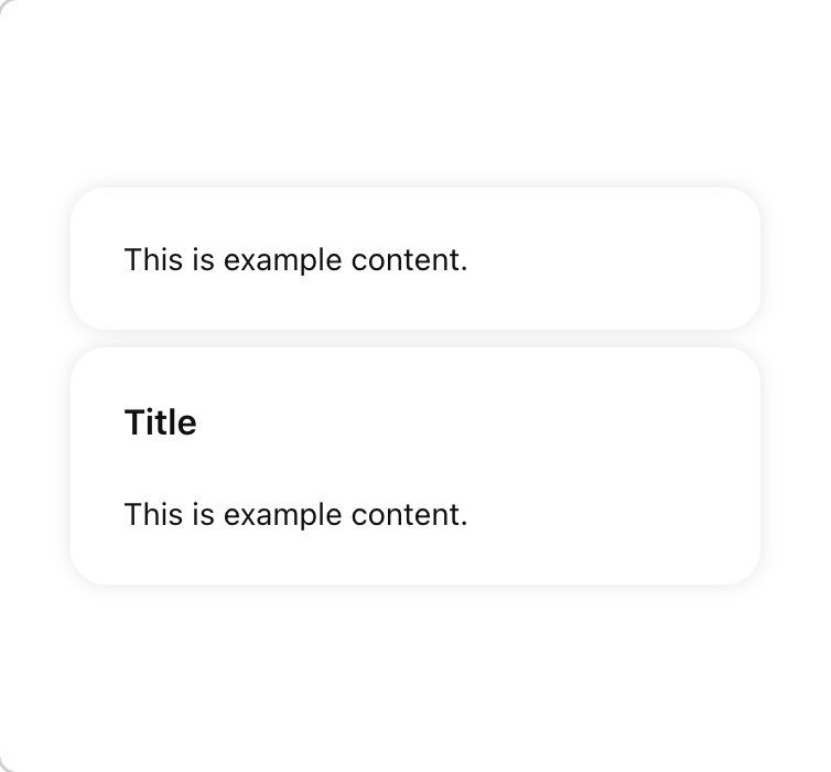
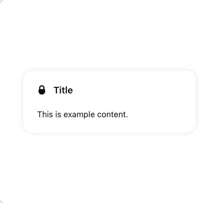
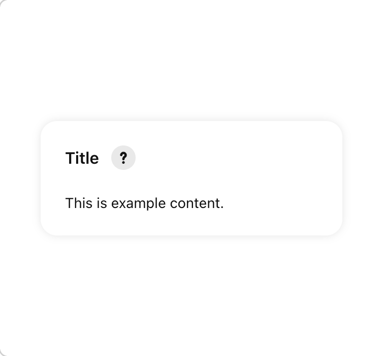
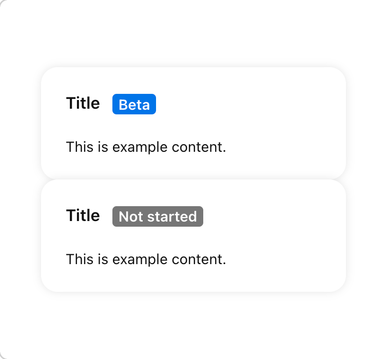
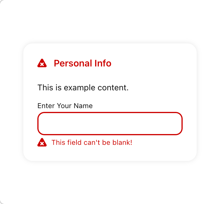
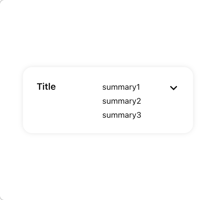
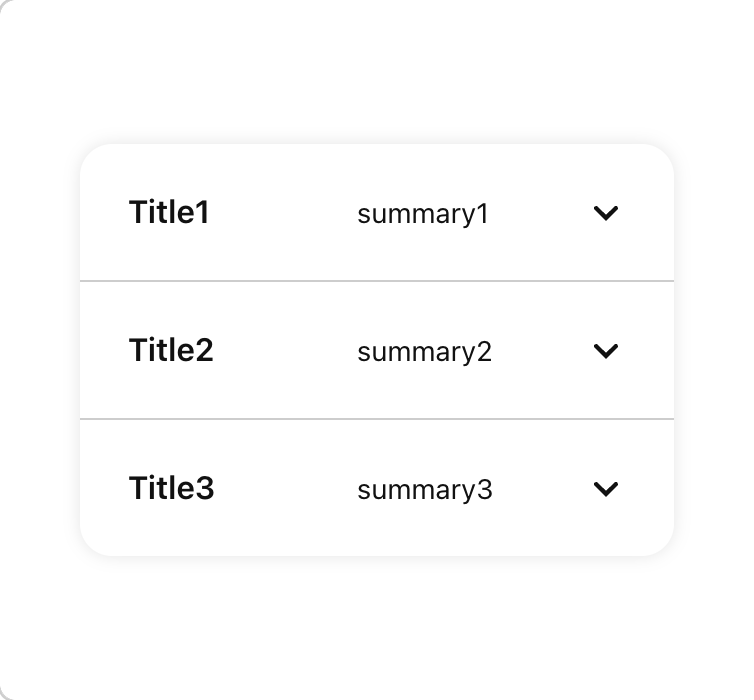
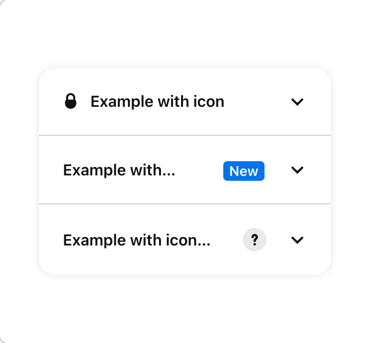
ActivationCards are used in groups to communicate a user’s stage in a series of steps toward an overall action.
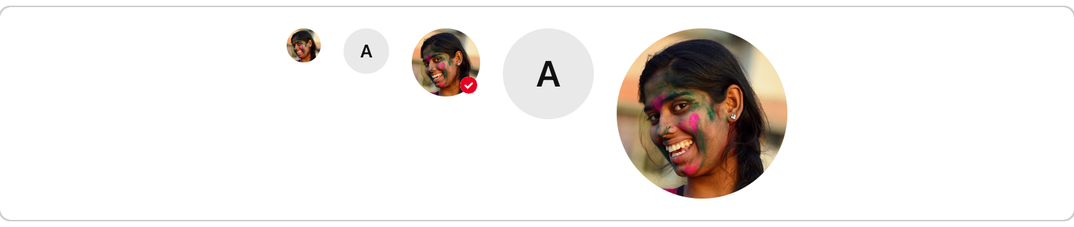
Avatar is used to represent a user. Every Avatar image has a subtle color wash. also known as Pinner rep, Persona, User Image, Identifier, Identicon



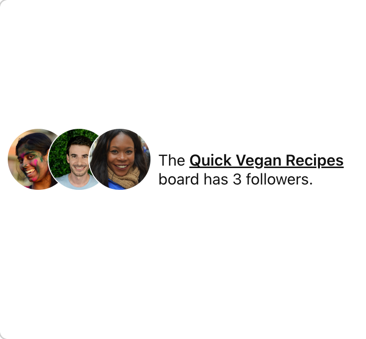
AvatarGroup is used to both display a group of user avatars and, optionally, control actions related to the users group. also known as Pinner reps, Personas, Facepile, User Images, Identification Group, Identicons

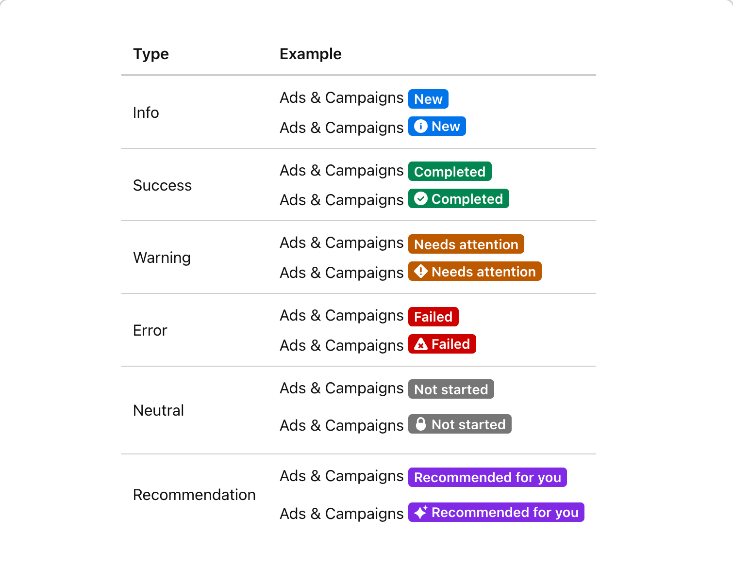
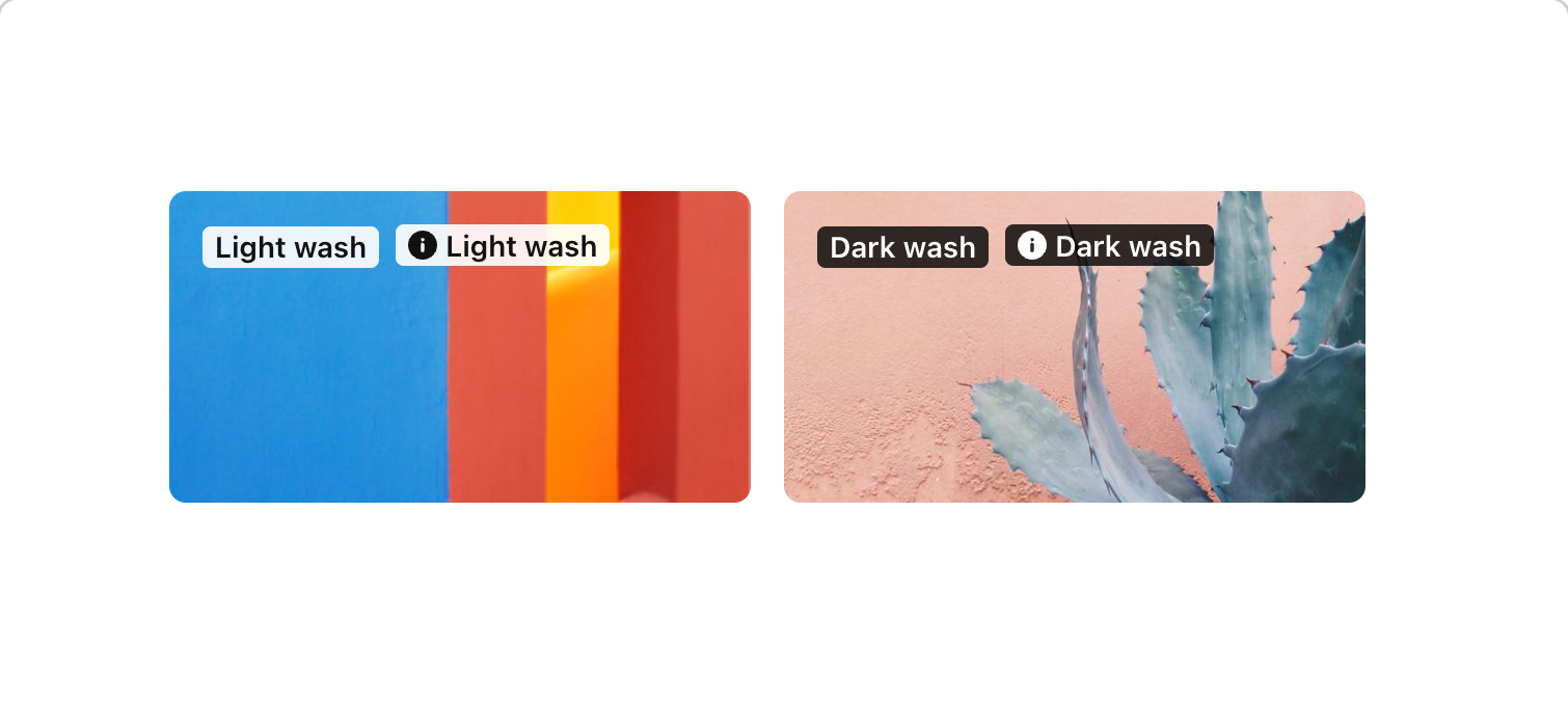
Badge is a label that indicates status or importance. Badges should provide quick recognition. also known as Lozenge, Label, Stamp, Flag
![Price Badge [To Discuss]](https://lchwovxxbgcdycaqmftj.supabase.co/storage/v1/object/public/public_screenshots/b_Y3iyZY8C/screenshot-cv_zxjwYyZ0-241120232315-0@2x.png)
![Video Duration Badge [To Discuss]](https://lchwovxxbgcdycaqmftj.supabase.co/storage/v1/object/public/public_screenshots/b_Y3iyZY8C/screenshot-cv_3LQtqp15-241120232424-0@2x.png)
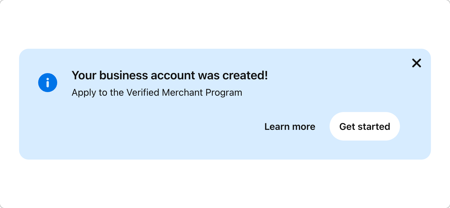
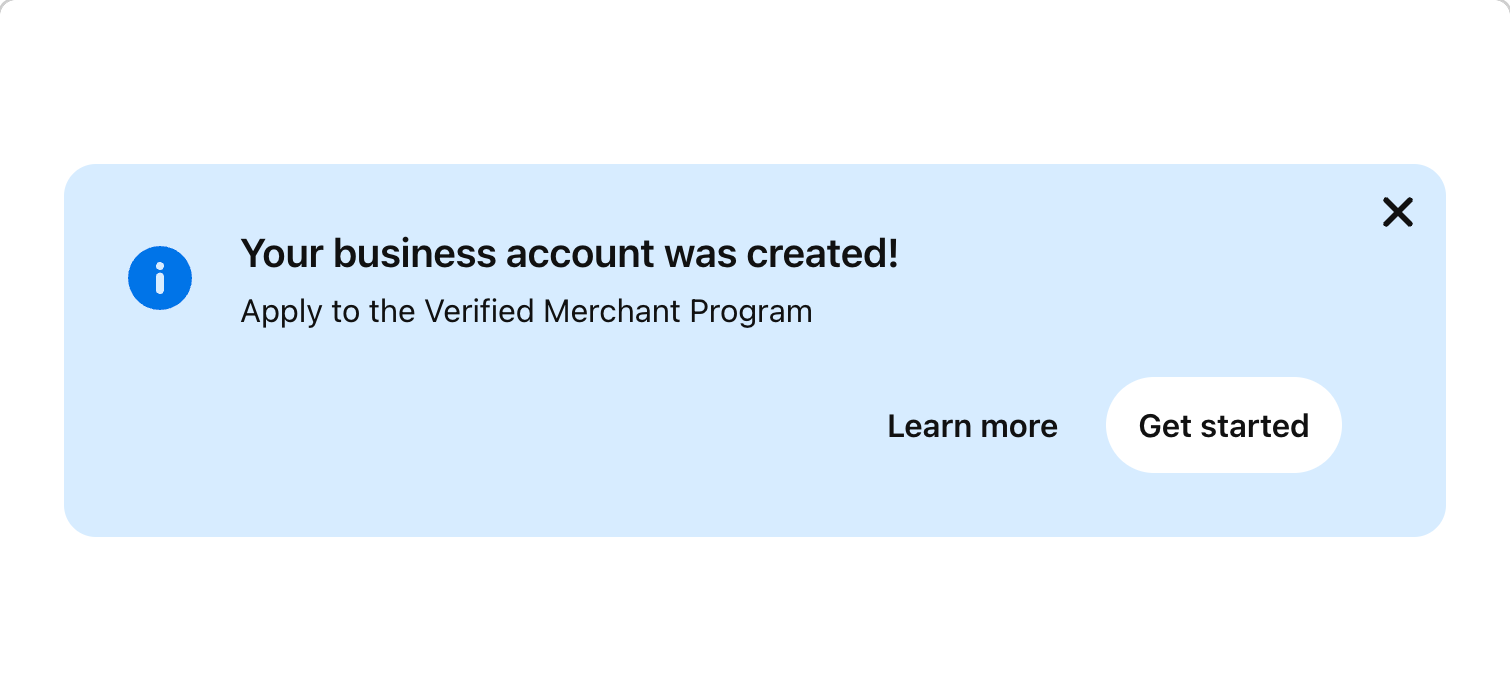
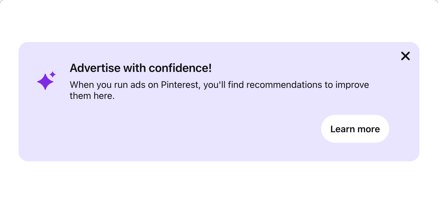
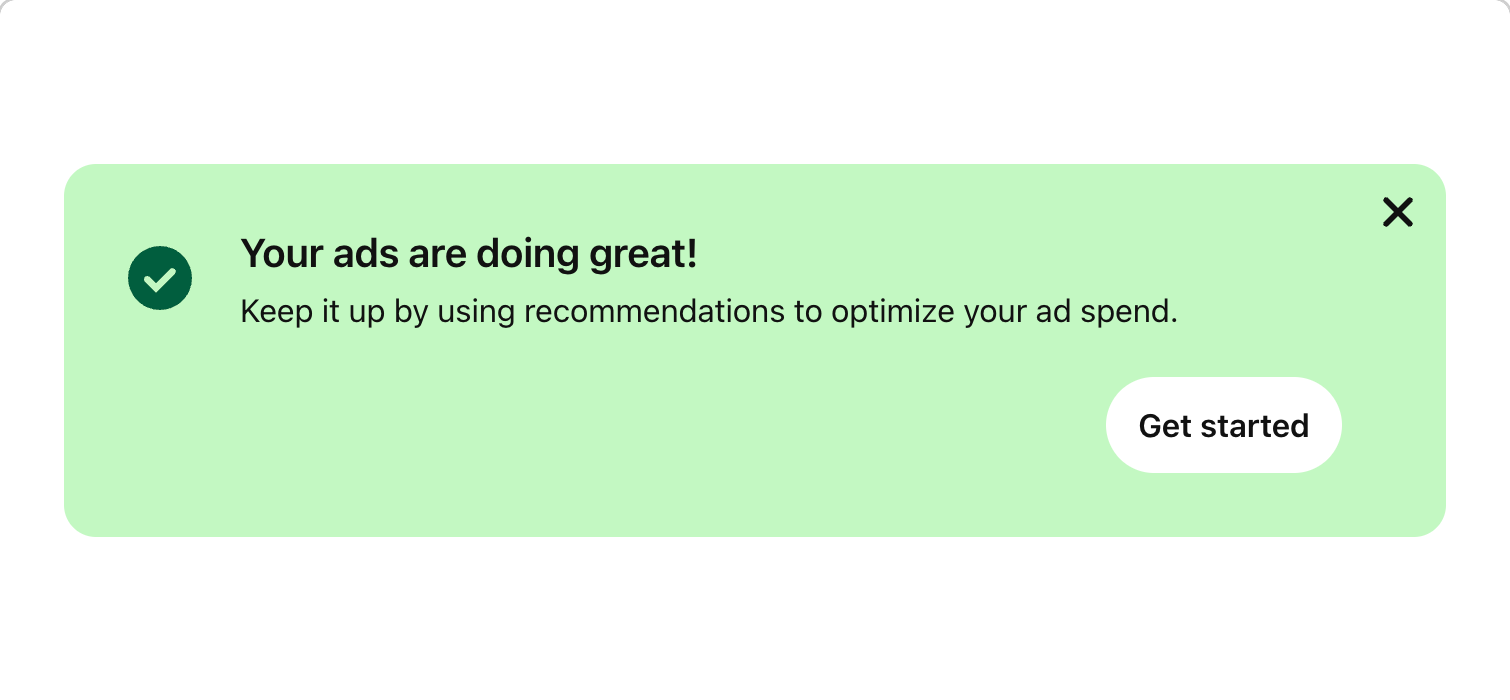
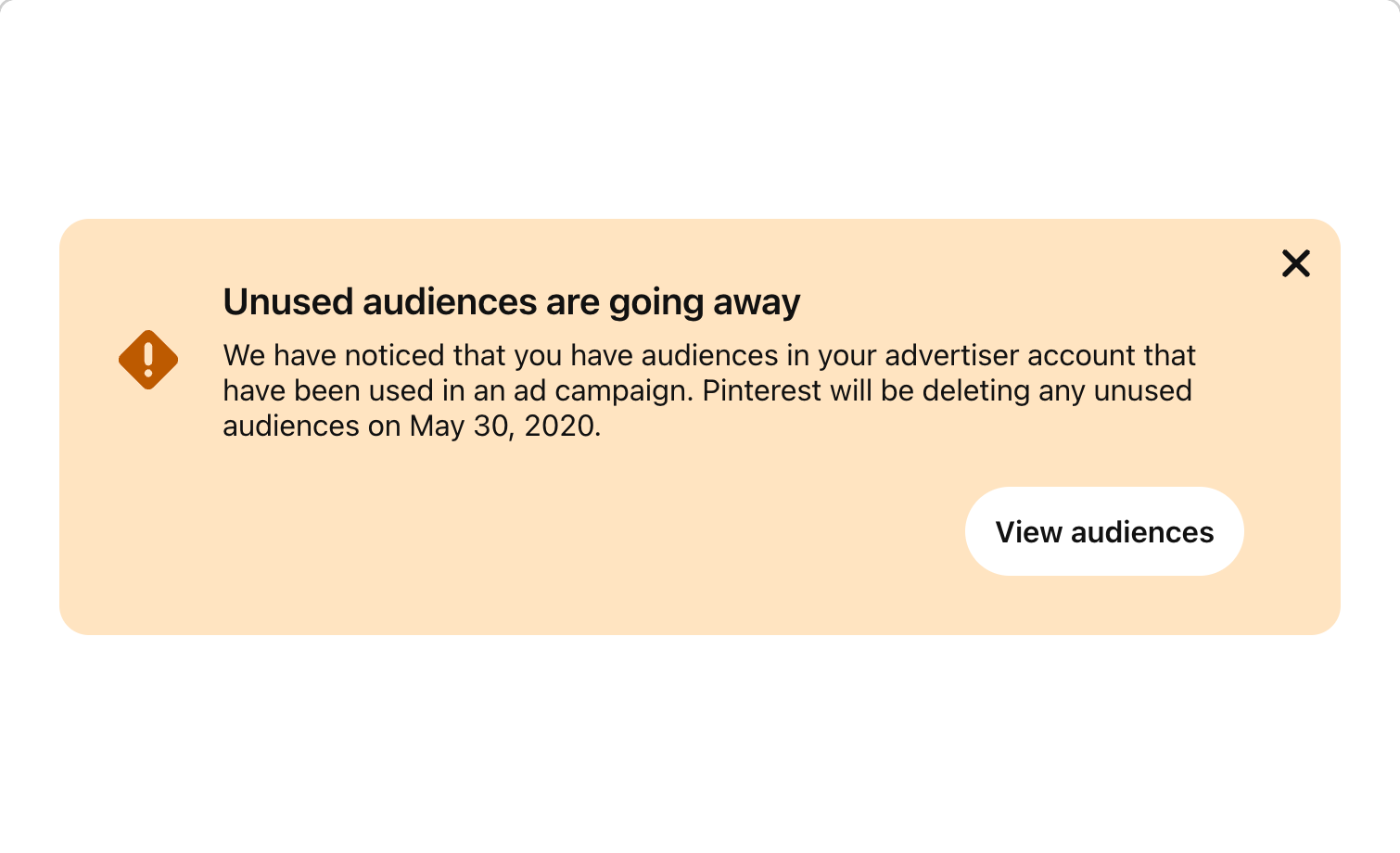
BannerCallout is a banner displaying short messages with helpful information for a task on the page, or something that requires the user’s attention. also known as Banner, Message, Notification, Notice, Note, Callout

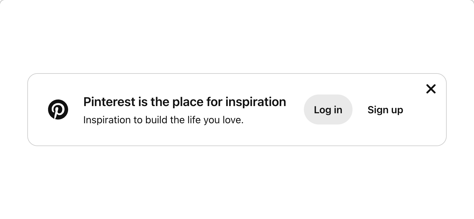
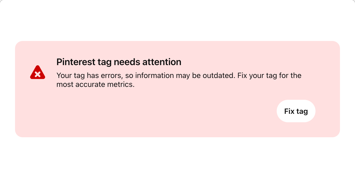

BannerOverlays displays short educational messages when users have performed actions that indicate some intent, such as a related pin tap or idea pin swipe. It is scrim-less, meaning users can scroll content underneath without having a wash layer on top of the content. BannerOverlay is a sticky component triggered by scroll, on tap or long-press, placed at the bottom of the screen. also known as UpsellOverlay
BannerSlim conveys brief information related to a specific section of a page. The message can relay success, warning, error or general information. Since they are about a specific section of a page or surface, BannerSlim sits inside of a container, and not at the top of the page. For alerts that apply to the whole page, use BannerCallout. also known as Notice, Note, Scoped Notification, SlimBanner
BannerUpsells are banners that display short messages that focus on promoting an action or upgrading something the user already has. also known as Banner, Offer Banner, CTA Banner, Upsell
Box is a component primitive that can be used to build the foundation of pretty much any other component. It keeps details like spacing, borders and colors consistent with the rest of Gestalt, while allowing the developer to focus on the content. also known as <div>, View
Buttons allow users to perform actions within a surface. They can be used alone for immediate action, or as a trigger for another component, like Dropdown or Popover. also known as Action, CTA
ButtonGroup is used to display a series of buttons. also known as Button Row, Action Bar
ButtonLink is mainly used as a navigational element to direct users to a new page or location.
ButtonToggle is a larger alternative to selection components such as Checkbox, RadioButton, and Switch. It enables users to choose between two states - selected or unselected. also known as Toggle, Action Button, Toggle Switch ------------------------------------------------------
ChartGraph is used for displaying various types of graphs plotted on an x and y axis. It makes it easier to identify and understand patterns over time across different categories, enabling people to make informed decisions quickly. also known as Bar Graph, Line Graph, Column Graph ChartGraph is still under development. The component API, style, and behaviour might change in follow-up releases.
Checkbox is used for multiple choice selection. They are independent of each other in a list, and therefore, different from RadioButton, one selection does not affect other checkboxes in the same list.
Collage, similarly to Masonry, creates a deterministic grid layout that can absolutely position and virtualize images. also known as Photo Composition -----------------------------------
Use Column to implement a 12-column system.
ComboBox is the combination of a Textfield and an associated Dropdown that allows the user to filter a list when selecting an option. ComboBox allows users to type the full option, type part of the option and narrow the results, or select an option from the list. also known as Typeahead, Autocomplete, Autosuggest
Containers are useful in responsively laying out content on different screens. also known as Content Block
Datapoint displays at-a-glance data for a user to quickly view key metrics.
DateField is used when the user has to select a date. Compared to DatePicker, DateField has no supporting calendar to select a date, the user must input date values with a numeric keyboard. DateField is distributed within the "gestalt-datepicker" package and must be installed separately.
DatePicker is used when the user has to select a date or date range. DatePicker is distributed in its own package and must be installed separately. also known as Calendar
DateRange enables users to preview and select a range of days by picking dates from a calendar or adding a text input. DateRange is distributed in its own package and must be installed separately. also known as Calendar, Date time picker, Date picker range
Divider is a light gray 1px horizontal or vertical line which groups and divides content in lists and layouts. also known as Separator, Horizontal Rule, <hr>, Rule
Dropdown displays a list of actions, options or links. It is triggered when a user interacts with a Button, Textfield or other control. Dropdown allows for complex functionality that can’t be accomplished with SelectList. also known as Menu, Contextual Menu
Fieldset creates a fieldset and legend for a group of related form items, like RadioButtons or CheckBoxes, in order to clearly indicate related form items." also known as Form group, Input Group, Choice Group, Form Block
Flex is a layout component with a very limited subset of the props available to Box and a special prop of its own. Use this component for flexbox layouts, especially when even spacing between elements is desired (see the gap prop!). also known as Row, Stack, Flexbox
Heading allows you to add H1–H6 level text on a page. They are generally placed underneath a PageHeader, and provide you with a way to create a logical text hierarchy. also known as Title, Headline
HelpButton is an affordance that accompanies an element on the screen. It helps describe or provide assistance on how to use the accompanying element. also known as InfoButton
Icons are the symbolic representation of an action or information, providing visual context and improving usability. See the Iconography and SVG guidelines to explore the full icon library. also known as <svg>, Symbol, Glyph
IconButton allows users to take actions and make choices with a single click or tap. IconButtons use icons instead of text to convey available actions on a screen. IconButton is typically found in forms, dialogs and toolbars. Some buttons are specialized for particular tasks, such as navigation or presenting menus. also known as Glyph button, Condensed Button
IconButtonFloating represents the primary or most common action on the screen. As the name suggests, it floats over the content and is always on top of everything on the screen. Similar to IconButton, the floating version uses icons instead of text to convey available actions. However, it is used when the action needs to be visible at all times in a sticky way where content can scroll underneath. IconButtonFloating remains in place on scroll. By default, it has a circular shape with a floating elevation shadow style built-in. When pressed, it will open more related actions by triggering Dropdown or Modal. IconButtonFloating is typically found in the Home feed, boards, and dashboards, allowing Pinners to perform core actions. also known as Glyph button, Floating action button, FAB, Quick create
IconButtonLink is mainly used as navigational element. Complete documentation for IconButtonLink coming soon. See IconButton documentation page
Image is the workhorse of Pinterest. If you define Pinterest to be all about collecting ideas, then images are how we choose to represent those ideas. In response, we've added a few extra superpowers to the regular img tag to make it even more awesome. also known as <img>, Picture, Photo
Use the Label component to connect a label with a form component in an accessible way. also known as Field Label, Form Label
Layers allow you to render children outside the DOM hierarchy of the parent. It's a wrapper around React createPortal that lets you use it as a component. This is particularly useful for places you might have needed to use z-index to overlay the screen before. also known as Portal, Overlay
Letterbox is useful if you have some source media which is larger than the area you want to display it in. For instance, you might have a really tall image and want it to be displayed in a neatly cropped square. While the ideal solution to this problem is to update the source image, this might not always be possible for either cost or performance reasons. Letterbox should be used in situations where you would otherwise use the CSS property background-size: cover.
Link is mainly used as navigational element and usually appear within or directly following a paragraph or sentence. also known as Anchor, <a>, Text Link, Hyperlink
List allows users to view individual, but related, text items grouped together. also known as Unordered List, Ordered list, <ol>, <ul>, <li>
Mask is used to display content in a specific shape.
Masonry creates a deterministic grid layout, positioning items based on available vertical space. It contains performance optimizations like virtualization and support for infinite scrolling. also known as Grid, Image List
A Modal displays content that requires user interaction. Modals appear on a layer above the page and therefore block the content underneath, preventing users from interacting with anything else besides the Modal. Modal should be used to gather short bits of information from the user. For confirmation of an action or acknowledgment, use ModalAlert. also known as Dialog, Prompt
A ModalAlert is a simple modal dialog used to alert a user of an issue, or to request confirmation after a user-triggered action. ModalAlert overlays and blocks page content until it is dismissed by the user. also known as AlertDialog, Prompt
NumberField allows for numerical input. also known as Number Input, Spin Box
OverlayPanels are surfaces that allow users to view optional information or complete sub-tasks in a workflow while keeping the context of the current page. The most common example of OverlayPanel displays content in a panel that opens from the side of the screen for the user to read or input information. OverlayPanels have default, internal padding for content. also known as Drawer, Panel, Tray, Sheet
PageHeader is used to indicate the title of the current screen and can also provide additional content and actions that relate to the current screen as a whole.
Pog is a lower-level functional component to show the active, hovered, & focused states of IconButton. This is an abstraction to allow for links that look like IconButton.
Popover is a floating view that contains a task related to the content on screen. It can be triggered when the user clicks or focuses on an element, typically Button or IconButton. It can also be triggered automatically, as in the case of user education. Popover is non-modal and can be dismissed by interacting with another part of the screen or an item within Popover. Popover is most appropriate for desktop screens and can contain a variety of elements, such as Button and Images. Popover is also the container used to construct more complex elements like Dropdown and the board picker, pictured below, which allow people to choose the board to save a Pin to. also known as Flyout ------------------------
PopoverEducational is a floating container that introduces users to elements on the screen. Used for education or onboarding experiences.
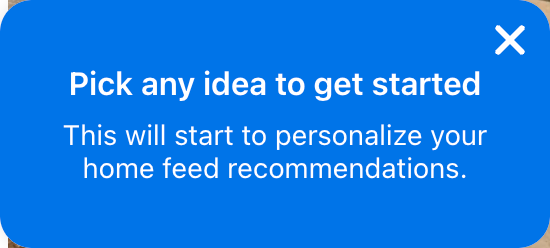
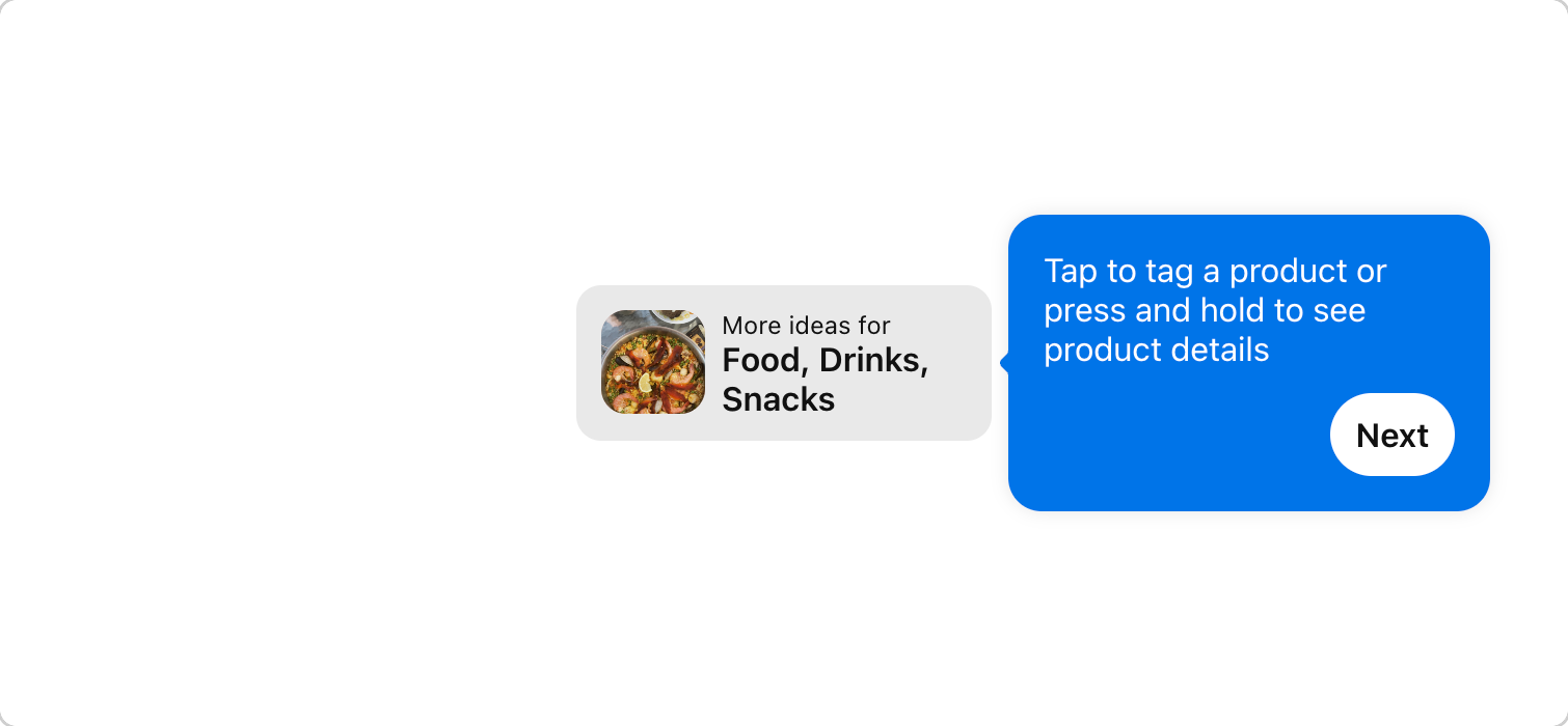
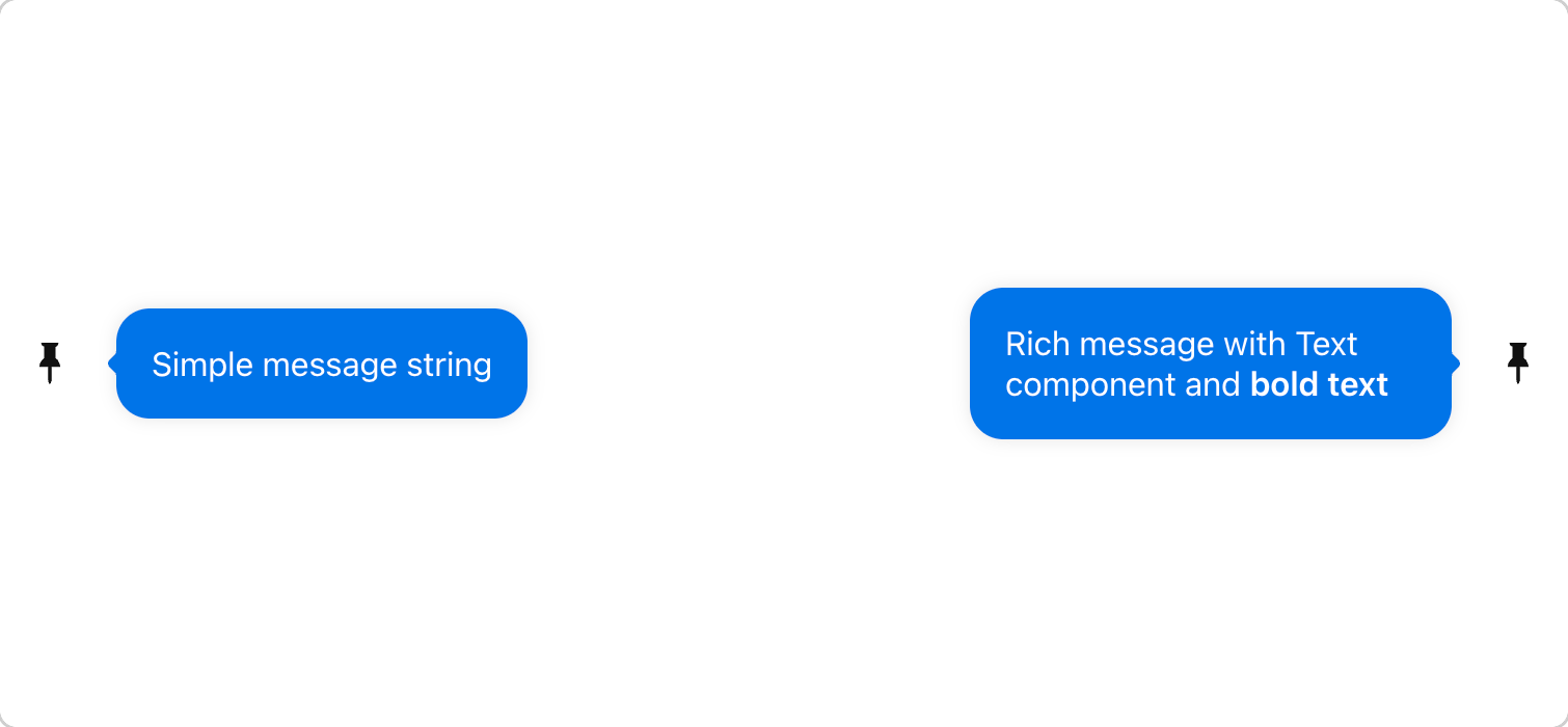
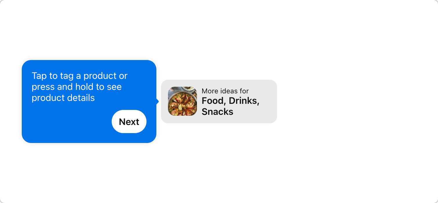
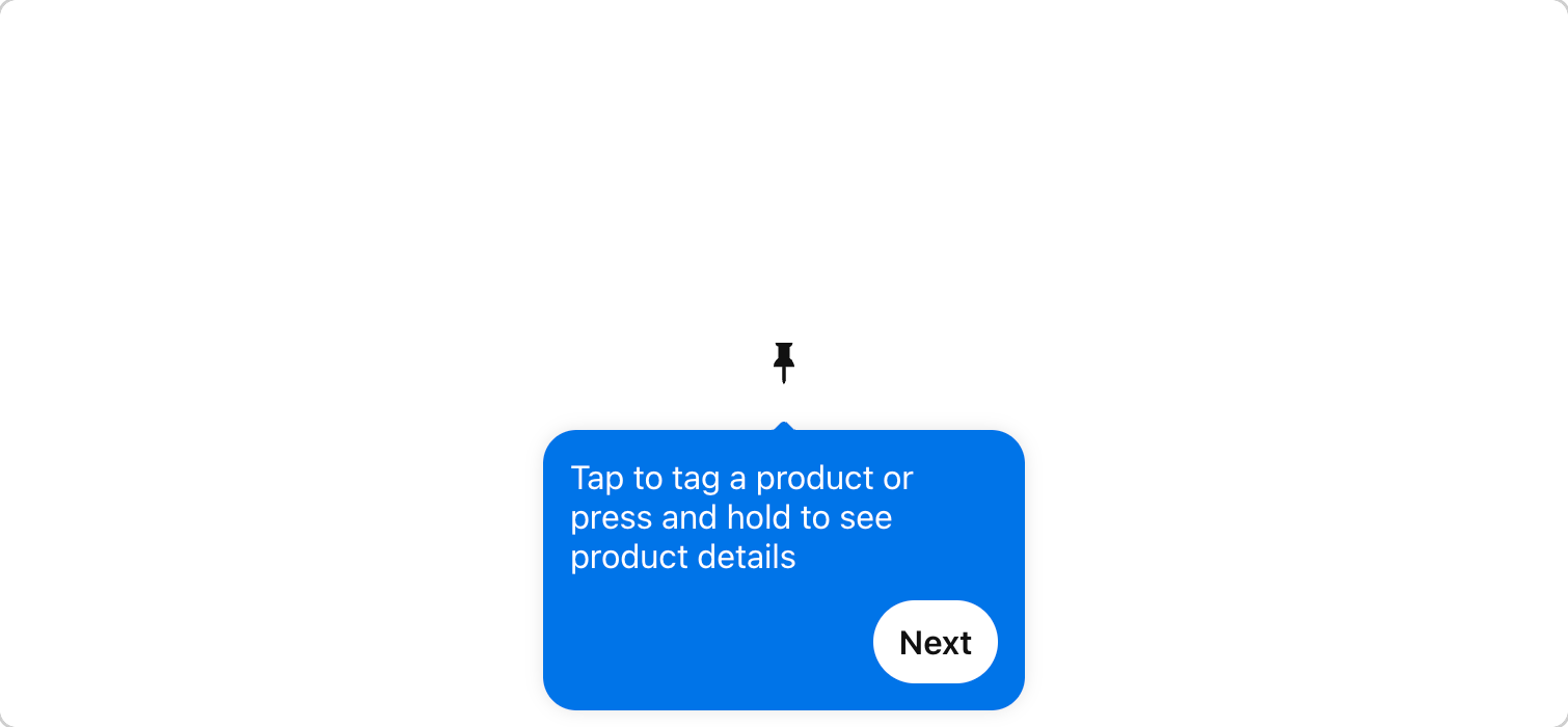
Pulsar brings focus to a specific element on the screen, acting like "training wheels" to guide people towards the intended way to perform the action. Pulsar is used in isolation or combination with other education components for more instruction. also known as Activity Indicator, Circular Indicator, Ring --------------------------------------------------------------
RadioGroups are used for selecting only 1 item from a list of 2 or more items. If you need multiple selection or have only one option, use Checkbox. If you need to provide a binary on/off choice that takes effect immediately, use Switch. also known as Single Select, Option Buttons, Radio Inputs -------------------------------------------------------------
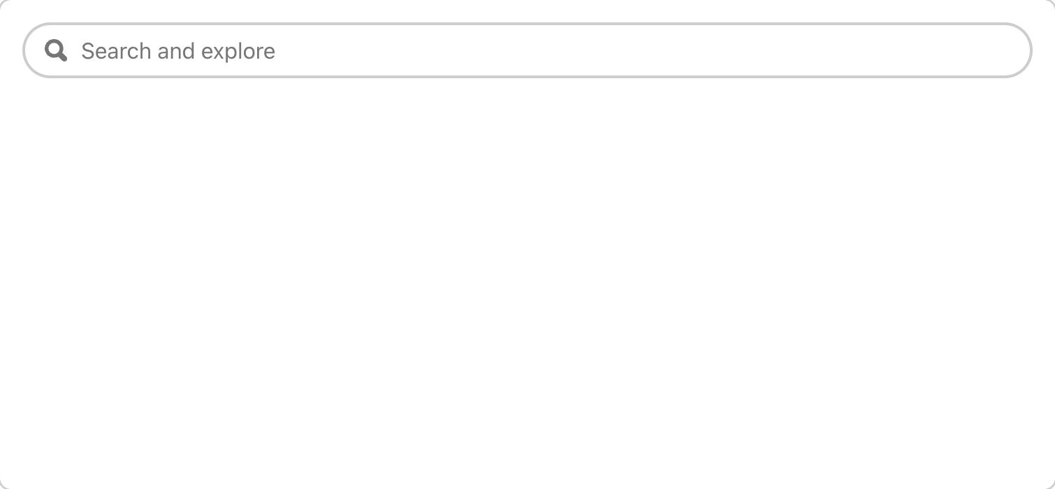
SearchField allows users to search for free-form content. also known as Search Box, Search Bar
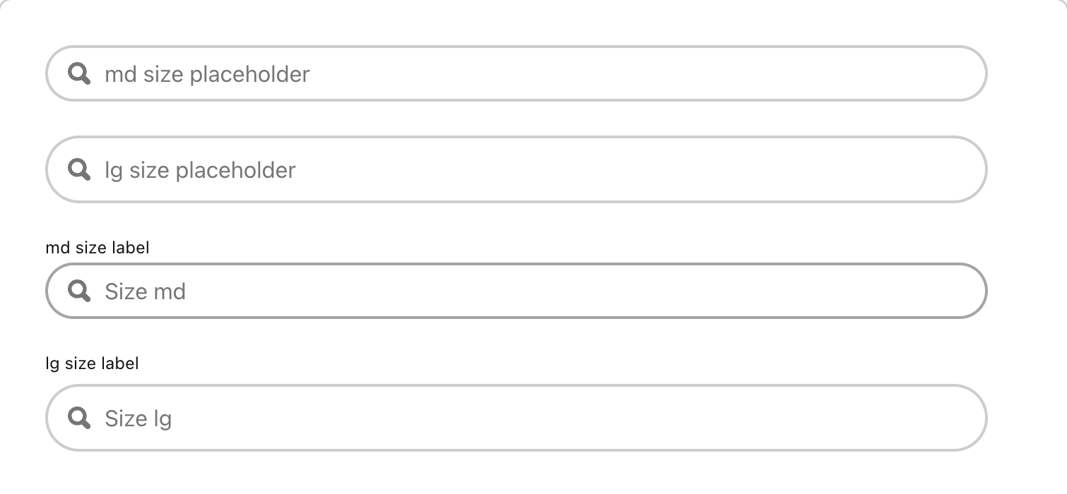
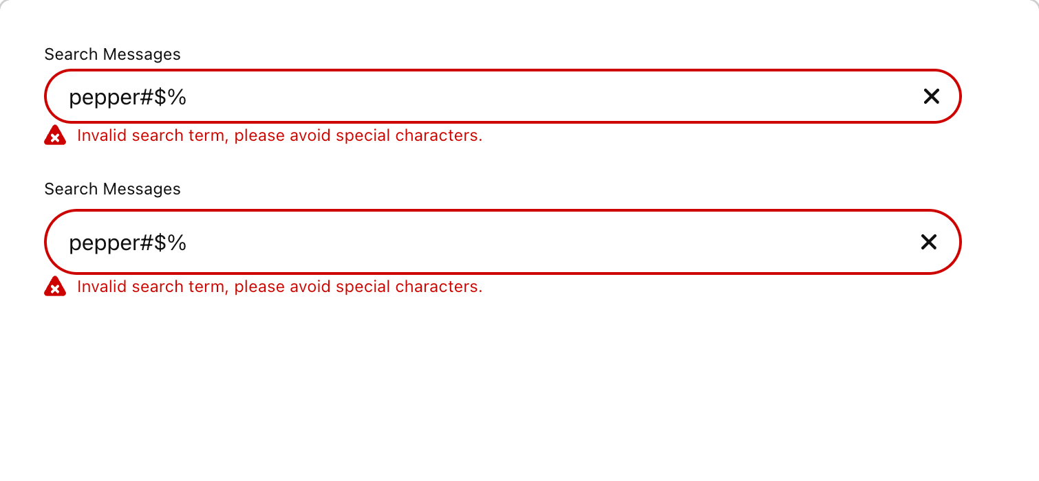



SearchGuide appends and refines a search query. They appear under SearchField after user submits a search input. also known as Search filters, Pivots, Vanilla guides --------------------------------------------------------
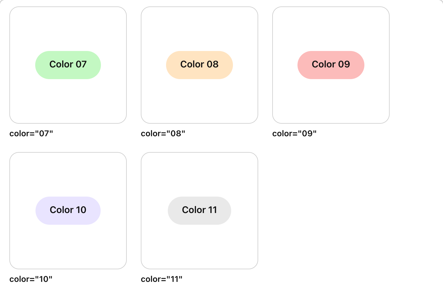
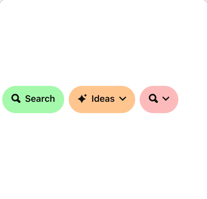
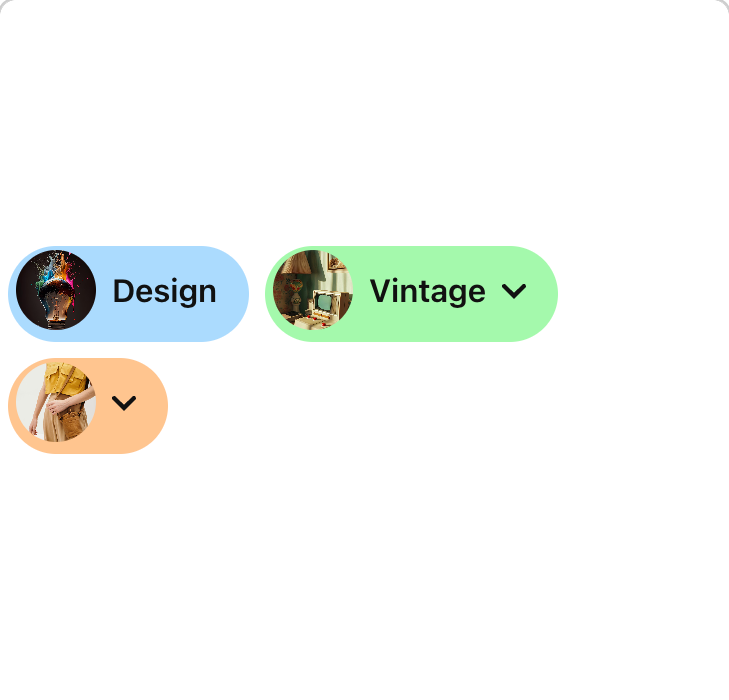
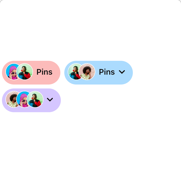
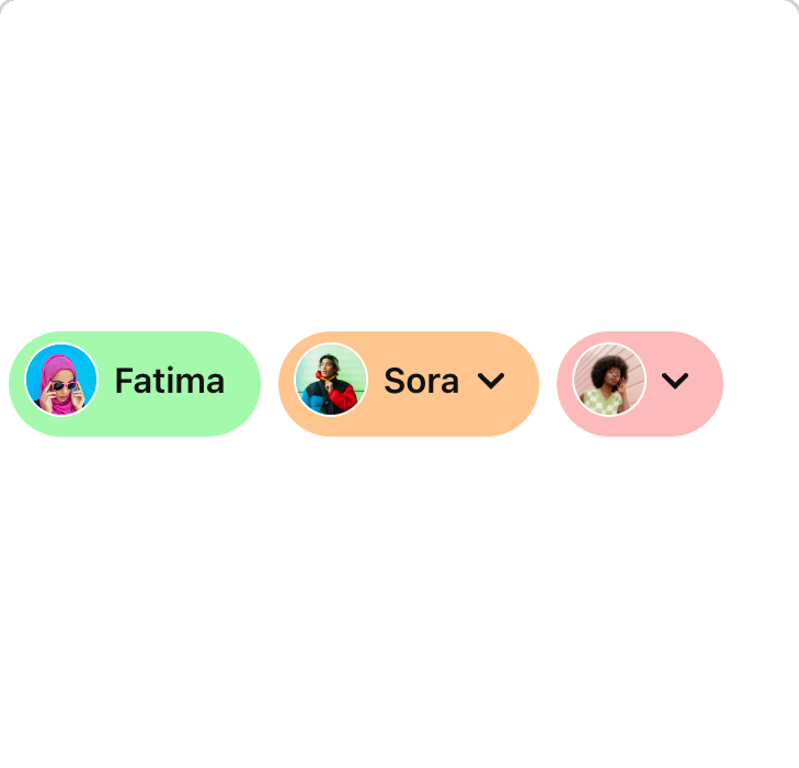
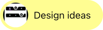
SearchGuideLink appends and refines a search query. They appear under SearchField after user submits a search input.
SegmentedControl may be used to group multiple selections. The controls display the current state and related state. Create layout to convey clear sense of information hierarchy. When a control is engaged, information below the control should also be updated. also known as Toggle Group ------------------------------
SelectList displays a list of actions or options using the browser’s native select. also known as Picklist, Picker
SheetMobile is a mobile only component. It is not used in desktop experiences. SheetMobile is a supplementary container that sits on top of the screen’s primary content and can be dismissed in order to interact with the underlying content. Sheets can contain a wide variety of information and layouts, including menu items, actions, and supplemental content. also known as Panel, Dialog, Drawer, Tray
SideNavigation is start-aligned and arranged vertically. It is used to navigate between page urls or sections when you have too many menu items to fit in horizontal Tabs. also known as Legend ------------------------
Spinner helps indicate that a surface's content or portion of content is currently loading. also known as Refresh Indicator, Refresh Control, Loader, Circular Loader, Loading Animation ------------------------------------------------------------------------------------------------
Status is a graphic indicator of an element’s state. also known as Status Indicator, Signal, System Feedback
Sticky allows an element to become fixed when it reaches a threshold (top, left, bottom, or right).
Use Switch for single cell options that can be turned on and off only. If you have a cell with multiple options that can activated, consider using Checkbox. Switch supports right-to-left(RTL) language locales layout (auto flip on RTL locales like Arabic). also known as Toggle, Slide Toggle
Table is a set of structured data that is easy for a user to scan, examine, and compare. Table data is displayed in a grid format and can be used to structure both interactive and static data. also known as Data Table, Data Grid
TableOfContents component is used to navigate to anchors on a page. It also serves as an outline of a page’s content. TableOfContents is placed on the right side of the page, close to the main content block. also known as Table of Contents, Page Navigation, Page Navigator, Secondary Nav
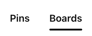
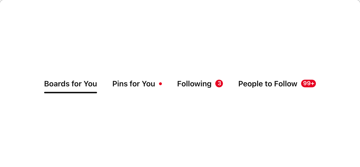
Tabs may be used navigate between multiple URLs. Tabs are intended as page-level navigation - if you're looking at just switching panels of content, please use SegmentedControl.
Tags can be used to categorize, classify or filter content, usually via keywords. They can appear within TextFields, TextAreas, ComboBox or as standalone components. also known as Chip, Pill, Filter Tag
TagData enables users to select multiple categories to compare with each other in a graph or chart. It contains a label and can be used as a filter for different sources. also known as Chip, Pill, Filter, Tag
TapArea allows components to be clickable and touchable in an accessible way also known as Touchable
TapAreaLink is mainly used as navigational element
Text component is used for all non-heading text on all surfaces, whether inside of UI components or in long-form paragraph text. also known as Copy, Subtext, Caption, Footer, Helper text
TextArea allows for multi-line input. also known as Multi-line Input
TextCompact component is used for metadata, annotations, and other instances where text should be small and dense. Its line height is tighter than the Text component.
TextField allows for multiple types of text input. also known as Text Input
TextUI component is meant to be used when text is interactive, such as a Button text or TextField labels. Compared to the Text component, TextUI is bolder and has a tighter line height.
TileData enables users to select multiple categories to compare with each other in a graph or chart view, while still being able to see all of the data points. also known as Card Grid, Item Featured, Choice Tile, Selection Card, Visual Picker
Toasts are brief and small messages that overlay content, but do not block the user’s flow, as they are out of the way and ephemeral. Toasts do not require user action and primarily acknowledge that a user has performed an action or completed a task. also known as Snackbar
Tooltip is a floating text label that succinctly describes the function of an interactive element, typically Icon Button. It’s displayed continuously as long as the user hovers over or focuses on the element. also known as Info Tip
Video is used for media layout
WashAnimated is used to highlight content in grids. It visually shows that children elements belong together and can highlight the items on hover. also known as Card, Panel, Tile
FixedZIndex and CompositeZIndex are utility classes that generate z-indices for Gestalt components.