Infa.ai
Carbon Design SystemComponents
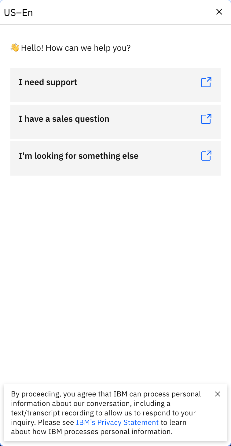
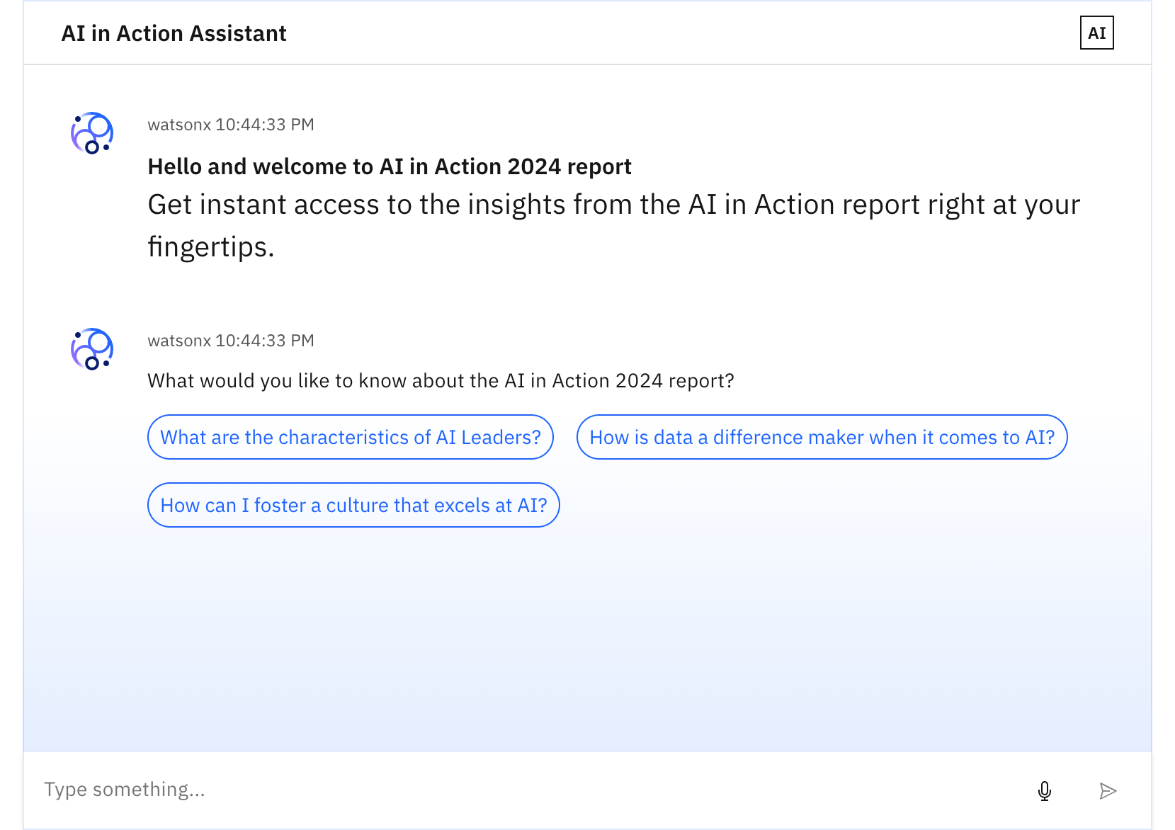
AI chat is a conversational framework between a user and an AI that can aid in creating tasks, finding insights, tracking documents, and more. For IBMers only: To learn more about chat, see Design for AI: Chat pattern.
An accordion is a vertically stacked list of headers that reveal or hide associated sections of content. 1. Header: contains the section title and is control for revealing the panel. 2. Icon: indicates if the panel is open or closed. 3. Panel: the section of content associated with an accordion header.
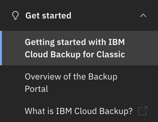
The breadcrumb is a secondary navigation pattern that helps a user understand the hierarchy among levels and navigate back through them. 1. Page link: Directs users to the parent-level page. 2. Separator: Clearly distinguishes between each page.

Buttons are used to initialize an action. Button labels express what action will occur when the user interacts with it. \ 1\. Contained button A. Text label B. Container C. Icon (optional) \ 3\. Ghost button A. Text label C. Icon (optional) \ 2\. Outlined button A. Text label B. Container C. Icon (optional) \ 4\. Icon button B. Container (optional) C. Icon



Checkboxes are used when there are multiple items to select in a list. Users can select zero, one, or any number of items. 1. Group label (optional): Communicates what needs to be selected below. 2. Checkbox input: A checkbox input indicating the appropriate state. By default it is unselected. 3. Checkbox label: Describes the information you want to select or unselect.


Code snippets are strings or small blocks of reusable code that can be copied and inserted in a code file. 1. Snippet text: Lines or a block of code. 2. Copy button (optional): An icon button to copy the code to the clipboard. 3. Show more button (optional): A ghost button to expand or collapse the code snippet to show more or fewer lines of code.

Contained lists group content that is similar or related and can contain read-only or interactive information. 1. List header area: Area to group the succeeding list items. 2. List title: Descriptive name for the group of list items. 3. List item: The content with in a list item row. 4. Interactive element (optional): An interactive element in the header or row such as a button, link, icon, or toggle.
Content switchers allow users to toggle between two or more content sections within the same space on the screen. Anatomy of a content switcher 1. Selected content tab: Only one content tab can be selected at a time and there should always be one selected. 2. Content tab: Selectable container for each content view. 3. Label text: Text or icon that describes the content view. 4. Content view: An area that can consist of component(s) and is usually right below the content switcher. Its view changes based on the selection.


Data tables are used to organize and display data efficiently. The data table component allows for customization with additional functionality, as needed by your product’s users. 1. Title and description: contains the data table title and an optional description. 2. Toolbar: global data table controls including search and table settings. 3. Column header: title for the row header with the optional sorting behavior. 4. Table row: can be configured to show different types of data. Rows can be selectable, expandable, and modified to show alternating zebra stripe background colors. 5. Pagination table bar: an optional component that lets a user navigate data as pages when the amount of data it too large to be shown at once.
Date and time pickers allow users to select a single instance or range of dates and times. Anatomy of a simple date input and a single date calendar picker. 1. Label: Instructs the user what to do with the control. 2. Date field: A text input field where the user can manually type in the date. 3. Date format: Format instructions should appear as helper text below the field or inline with the label. 4. Icon: calendar icon indicates the calendar menu is available. 5. Calendar: The menu where a date may be selected. 6. Month and year controls: Allows the user to navigate through past and future time frames. 7. Previous and next month controls: Allows the user to move forward or backward one month at a time. 8. Week day: Days of the week. 9. Day: Days in the month, see calendar variants for specific day styles.
Dropdowns present a list of options from which a user can select one option, or several. A selected option can represent a value in a form, or can be used as an action to filter or sort existing content. 1. Labels: Text that informs the user what to expect in the list of dropdown options. 2. Helper text: Assistive text to help the user choose the right selection. 3. Field: Persists when the dropdown is open or closed. 4. Option: A choice for the user, shown with other choices in a menu. 5. Menu: A list of options to choose from, displayed as an open state. from.


File uploaders allow users to select one or more files to upload to a specific location. 1. Heading: Text to describe the upload section. 2. Description: Text to help the user make an informed selection. 3. Button or drop zone label: The action to select a file to upload. 4. Uploaded file: A file that has successfully been uploaded. 5. x: The delete x icon will remove the uploaded file.
A form is a group of related input controls that allows users to provide data or configure options. 1. Header (optional): The addition of a title and description as a header that can provide the user with additional context or instructions. 2. Form body: Area where users provide information. Information can be entered through various input fields, including text fields, checkboxes, and many other types. Input components contain labels and helper text that the user submits correct data. 3. Footer: Provides actions that allow users to submit or cancel the data entered in the form.
The inline loading component provides visual feedback that data is being processed. 1. Loading status: indicates the state of the loading sequence (active, inactive, finished, error). 2. Label (optional): assistive text that explains the loading status.
Links are used as navigational elements. They navigate users to another location, such as a different site, resource, or section within the same page. 1. Link text: Communicates what is being linked to. 2. Icon (optional) Indicates the destination or type of content being. referenced


Lists are vertical groupings of related content. List items begin with either a number or a bullet.
Loading spinners are used when retrieving data or performing slow computations, and help to notify users that loading is underway.
A toggle is used to quickly switch between two possible states. They are commonly used for “on/off” switches. Default and small toggle variants
Modals focus the user’s attention exclusively on one task or piece of information via a window that sits on top of the page content. The modal is composed of three distinct zones: A header, the body, and a footer. Components (eg. data table, form, progress indicator) can occupy the full width of the modal. 1. Header: Includes a title, optional label, and the close icon. 2. Body: Contains the information and/or controls needed to complete the modal’s task. It can include message text and components. 3. Footer: Contains the main actions needed to complete or cancel the dialog task. Button groupings change based on modal variant. 4. x: The close x icon will close the dialog without submitting any data. 5. Overlay: Screen overlay that obscures the on-page content.
A menu is a list of interactive options that appears when users interact with an element or perform a specific action. 1. Trigger: Elements that are triggered to display a list of available actions. These menu triggers can include a menu button, a combo button, and an overflow menu within menu buttons. Menus can also be opened when right-clicking on a page or specific element, like a column, or a row. 2. Action item: A menu item that can be activated to apply its action on certain elements. This item can be accompanied by a submenu indicator or keyboard shortcuts. 3. Divider: A rule that indicates different sections within the menu. 4. Submenu indicator: A caret icon that indicates a submenu. 5. Keyboard shortcut: Certain action items may also have keyboard shortcuts. 6. Menu: A container displays the open state and contains a list of actions that can be selected. 7. Selected item: An item that can be selected. The selection can be single or multi-selected. 8. Submenu: A nested level off of the primary level.
Menu buttons, including menu buttons, combo buttons, and overflow menus, open a menu with a list of interactive options. #### 1\. Menu button A. Primary button C. Menu #### 2\. Combo button A. Primary button B. Icon button C. Menu #### 3\. Overflow menu A. Icon button C. Menu
Notifications are messages that communicate information to the user. The three variants of notifications are toast notifications, inline notifications, and actionable notifications. 1. Icon: Informs users of the kind of notification at a glance. 2. Title: Gives users a quick overview of the notification. 3. Action (actionable only): Ghost or tertiary button that allows users to address the notification or navigates them to a page with further details. 4. Close button (optional): Closes the notification. 5. Message: Provides additional detail and actionable steps for the user to take. 6. Timestamp (optional for toast): Shows the time the toast notification was sent.
Number input lets users enter a numeric value and incrementally increase or decrease the value with a two-segment control. 1. Label: Text that informs the user about the content they need to enter in the field. It is required unless you get an approved accessibility exemption. 2. Numeric value: The value changes when user enters a value into the field or uses the subtract or add controls. 3. Helper text: Assistive text that can provide additional aid or context to the user. Often used to explain the correct data format. 4. Field: The container in which a user enters data. 5. Subtract icon: This icon triggers decremental values. 6. Add icon: This icon triggers incremental values. 7. Status icon: Indicates the state of the number input, either error or warning. 8. Error or Warning text: It replaces the helper text when an error or warning state appears.
Pagination is used for splitting up content or data into several pages, with a control for navigating to the next or previous page.
A popover is a layer that pops up over all other elements on a page. 1. UI trigger button: An interactive element that triggers the popover to open on click, hover, or focus. 2. Tip: An indicator that is added to a popover container to help show the relationship between the popover and where it was triggered from. 3. Content area: An area to place text and interactive elements. 4. Container: An area to place text and interactive elements.


A progress bar provides feedback about the duration and progression of a process, such as a download, file transfer, or installation, to indicate how long a user will be waiting. 1. Label: The text describes the process that the progress bar refers to. The label can be visually hidden, but must be defined in order to be accessible. 2. Helper text (optional, except for error): Assistive text to show additional information about the process taking place. For determinate, the text is usually a percentage, fraction, ratio, or numeric value showing progression. Such values are not applicable when a progress bar is indeterminate. A progress bar that reaches an error state must convey the error in the helper text. 3. Track: The static area that the bar indicator moves on top of and acts as a fixed visual reference of what the total length and duration of the process could be. 4. Bar indicator: Indicates how much the process has progressed. 5. Status icon: Indicates the state of the progress bar, either in error or success state.
Tabs are used to organize related content. They allow the user to navigate between groups of information that appear within the same context. 1\. Line tabs A. Label B. Indicator 2\. Icon-only line tabs C. Indicator E. Icon 3\. Line tabs with icon A. Label B. Indicator C. Icon



A progress indicator guides users through any linear, multistep task by showing the user their completed, current, and future steps. 1. Status indicator: Communicates if a step is completed, current, not started, disabled or has an error. See the status indicator pattern for guidance. 2. Active step line: Indicates completed steps and the step the user is currently on. 3. Label: Communicates what the user will accomplish in each step. Numbering each step also makes the progression more obvious. 4. Inactive step line: Indicates steps that are not started as well as steps that are in an error, disabled, or skeleton state. 5. Helper text: Labels a step as optional or in an error state.
Use radio buttons when you have a group of mutually exclusive choices and only one selection from the group is allowed. 1. Group label (optional): Describes the group of options or provides guidance for making a selection. 2. Radio button input: Indicates the state of a radio button. By default, no option will be preselected. 3. Radio button label: Describes the information you want to select or unselect.
Search enables users to specify a word or a phrase to find relevant content without navigation. 1. Field: The place where a user enters their search query. 2. Search icon: Signifies a search field. The magnifying glass icon is a universal way to indicate search. 3. Field text: Inputted search text by the user. Placeholder text is visible before the user types into the field. 4. Close icon: Appears after the user has actively typed into the search field. Acts as a function to clear the search field.
Select allows users to choose one option from a list of values. 1. Labels: Text that informs the user what to expect in the list of dropdown options. 2. Default option: An empty option selected by default. The user can decide whether to choose a different option from the list. Depending on the use case, this defaulted behavior can be modified to be a prefilled selection to the first option in the list, which is typically shown in alphabetical order, or the prefilled selection could be a frequent or commonly used option that is on the list. 3. Helper text (optional, except for error and warning): Assistive text to help the user choose the right selection. Helper text is shown in a tooltip for fluid styles. 4. Field: Persists when the dropdown is open or closed. 5. Option: A choice for the user, shown with other choices in a list. 6. List: A list of options to choose from, displayed as an open state. 7. Status icon: Indicates the state of the select, either error or warning. 8. Error or Warning text: Replaces the helper text when an error or warning state appears.


Sliders provide a visual indication of adjustable content, where the user can increase or decrease the value by moving the handle along a horizontal track. 1. Label: Text describing what kind of value will be selected from the slider. 2. Min value: The minimum value that can be selected in the slider range. 3. Max value: The maximum value that can be selected in the slider range. 4. Number input: An input to specify a selected value within the slider range. 5. Handle: An indicator that can be moved on the track within the slider range to specify a selected value. 6. Track: Shows a user’s available minimum and maximum values on the range to select from.
Structured lists group content that is similar or related, such as terms and definitions. 1. Column header: Shows titles for the row header description. 2. Data row: Shows different types of data. Rows can be selectable and modified to show alternating zebra stripe background colors
Use tags to label, categorize, or organize items using keywords that describe them. Anatomy of read-only, dismissible, selectable, and operational tags. #### 1\. Read-only tag A. Decorative icon (optional) B. Title C. Container #### 3\. Selectable tag A. Decorative icon (optional) B. Title C. Container E. Border #### 2\. Dismissible tag A. Decorative icon (optional) B. Title C. Container D. Close icon #### 4\. Operational tag A. Decorative icon (optional) B. Title C. Container E. Border


Text inputs enable users to enter free-form text data. You can use them for long and short-form entries. 1. Label: Text that informs the user about the content they need to enter in the field. It is required unless you get an approved accessibility exemption. 2. Value: The content the user has entered into the field. 3. Field: The container in which a user enters data. Must meet 3:1 non-text contrast requirements. 4. Helper text (optional): Assistive text that can provide additional aid or context to the user. Often used to explain the correct data format. It is positioned below the field in the default style and surfaced through a tooltip in the fluid style.
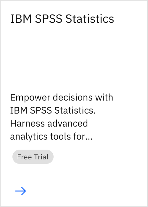
Tiles are a highly flexible component for displaying a wide variety of content, including information, getting started, how-to, next steps, and more.






Toggletips use the disclosure pattern to toggle the visibility of a popover. They display additional, hidden information upon the click of a UI trigger element and can contain interactive elements. 1. UI trigger button: Usually a button but as long as the trigger is interactive, it can visually change its shape and size depending on the use case. 2. Tip: An indicator that is added to a popover container to help show the relationship between the popover and where it was triggered from. Toggletips can utilize no tip, caret tip, or tab tip types. 3. Content area: Varies based on use case and follows disclosure guidelines. 4. Popover container: Area that contains text and interactive elements.
Tooltips display additional information upon hover or focus that is contextual, helpful, and nonessential while providing the ability to communicate and give clarity to a user. 1. UI trigger button: Button that triggers a tooltip on hover or focus. 2. Caret tip: Closely associates the container with the related trigger element. 3. Container: Contains helper text.

A tree view is a hierarchical structure that provides nested levels of navigation. 1. Branch node: A node that has one or more child nodes. Can be expanded or collapsed to reveal or hide child nodes. 2. Leaf node: A node that has no child nodes and can appear at any level of the tree view hierarchy. A leaf node may be referred to as a child node when it is nested underneath a branch node. 3. Caret icon: An icon to expand or collapse a branch node. 4. Node icon (optional): An icon to visually represent and support a node label, they can assist the user to scan different content types quickly.
This header is part of the Carbon UI shell. A shell is a collection of components shared by all products within a platform. It provides a common set of interaction patterns that persist between and across products. 1. Hamburger menu: The hamburger icon is used to open product navigation such as the left panel. The hamburger menu is only needed when there is a collapsable left navigation. 2. Header name: For IBM products, the header name is always preceded by “IBM.” 3. Header links: Links in the header are supported as product navigation, if required. These links move to the side menu in narrow screen widths. 4. Sub-menu: Sub-menus are supported as product navigation, if required. Include the down-pointing chevron after the link label. Sub-menus open on click and are closed by either selecting an item in the menu, clicking outside the menu area, or clicking on the menu label. When open, the chevron should point up. Sub-menu labels serve only to open the dropdown; they cannot link to another page in the product. 5. Header utilities: These utilities are reserved for universal, system-level functions such as profile, search, notifications, and similar functions. Not every product on a system is required to show the same utilities, but it is recommended for a better cross-product user experience. 6. Switcher: The switcher provides a way for the user to easily navigate between products and systems. Recommended uses for this component include recently used apps, frequently used apps, or all apps attached to the user’s account. If the list is a manageable size, include all apps or products available on the system.

This left panel is part of the Carbon UI shell. A shell is a collection of components shared by all products within a platform. It provides a common set of interaction patterns that persist between and across products. UI shell components

The right panel is part of the Carbon UI shell. A shell is a collection of components shared by all products within a platform. It provides a common set of interaction patterns that persist between and across products. UI shell components
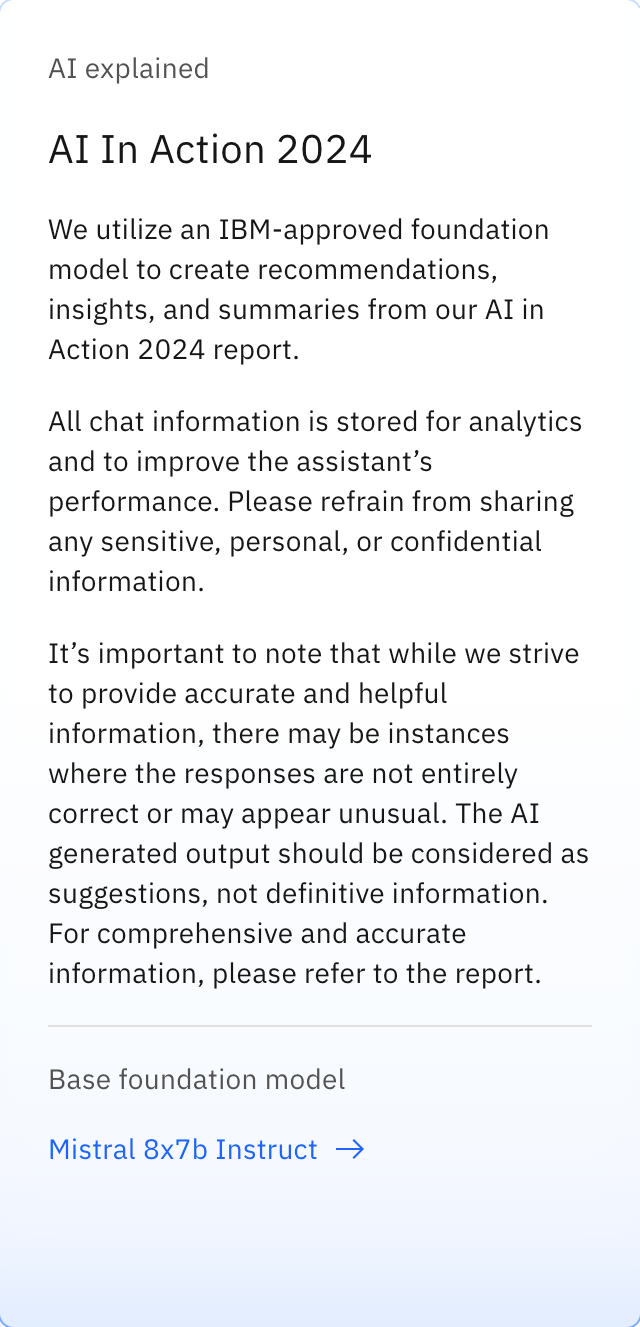
The AI label indicates an instance of AI in the UI. It enables AI transparency through the visual recognition the AI icon and is the key pathway to AI explainability by acting as the trigger for the explainability popover. ### Anatomy 1. AI indicator / button: indicates AI is present and is the button trigger for the explainability popover. It can be either the default or inline variant. 2. Text label: the text abbreviation for artificial intelligence which can be translated as needed. 3. Explainability popover: Area that contains AI explainability content and interactive elements.